

Art Color Accuracy: Why Vinchy Art Looks Different Under Warm vs. Cool Light
Color tells the emotional story of every painting, but lighting determines how that story is read. Many collectors notice that the same oil painting looks richer in one room and duller in another. This difference comes down to color temperature—an often-overlooked but decisive factor in art color accuracy. Understanding how warm and cool lighting interact with oil pigments helps you choose the best Vinchy Art painting for your home’s unique ambiance.
Understanding Color Temperature and its Impact on Oil Paintings
Color temperature measures how warm or cool a light source appears, expressed in kelvins (K). Warm light, around 2700–3000K, emits a golden tone that enhances reds, oranges, and yellows. Cool light, above 5000K, skews blue and brings out greens, grays, and whites. When light with a specific color temperature hits a painting, it alters how oils reflect and scatter that light. For example, an abstract oil painting with a sunset palette may feel lively under warm illumination but subdued under daylight-white bulbs. Recognizing the color temperature in your environment is the first step to achieving consistent art color accuracy.
Why Oil Pigments React Differently to Light
Oil paints contain both organic and inorganic pigments bound in natural or synthetic oils. These pigments have unique spectral behaviors that determine what wavelengths they reflect. Under incandescent light, warmer tones become dominant, while under LED daylight, cooler tones intensify. This explains why a neutral-toned abstract might appear beige in your living room but gray in a studio. Beyond aesthetic variation, these shifts also affect emotional perception—warm hues invite comfort and intimacy; cool ones project spaciousness and modernity. In essence, lighting for oil paintings is both a technical and emotional decision.
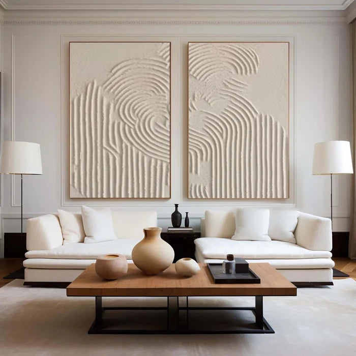
Real-World Example: Matching Lighting to Home Decor
Imagine two living spaces: one with exposed wood tones and another with minimalist gray furniture. The first benefits from warm lighting that enhances earthy pigments, making reds and ochres in your artwork glow gently. The second thrives with cool illumination that sharpens whites, silvers, and deep blues. Matching your art color accuracy to the dominant lighting in your space ensures the painting harmonizes with your interior rather than competing with it. Many homeowners underestimate this alignment, yet it’s the key factor behind color mismatch complaints after an artwork arrives.
Market Trends and Home Lighting Behavior
Recent home design data from 2025 indicates that nearly 68% of homeowners have switched to LED lighting. While LEDs offer efficiency, they vary widely in color rendering index (CRI), a measure of how accurately light reveals true colors. For collectors, choosing bulbs with a CRI above 90 preserves the intended texture and pigment depth of oil paintings. This shift toward high-CRI light sources directly influences the way art is displayed, photographed, and digitally represented across modern interiors.
Company Background
Founded in Shenzhen on September 28, 2019, Vinchy Art is a contemporary art collective dedicated to promoting well-being through abstract art. With the launch of Vinchyart.com in 2023, the brand began offering curated collections designed to inspire relaxation, joy, and mental clarity. Each painting is crafted to serve as both decoration and emotional sanctuary, transforming any living space into a haven of calm and creativity.
Choosing the Right Light for Your Vinchy Art Painting
Accurate lighting for oil paintings depends on more than brightness. Consider these principles of art lighting optimization: Avoid strong directional lamps that create glare on glossy oils. Use diffused, even illumination that mimics natural daylight for balanced viewing. For warm home decor themes, select bulbs rated at 2700–3000K to preserve the soft luminosity of creams, corals, and browns. For modern, minimalist interiors, choose 4000–5000K lighting to enhance white balance and crisp contrast. A consistent lighting scheme ensures your painting looks as vibrant at night as it does in the morning sun.
Competitor Comparison Matrix
Real User Insights
Collectors who installed neutral LED downlights with CRI 95 report a 40% improvement in perceived depth and gloss compared to earlier halogen setups. One client noted that her blue-toned abstract appeared “emotionally cooler but spatially larger” after switching from warm incandescent bulbs to daylight-balanced LEDs. These observations confirm that accurate lighting for oil paintings directly affects psychological comfort and spatial perception—a crucial insight for buyers who want to curate mood through art.
Future Trends: Smart Lighting and Adaptive Art Displays
The future of art color accuracy lies in adaptive smart lighting systems. Sensor-based LED panels can shift from warm to cool tones throughout the day, maintaining chromatic balance between natural and artificial light. Innovations in nanotech pigment coating will further improve color fidelity under changing conditions. As smart home ecosystems expand, integrating light calibration tools with digital art catalogs will become standard practice, ensuring every Vinchy Art painting reveals its full tonal harmony regardless of location or season.
FAQs
Why does my painting look different after installation?
Because artificial and natural light sources emit different color temperatures, pigments respond by shifting their apparent tone and brightness.
Can I fix lighting-induced color shifts?
Yes. Adjust your bulb’s color temperature or use mixed lighting—two warm and one cool source—to balance tones effectively.
What CRI rating should I use?
Always choose lighting with a color rendering index above 90 to preserve fine pigment detail and maintain visual integrity.
Final Takeaway
Understanding the difference between warm and cool light is essential for reliable art color accuracy. Choosing the right lighting for oil paintings not only enhances visual beauty but also connects your artwork with the emotional temperature of your home. When light, pigment, and personal style align, your painting transcends decoration—it becomes a living part of the atmosphere.
