





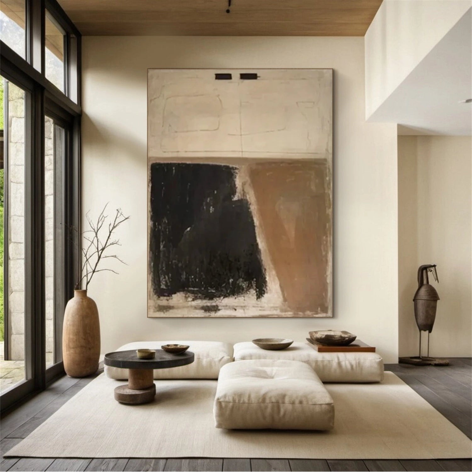


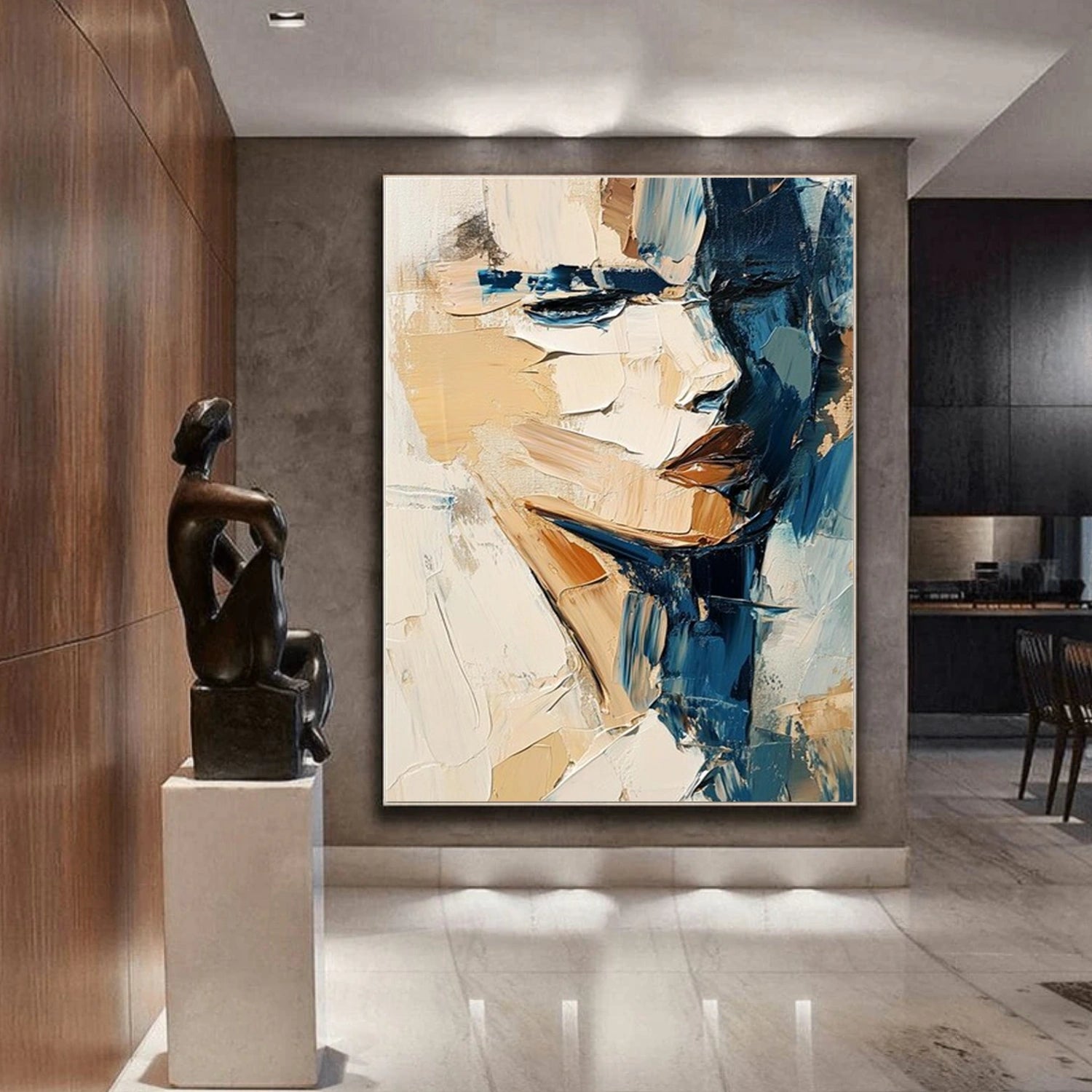
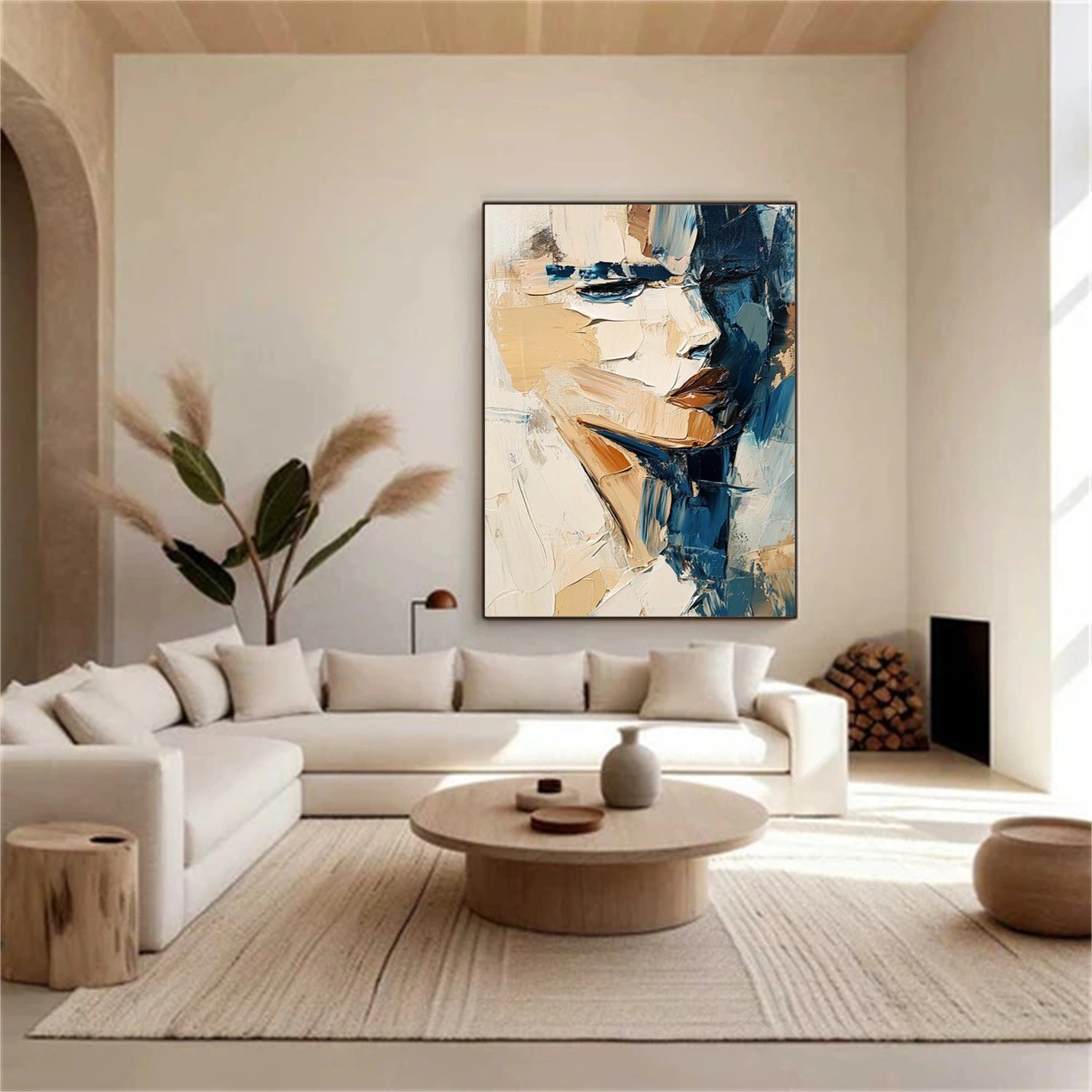
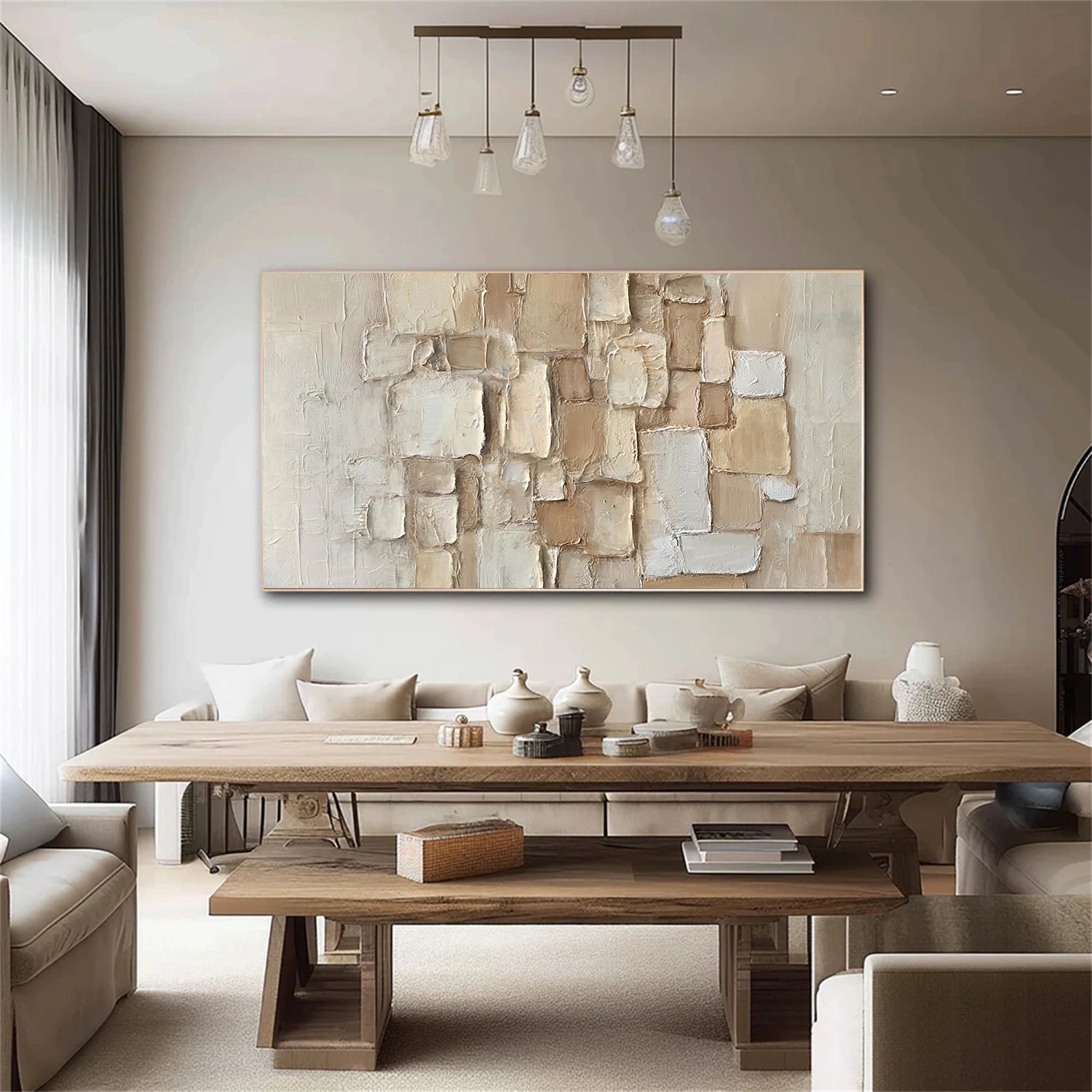
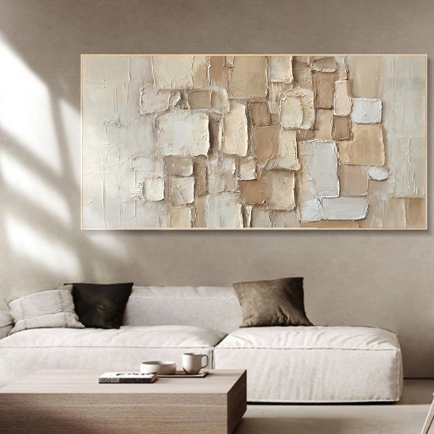


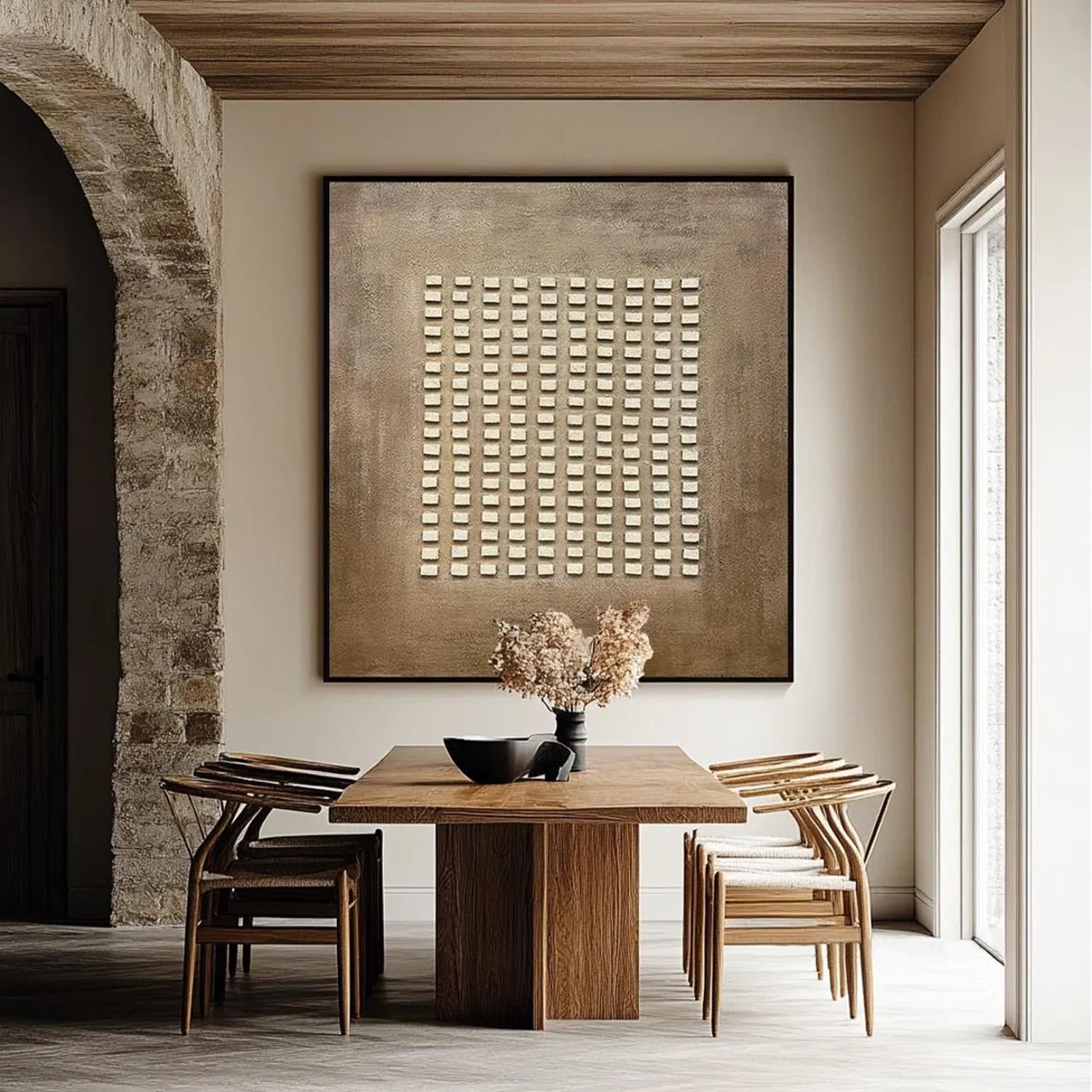
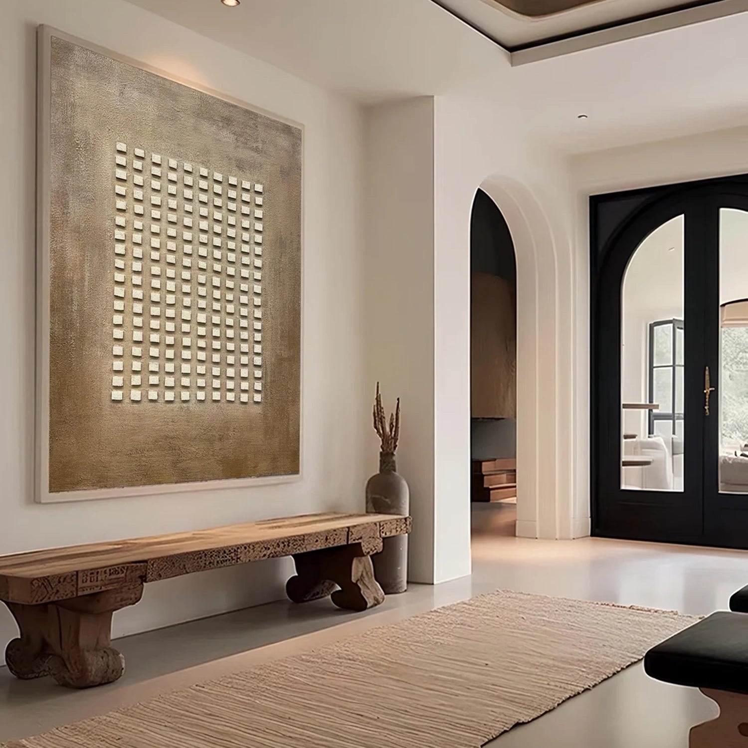


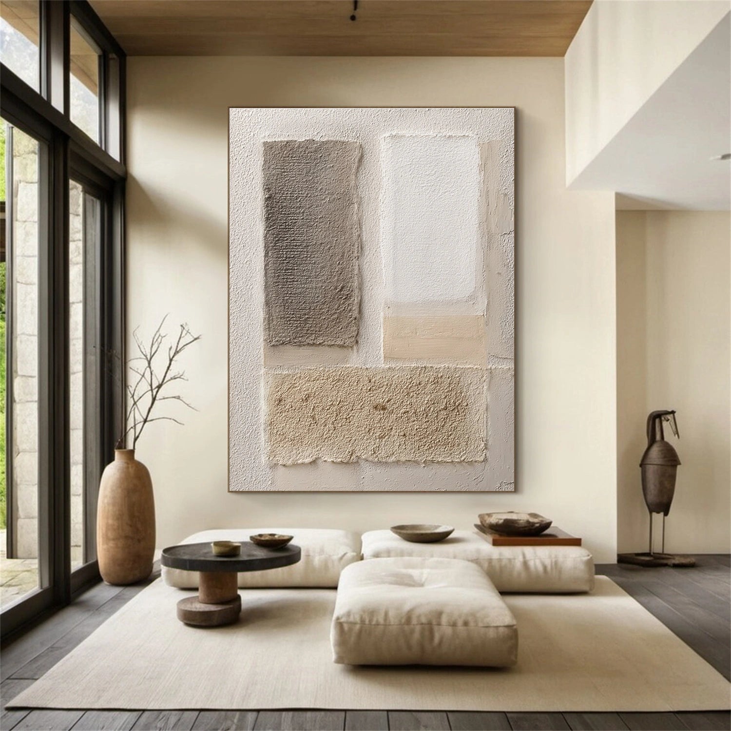




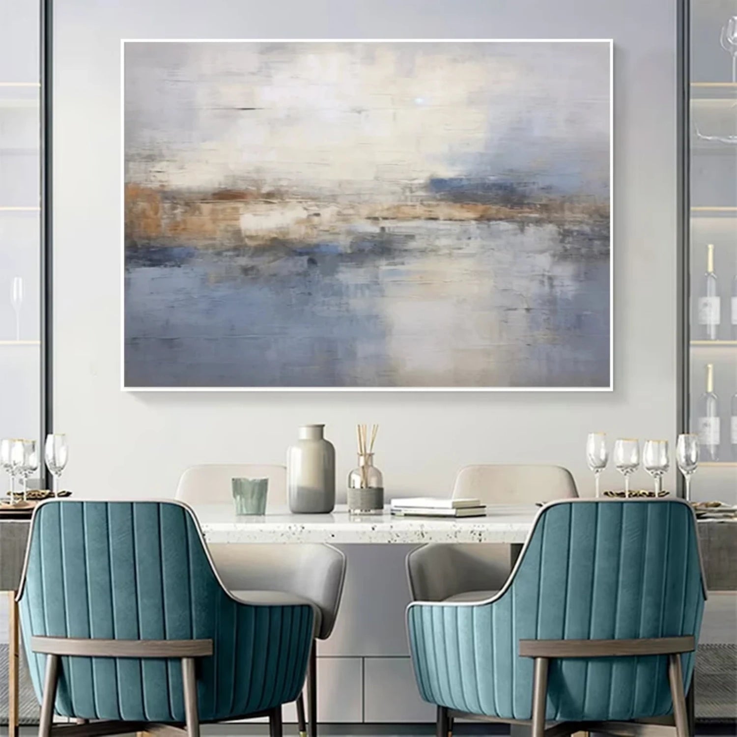
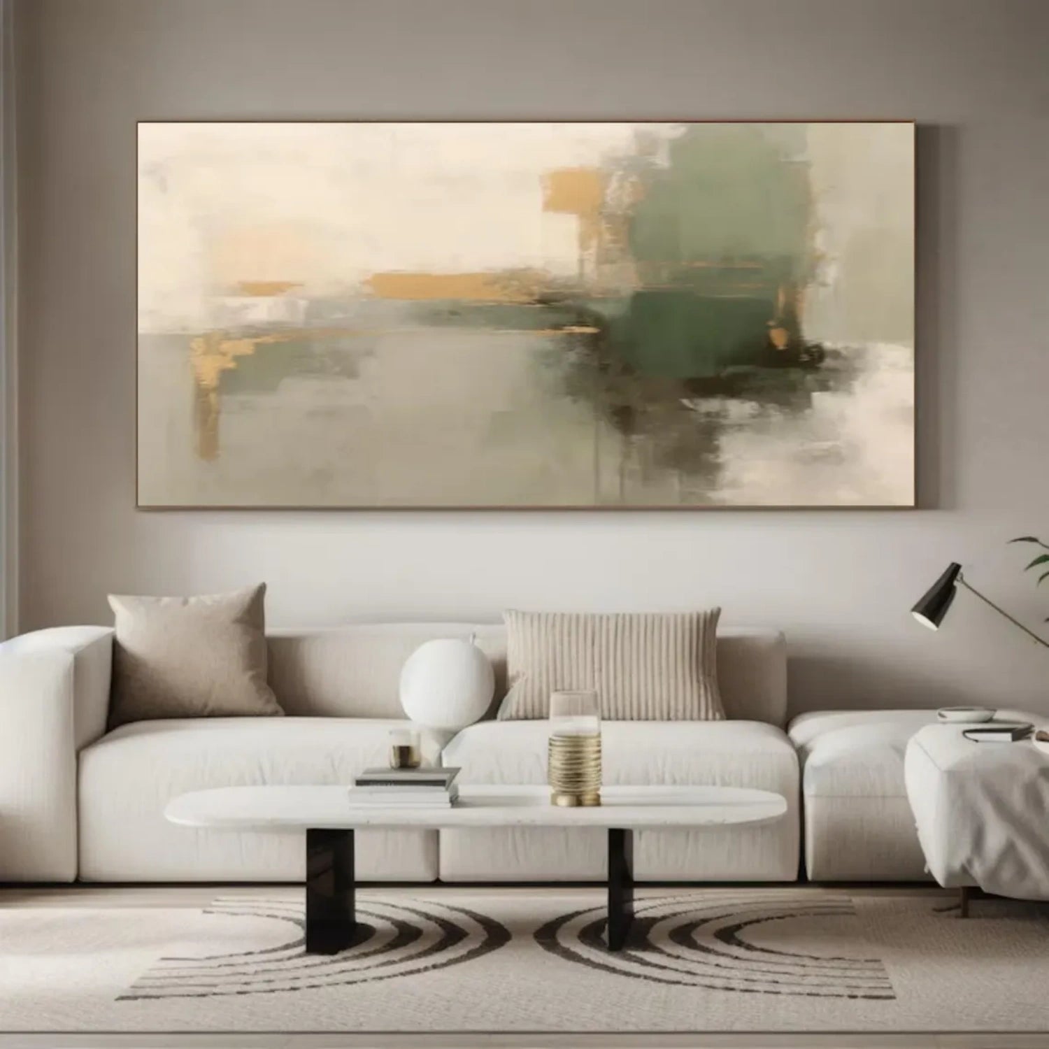
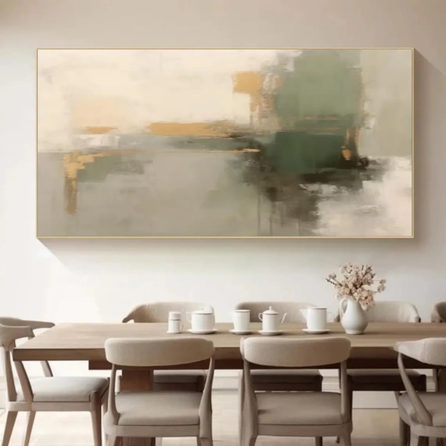
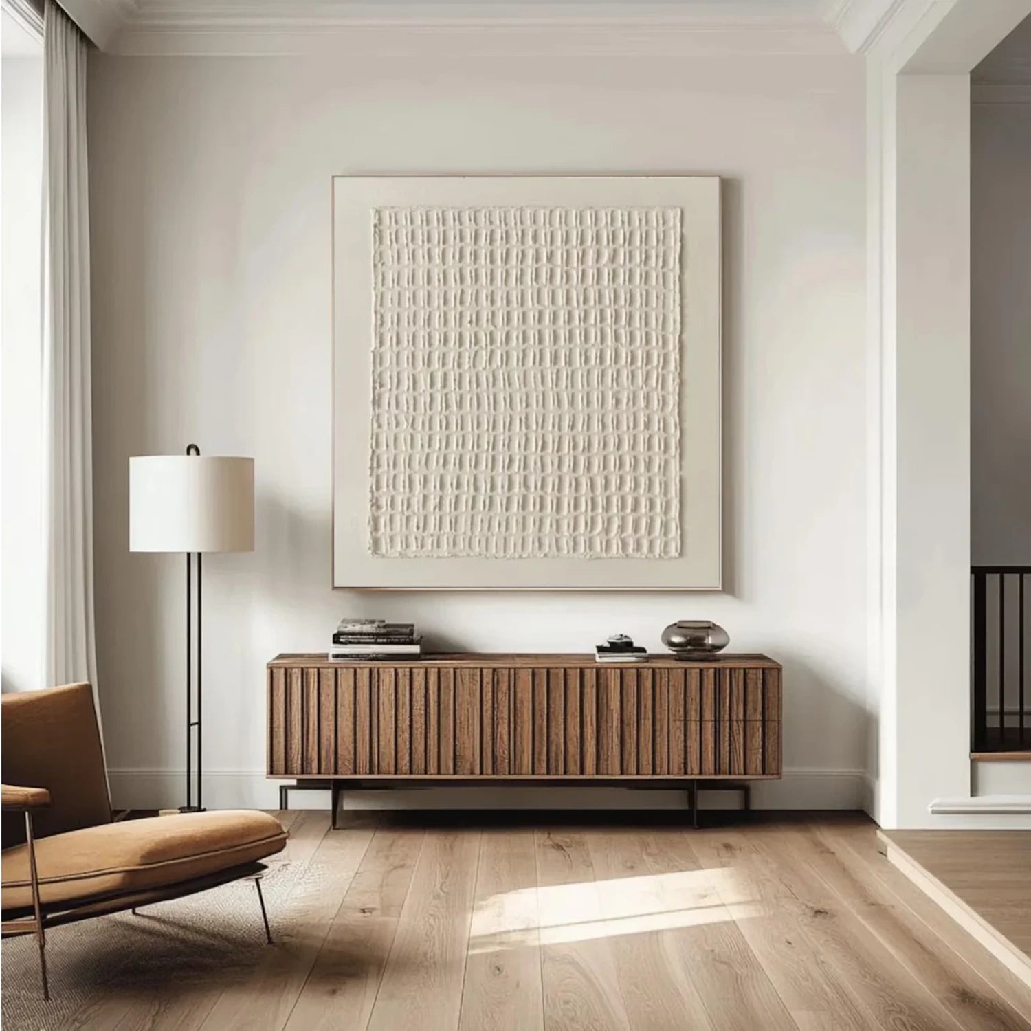





Brown Art for Rooms With Warmth and Contrast
Brown art offers more range than a single earth tone. A piece may use pale beige and soft brown, deep umber against white, or several warm shades in one composition. When browsing brown wall art, look at the relationship between its light and dark areas. That contrast often determines whether the painting becomes a focal point or sits quietly alongside the rest of the room.
This collection includes brown abstract art as well as works with mountain, floral, and other subjects. Some rely on color and shape; others make visible texture part of the composition. Start with the artwork you would enjoy seeing every day, then compare its palette, dimensions, and overall visual weight with the wall where it will hang.
Explore Brown Abstract Art and Other Subjects
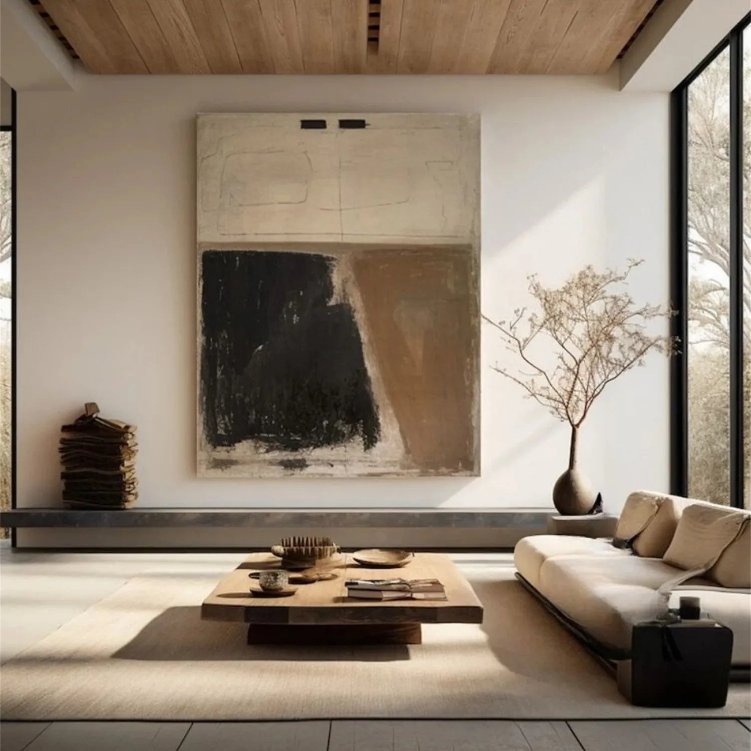
Brown abstract art lets color and form take the lead. Broad shapes can give a painting a strong presence from across the room, while smaller marks invite a closer look. If you are comparing several brown abstract paintings, notice where your eye goes first and whether the composition still feels balanced after that first impression. Browse the wider Abstract Art collection for other approaches to shape and color.
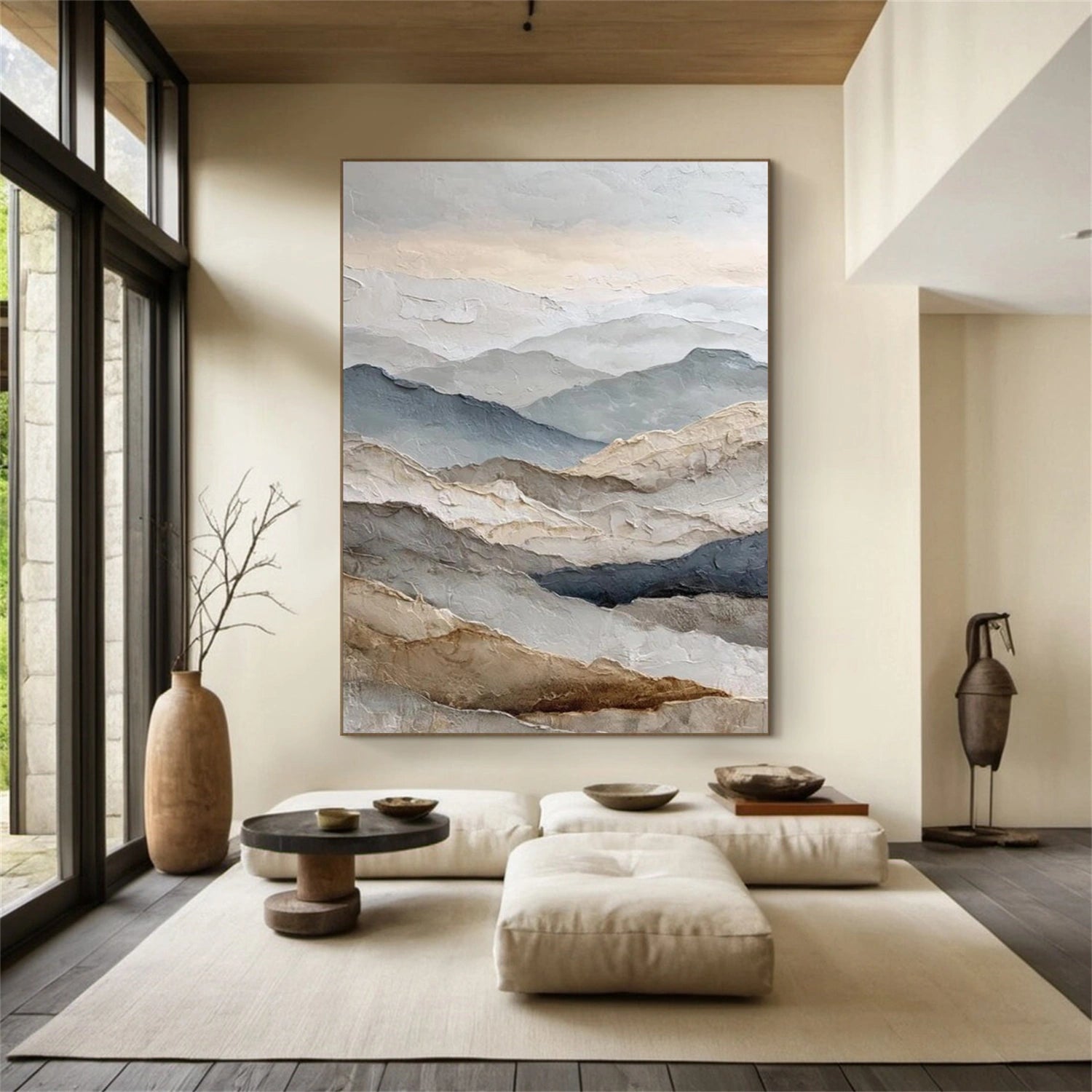
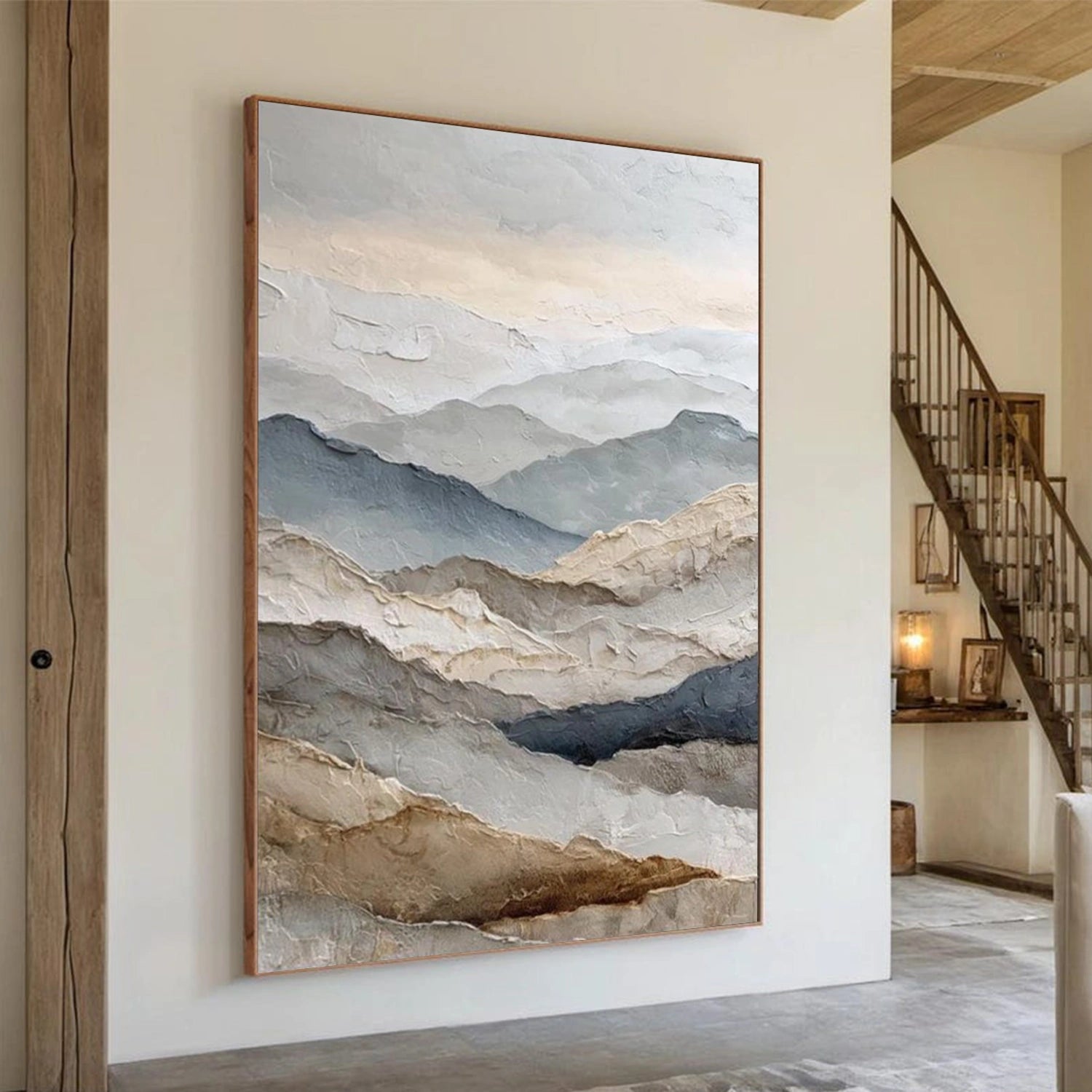
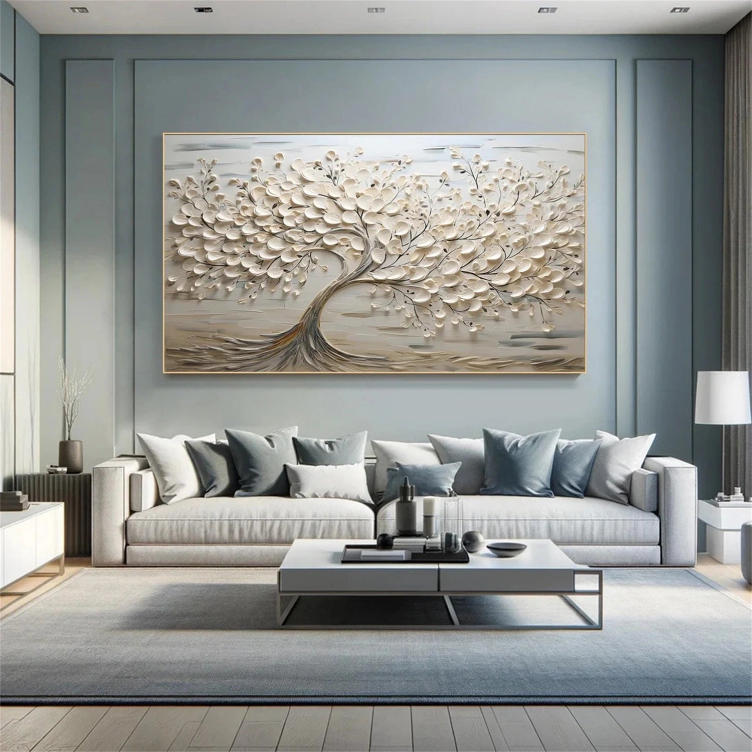
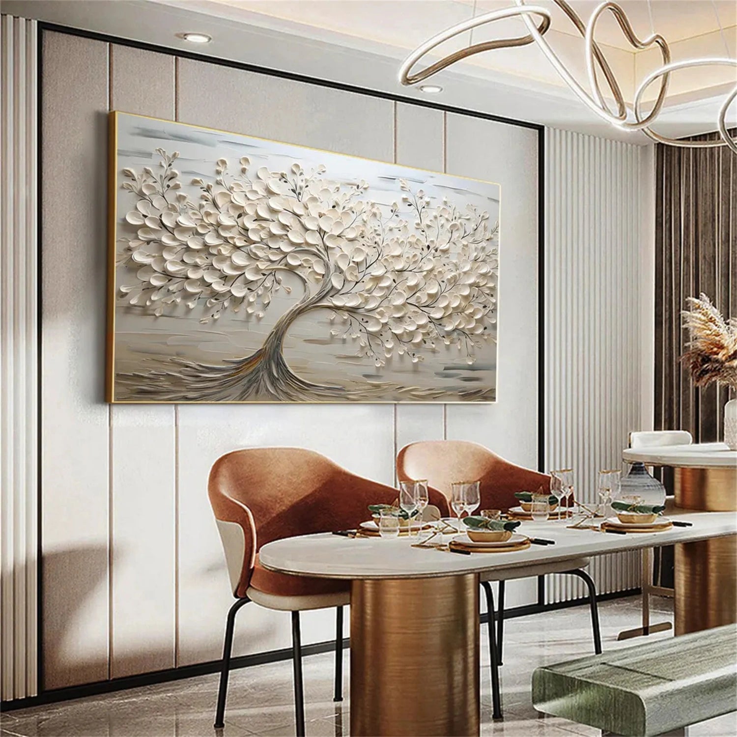
A recognizable subject changes the role of brown. An abstract mountain painting can emphasize the outline and scale of a landscape. Flower and tree art introduces organic forms that may suit a room with natural materials or botanical details. Choose the subject first if a particular image matters to you; choose by composition first if you want the artwork to work with several possible room styles.
For a more restrained look, compare the pieces here with Wabi Sabi Art and Minimalist Art. These collections can help you decide how much detail, contrast, and open space you want in your brown artwork.
Find the Right Brown for Your Existing Palette
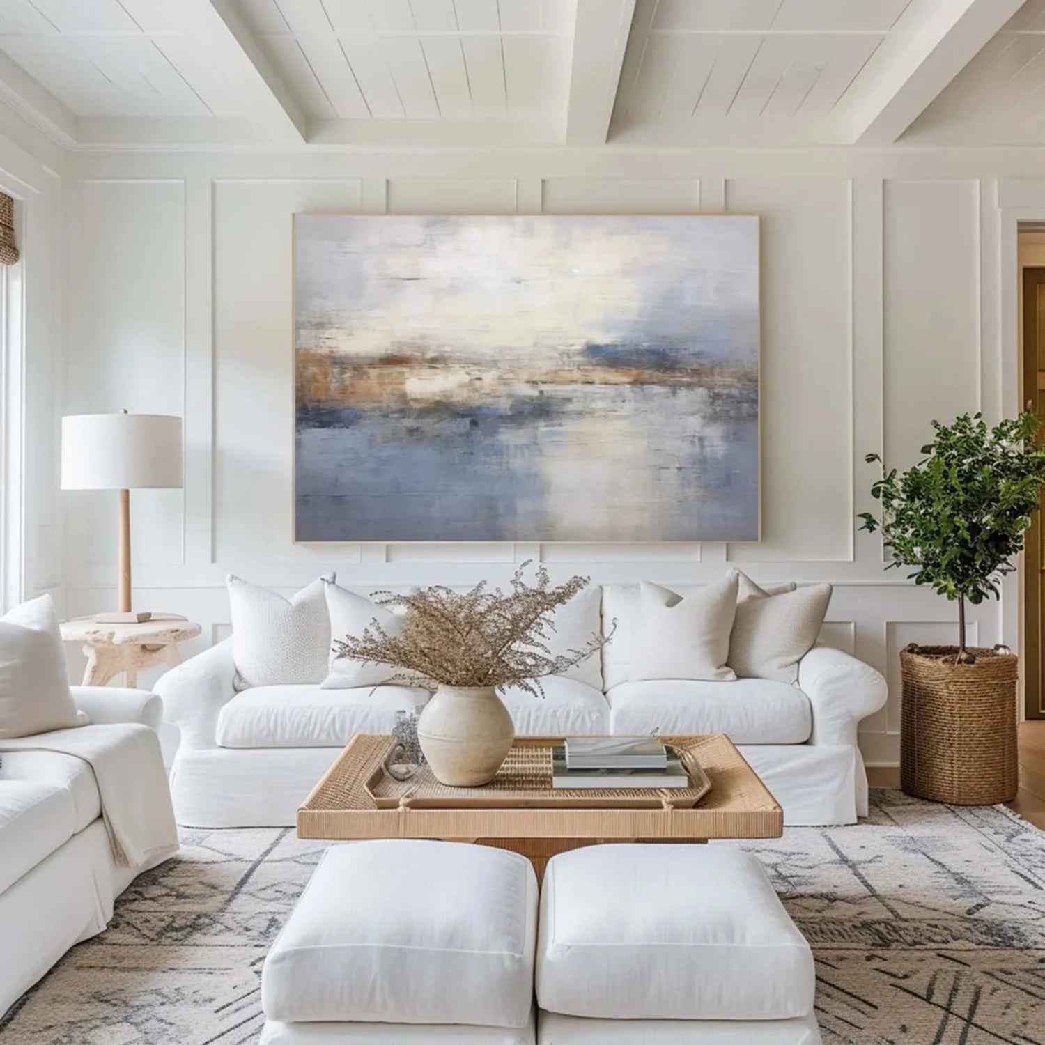
The same brown painting can look different beside white walls, dark upholstery, warm wood, or cooler grey furniture. Before choosing, identify the largest colors already in the room. A darker brown may stand out clearly against a light wall; a lighter brown and white composition may bring more contrast to a room with dark furniture.
You do not need to match every shade. Repeating one tone from the brown art in a rug, cushion, or piece of furniture can create a connection without making the room look overly coordinated. If the space already contains a lot of brown, look for artwork with enough white, black, beige, or another contrasting color to remain distinct.
Brown and white abstract art is one option when you want warmth but also need lighter areas in the composition. For a deeper palette, pay attention to how much of the canvas is occupied by dark brown. View the full product image at a small size: it is a useful way to judge how the painting may read from across the room.
Texture Adds Detail to Brown Wall Art
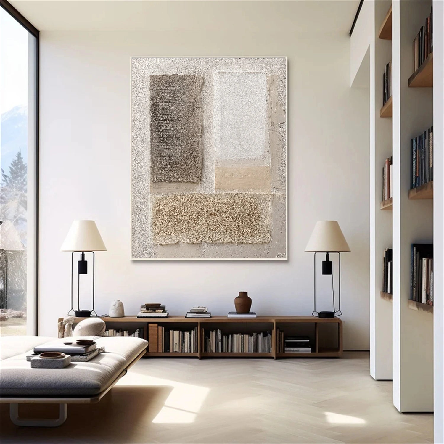
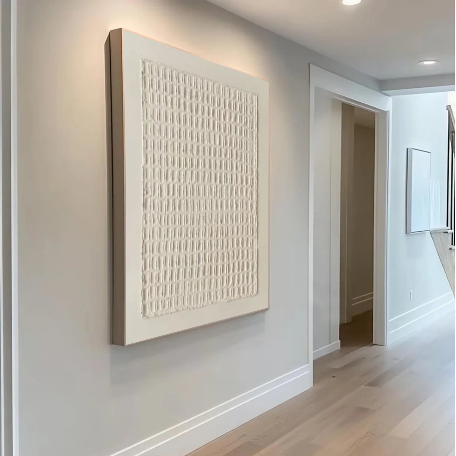
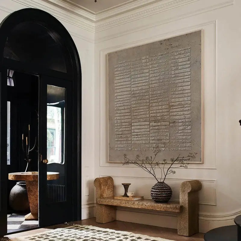
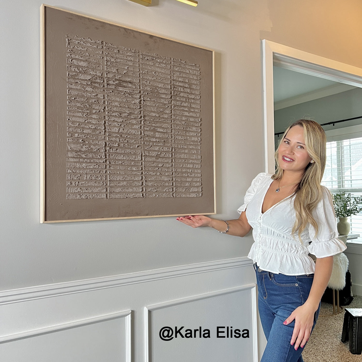
Texture can give brown wall art another layer of interest. Raised areas and visible marks may become more noticeable when light reaches the surface from different angles. If a textured brown painting appeals to you, check its close-up photographs as well as its main image. The close-ups help you judge whether texture is a defining feature or a subtle detail.
Compare a work such as Beige & Brown Abstract #BB137 with other pieces in this collection to see how differently artists can use a similar palette. If surface detail is your priority, explore 3D Textured Art too. Choose the artwork for its complete composition, not solely for a close-up of its texture.
Consider the light on the intended wall. A painting viewed beside a window may reveal different details during the day from one lit mainly in the evening. Look at the space at the times you use it most, then decide whether you prefer pronounced texture or a smoother-looking composition.
Brown Paintings for Living Rooms, Bedrooms, and Dining Areas
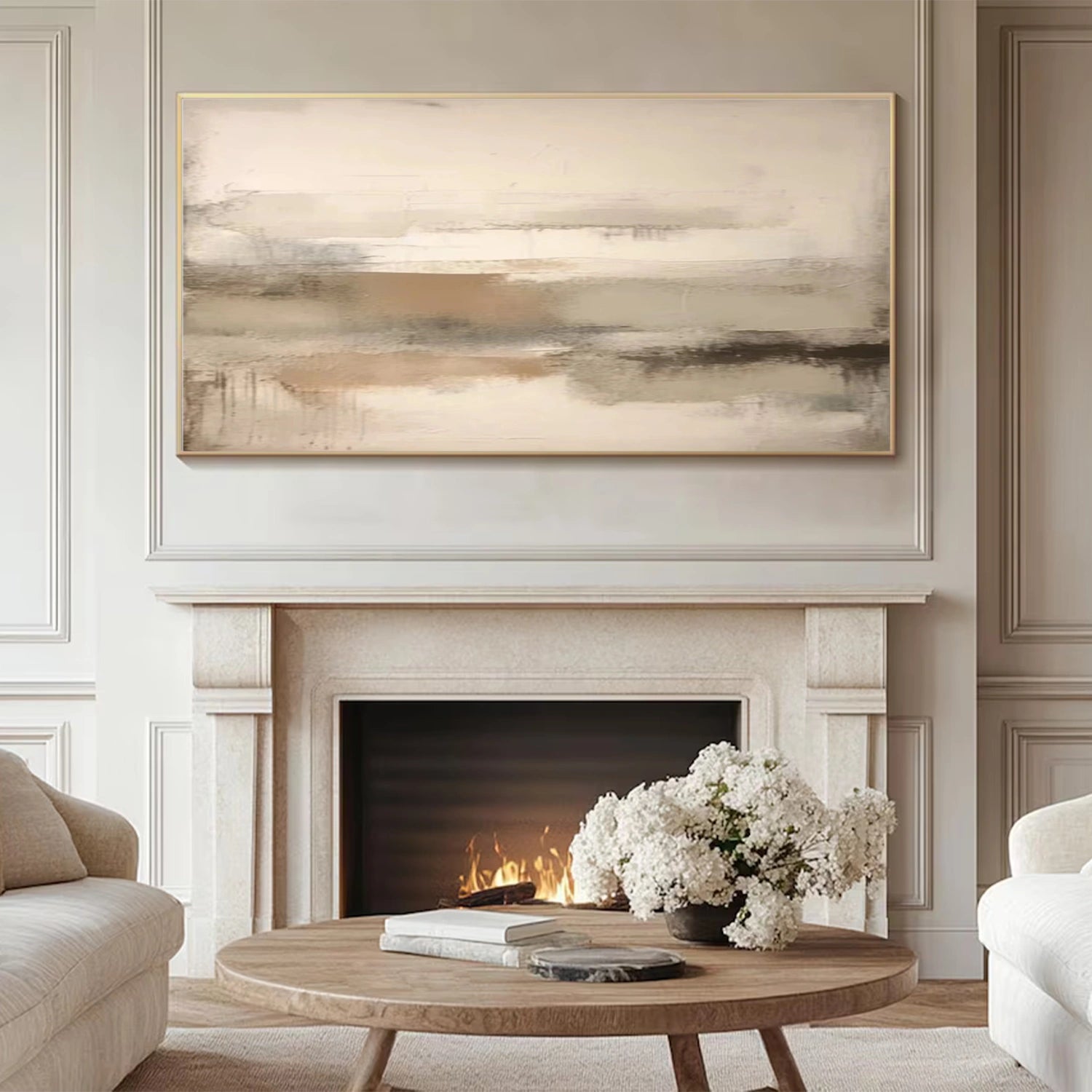
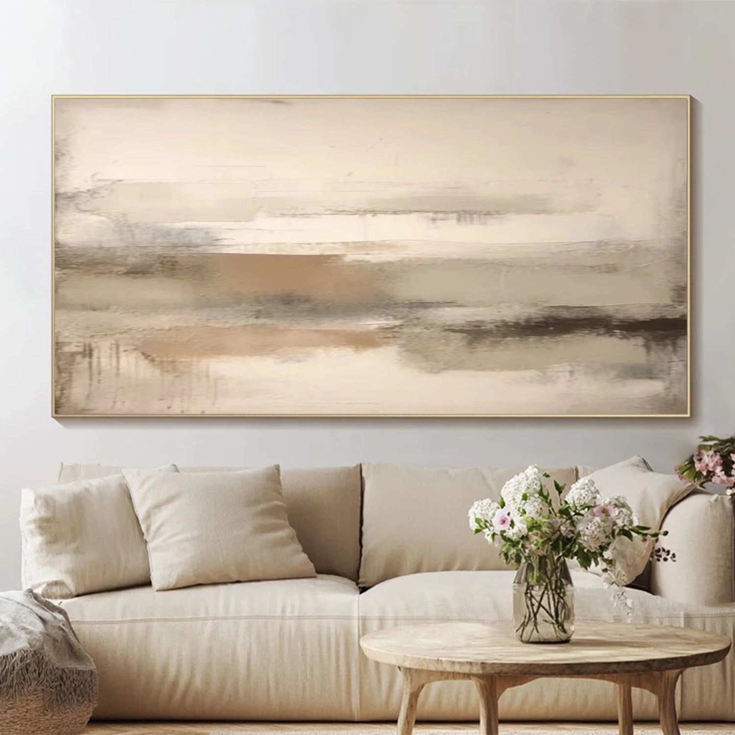
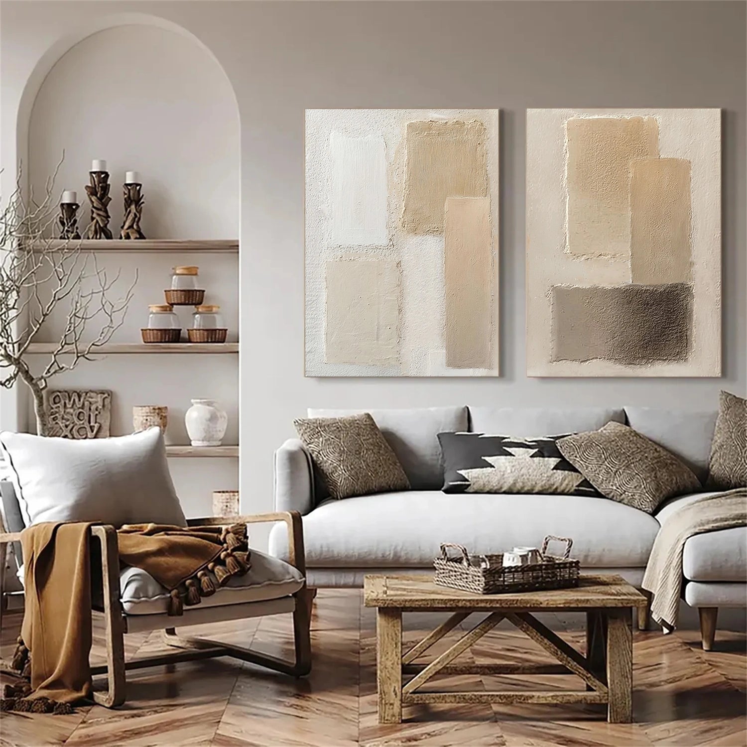
In a living room, brown abstract wall art can connect visually with wood furniture, leather, woven textiles, or other warm tones. Above a sofa or console, judge the painting from the main seating position. Its overall shapes should be clear at that distance, even if the smaller details are best seen up close.
For a bedroom, compare brown paintings with the headboard, bedding, and wall color. A piece with lighter areas may remain visible against dark furnishings; one with stronger dark shapes may provide a focal point on a pale wall. The aim is to choose a composition you enjoy in the context of the whole room.
A dining area often has a wide wall above a sideboard or alongside a table. Here, consider how the painting’s proportions relate to the furniture. Brown art with a clear horizontal movement may suit a long wall, while a more compact piece can work where lighting or shelving already occupies part of the space.
Choose a Single Brown Painting or a Set
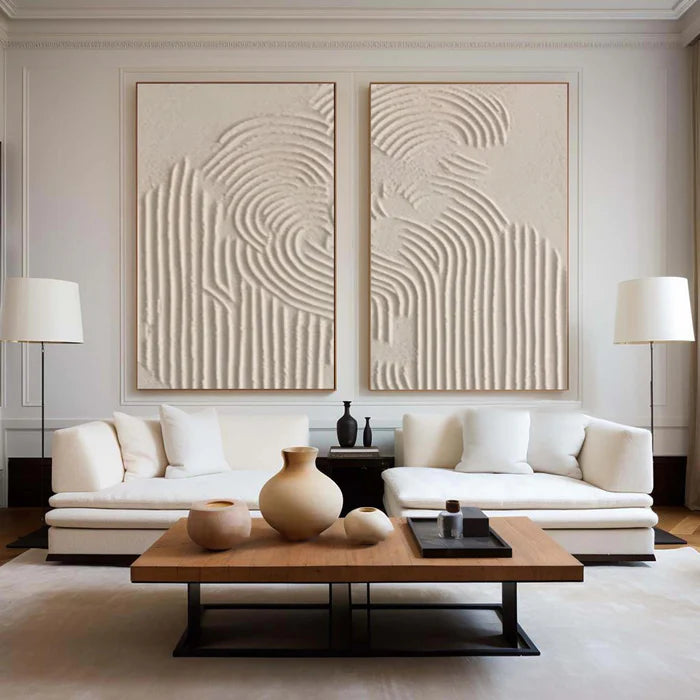
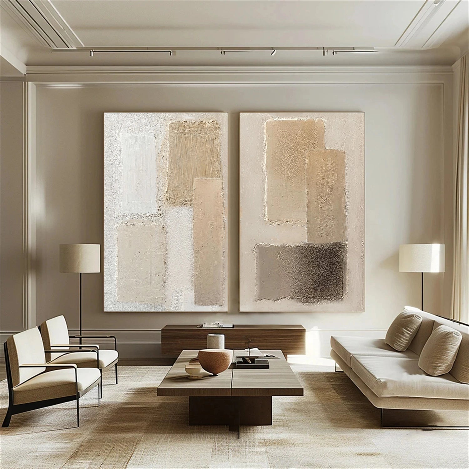
A single brown painting gives the wall one uninterrupted focal point. A pair creates a different rhythm and can spread color across a wider area. Compare a piece such as Beige & Brown Abstract Set of 2 #BB163 with individual paintings, keeping the combined width of both pieces in mind.
Before ordering, measure the available wall and check the dimensions listed on the product page. You can mark the intended outline with removable tape to see how the artwork sits above the furniture. For a set, mark both pieces and the gap between them; the spacing is part of the finished arrangement.
Size also affects how strongly a brown painting reads. A small work may invite close viewing, while a larger composition needs to hold together from farther away. Choose the format that fits the wall and your viewing distance, rather than relying on the scale shown in a styled product photograph.
Compare Brown Artwork Before You Decide
When several works appeal to you, compare them in the same order: subject, overall composition, balance of light and dark, visible texture, then dimensions. This helps you identify why you prefer one brown painting over another. A piece may have the exact shade you wanted but less suitable proportions for your wall.
Finally, check the individual product page for its available options and images. Brown artwork should make sense both on the screen and at its actual size in your room. If you are undecided between two pieces, the one with the better composition and fit is usually a more useful choice than the one whose color matches a furnishing exactly.
Frequently Asked Questions About Brown Art
Does brown abstract art work with white walls?
Yes. White walls give brown abstract art a clear background. Compare lighter and darker pieces to decide how much contrast you want, then check the painting’s size against the furniture beneath it.
Can I hang brown wall art in a room with brown furniture?
Yes, but vary the tones or add contrast. Brown wall art with lighter areas, a distinct subject, or visible texture can remain separate from brown furniture instead of blending into it.
Should I choose one brown painting or a set of two?
Choose one for a continuous focal point. Consider a set of two when you want to fill a wider wall with some space between the pieces. Measure the full arrangement, including that gap, before deciding.
What should I check in product images of textured brown art?
View the complete painting first to judge its composition from a distance. Then inspect close-ups for surface detail and confirm the dimensions and options on the product page.