


Blue and Green Wall Art: Sophisticated Combinations for Fresh Rooms
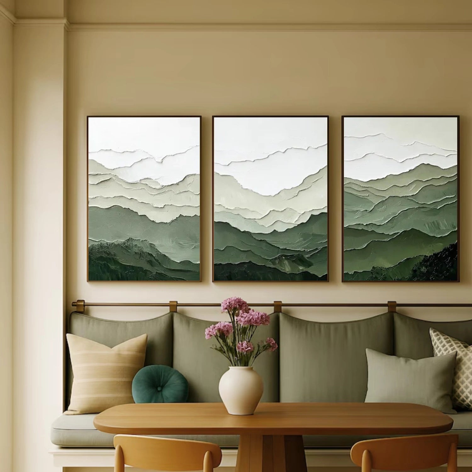
Teal, petrol and blue-green sit on one of the most useful borders in all of interior design: the exact line where calm meets life. Blue brings depth, order and cool distance; green brings growth, freshness and quiet energy. A painting that lives on the border gets both - the composure of a deep sea and the vitality of the shore. When that border is built in textured relief, the combination becomes physical: raised strokes of blue-green hold light in their ridges and give the wall the material presence of glazed stone or sea glass. This guide explains how to read the blue-green family, why the combination works in specific rooms, how to pair it with furniture and metal, and how to verify a piece before you commit to it.
Why the blue-green border works
Every useful color combination answers a room's actual need, and the blue-green answer is balance. Blue alone can read cool and distant; green alone can read earthy and casual. On the border between them, the two qualities negotiate - the blue lends structure to green, the green lends warmth to blue, and the result is a color that feels both grounded and fresh. That is why teal and petrol appear in so many hotels, spas and stable interiors: the hues are sophisticated without being loud, which is the definition of a color a room can live with for a decade.
The border is also forgiving: blue-green harmonizes with warm wood, cool stone, brass, black iron, cream, olive and navy - nearly the entire useful material vocabulary of a home - and it is the rare purchase that survives a full restyle without moving.
Reading the blue-green family
The family is a spectrum, and the useful skill is placing a piece on it. A teal leans blue: darker, cooler, more formal, closer to navy in character. A petrol leans green: warmer, lighter, more energetic, closer to bottle green. Sea glass sits in the middle: softly muted, slightly milky, generous with neutrals. When you look at a textured canvas, find the deepest valleys again - the pigment at the bottom of the relief tells you which side of the border the piece actually lives on, regardless of what the surface highlights suggest.
Undertone placement changes the whole pairing scheme. A blue-leaning teal pairs with silver, chrome, grey and navy; keep the furniture cool and the effect reads as formal calm. A green-leaning petrol pairs with brass, wood, olive and terracotta; keep the furniture warm and the effect reads as settled energy. A neutral sea-glass tone pairs with everything, which is why it is the safest choice for rooms mid-restyle. Name the side of the border before you name the room, and the rest of the scheme follows.
Texture again serves as the honesty check. Real relief means the color at the ridges differs from the color in the valleys, because the paint pools as it is built. If a blue-green product shows identical color at every depth, the surface is flat - the depth claim fails the ridge test instantly.

Blue-green in the living room
The living room is where blue-green earns its reputation. Above a neutral sofa - grey, cream or stone - a petrol or teal piece becomes the room's one deliberate color decision, and the texture gives it the weight a flat canvas would not carry. Use the two-thirds rule: the canvas spans about two-thirds of the sofa width, hung at a center of roughly 145-150 cm. One textured blue-green anchor, a linen throw and one warm accent is a complete scheme that reads as designed without effort.
Against a navy or slate wall, choose the light end of the family - sea glass or light petrol - so the piece separates from the wall instead of vanishing into it. Against cream or beige, the deeper teals work because the wall supplies the contrast. The rule of missing value applies here exactly as it does in monochrome: buy the painting that provides what the wall already lacks.
If the living room already has plants, blue-green texture is the single best companion available. The raised strokes echo the leaves, and the canvas holds the same light the plants do at sunrise and dusk. The room starts to feel like a single living composition rather than furniture plus decor.
Blue-green in the bedroom, kitchen and office
Above the bed, deep petrol is a sophisticated alternative to navy: it carries the calm of dark blue with a touch of growth that keeps the room from feeling cold. Choose horizontal relief that echoes the bed line, and pair it with white or cream linen. In the kitchen, a small sea-glass piece beside the dining table adds the freshness that white cabinets always need, placed away from steam. In the office, mid-tone teal behind the desk supports focus without the flatness of grey - the texture gives tired eyes a surface to rest on that does not demand interpretation.
In each room the same two rules apply: the piece needs a directed light source to unlock the relief, and it needs one warm neighbor - wood, brass, terracotta or a warm lamp - so the blue-green never reads as cold.
Pairing blue-green with wood, metal and stone
Wood pairing follows the border logic. Walnut and dark oak pair with petrol and deep teal; pale oak and ash pair with sea glass and light teal; olive-toned wood pairs with everything because it shares the family. Metal pairing is where blue-green differs from pure blue: brass and gold work strongly with petrol and green-leaning tones, while chrome and silver work with blue-leaning teal. Choose one metal and let the canvas answer it.
Stone and tile floors change the calculation. On porcelain tile, keep the piece's tone one step lighter than the floor effect you want, because smooth cool floors pull warmth out of any color. On warm wood floors, the canvas can go one step deeper. Natural stone - travertine, limestone - pairs with sea glass as if designed together, because both are muted, earth-toned and quiet. The overall rule: let the biggest cool surface in the room set the floor, and buy one step in the opposite direction.
Blue-green in gallery walls and sets
Blue-green is an excellent anchor for a mixed gallery wall because it sits between the warm and cool objects. A large petrol textured piece plus one warm small piece plus one neutral completes a wall that a pure blue could not hold together. The border color is the negotiator; the eye moves from green items to blue items through the anchor without noticing the transition.
For sets and diptychs, the border family is unusually forgiving: two blue-green pieces of different tones, or a blue-green plus a neutral, always cohere because they share one value system. The most sophisticated set scheme is one deep teal and one sea glass, hung with a gap of 8-12 cm between them; the two sides of the border talk to each other and the wall reads as one considered composition.
Lighting and the daily behavior of blue-green
Blue-green behaves unusually across the day because it contains two responses to light. In morning light, the green side dominates - the piece looks freshest and most alive. At midday, it settles toward its true tone. In warm evening lamp light, the blue side takes over and the piece drifts toward teal-navy, which is exactly the calm shift a bedroom wants at night. The daily drift is the genre's hidden luxury: one canvas, two personalities, scheduled by the sun.
The lighting rule follows from the behavior: side light from a warm lamp at 30-45 degrees maximizes both personalities, revealing the green highlights and the blue shadows on the same strokes. Cool daylight from a window shows the freshest version; warm evening lamps show the calmest. If a room has both, the piece performs all day. If the room has only one source, choose the tone of the family that matches the hours when the room is used most.
Verification walk for blue-green
Five checks confirm a blue-green purchase. One: the ridge test - run a fingertip over the surface and confirm relief exists. Two: the valley read - identify which side of the border the deepest color sits on, and confirm it with the room furniture you own. Three: the warm-note check - name the brass, wood or terracotta item the canvas will talk to; if the room has none, budget a lamp or accent. Four: the drift test - photograph the piece in the final spot at morning and evening and confirm you can live with both personalities. Five: the scale check - paper cut-out at the wall for a day before committing. Five checks, one evening, and the blue-green border becomes a verified partner rather than a gamble.
What the border offers, in the end, is a room that feels both settled and alive. Deep water and growing things are the two oldest sources of calm in human attention, and a textured canvas that holds both qualities in one surface is a small piece of that certainty on a wall. Get the side of the border right, match it to your warmth, light it from the side, and the piece will not just decorate the room - it will hold the room's mood the way the sea holds the tide.
One border-family check: the same canvas holds green in morning light and deeper teal by evening - live with both before you decide.
To explore more options, see blue-green abstract art and blue paintings.

