

Choosing abstract art for living room and every other space in your home with a room by room mindset
A large abstract painting can anchor a living room—or quietly unsettle it if the scale or palette fights the furniture. The same piece that feels energetic in a dining area may feel restless in a bedroom. That’s why searching for abstract art for living room often leads to a broader realization: each room asks for a different visual tempo. The most reliable way to choose well is to think in terms of room energy, not just style labels. Abstract works—especially handcrafted canvases with visible brushwork or texture—respond strongly to light, distance, and proportion, so the decision is less about “what looks good online” and more about what will feel right once it’s on your wall.
The living room sets the visual rhythm
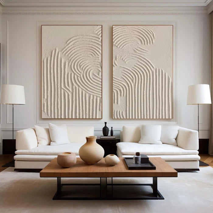
Start here because it carries the most visual weight. In a typical living room, the main wall above the sofa or opposite the seating area benefits from a single, confident statement piece. Large-format abstract art introduces a focal point that organizes the rest of the space—coffee table, rug, lighting—around it.
A practical rule is to let the artwork span roughly two-thirds to three-quarters of the sofa width. Beyond size, color contrast matters: if your upholstery is neutral, a painting with controlled saturation (deep blues, rust tones, layered neutrals with accents) reads as intentional rather than loud. Hand-painted canvases with subtle texture—knife-applied layers or raised plaster details—create shadow variation that keeps the wall active without needing overly busy composition.
If your room already has strong patterns (bold rugs, sculptural lighting), dial back the artwork’s complexity. In calmer rooms, a more expressive composition can carry the space.
Bedroom walls favor restraint and softness
Bedrooms benefit from slower visual pacing. Abstract art here works best when it reduces cognitive noise: softer gradients, low-contrast palettes, and gentle transitions between tones. Think sand, stone, misty blues, or muted blush layered with off-whites.
Texture still matters, but in a quieter way. Fine brushwork or lightly built plaster surfaces catch morning and evening light without creating harsh shadow lines. Placement is usually above the headboard; keep the bottom edge high enough to avoid crowding pillows, and avoid overly fragmented compositions that pull the eye around the room.
A common misstep is reusing a bold living-room piece in the bedroom. What felt energetic in a social space can feel intrusive when you’re trying to wind down, especially under warm 2700K lighting where reds and oranges intensify.
Office spaces benefit from structure and clarity
In a home office, abstract art should support focus rather than compete with it. Geometric compositions, restrained palettes (black, white, greys, or a single accent color), and clear directional lines help stabilize the visual field.
Scale can be moderate rather than oversized, particularly if the desk sits close to the wall. Orientation matters: vertical pieces can emphasize height and order, while horizontal works can visually widen a compact workspace. If your background appears on video calls, choose a composition with enough structure to read cleanly on camera without distracting flicker from high-contrast micro-details.
Dining areas welcome color and movement
Dining rooms can handle more saturation and rhythm. Abstract art here often leans into warmer palettes—terracotta, amber, wine tones—or lively color interplay that feels animated under evening lighting.
Because viewers are typically seated and closer to the wall, medium-to-large works with readable forms perform well. A slightly higher hang can prevent visual crowding with chairs and table edges. If your table is long, a horizontal canvas or a balanced pair can echo that proportion without fragmenting the wall.
Hallways need direction, not dominance
Hallways are transitional, so the art should guide movement rather than stop it. Narrow vertical canvases, elongated horizontals, or a measured series can create a sense of flow.
Spacing is critical: consistent gaps between pieces keep the eye moving forward. Subtle tonal shifts work better than abrupt contrasts, especially in tight corridors where strong color blocks can feel abrupt. Texture should be moderate; heavy relief can cast sharp shadows under overhead lighting, exaggerating narrowness.
Matching scale and placement to real walls
Use this quick matrix to translate room intent into practical sizing and placement decisions.
Handcrafted texture changes how art behaves
Abstract paintings are not just images; they are surfaces. A textured plaster piece or layered acrylic with visible strokes will look different at 9 a.m. than at 7 p.m. because side lighting creates micro-shadows. This is where handcrafted work diverges from flat prints: it introduces depth that can either enrich a neutral room or become too assertive in tight spaces.
If your lighting is directional (wall washers, spotlights), expect texture to be more pronounced. In evenly diffused light, color relationships matter more than relief. When evaluating online, look for close-up images that reveal surface build—this is often the difference between a painting that feels tactile and one that reads flat.
Where online buying can go wrong and how to avoid it
Most disappointment comes from three gaps: scale, color shift, and expectation of texture.
-
Scale mismatch: A piece that looks substantial on a product page can feel small on a wide wall. Measure your wall and mock the footprint with tape before ordering.
-
Color under lighting: Warm bulbs (2700K) deepen reds and yellows; cooler light (4000K) can flatten warm neutrals and emphasize blues.
-
Texture expectations: Product photos can underplay or exaggerate relief depending on lighting direction; check multiple angles if available.
If you want a shortcut, browsing a curated set can help you anchor decisions by room intent—see these room-specific abstract collections to compare how scale, palette, and composition shift across spaces.
Using guidance tools when you are unsure
When the wall, furniture, and lighting variables start to overlap, a second set of eyes helps. Vinchy Art approaches selection like an “art audit,” looking at your room’s palette, materials, and proportions before recommending options. Their digital Room Preview lets you upload a photo of your wall to test scale and placement, which is especially useful for large living-room pieces where centimeters matter.
If you are balancing multiple rooms at once or coordinating with an existing palette, you can request input from their professional art advisory team. This tends to be most helpful when you want consistency across spaces without repeating the same artwork.
Frequently Asked Questions
How big should abstract art be for a living room wall?
A reliable starting point is 2/3 to 3/4 the width of your sofa or main furniture piece. This creates a clear focal point without overpowering the wall. Always confirm with a taped outline before purchasing.
Is colorful abstract art a good idea for bedrooms?
Usually not in high saturation. Bedrooms benefit from softer palettes and lower contrast so the artwork supports rest. If you prefer color, keep it muted and blended rather than sharply defined.
Can I use one abstract style across all rooms?
You can keep a consistent language—such as similar brushwork or palette family—but vary intensity, scale, and contrast by room. Consistency in technique with variation in energy tends to feel intentional.
Do textured paintings require special lighting?
They do not require it, but they respond strongly to it. Directional lighting will emphasize relief and shadows; diffused lighting will make color relationships more prominent. Plan based on the effect you prefer.
What is the safest way to buy abstract art online?
Measure your wall, consider your lighting temperature, review close-up images for texture, and use a room preview if available. If uncertain, ask for advisory input before finalizing size and palette.