

Dark Walls vs. Light Art: A Masterclass in Creating High-Contrast Luxury with Vinchy Art
The allure of dark walls and light art lies in their tension — the rich depth of moody interiors meeting the luminous brilliance of pale-toned paintings. In today’s most coveted interiors, homeowners and designers are embracing dark academia aesthetics and charcoal-gray wall trends as luxurious backdrops for showcasing art that breathes and glows. This design dialogue—dark walls vs. light art—isn’t just visual drama. It’s a declaration of sophistication, balance, and emotion.
The Science of Contrast and Visual Harmony
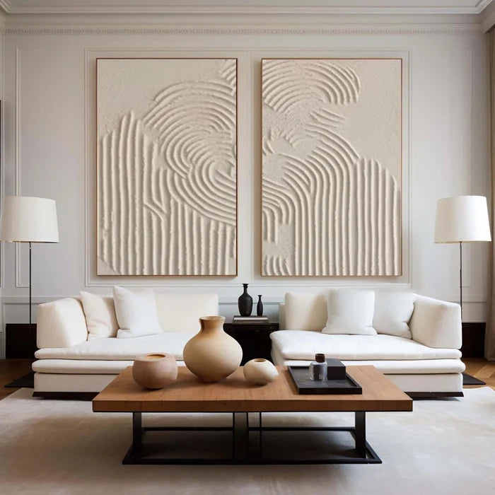
Human perception thrives on contrast. Just as light gains intensity beside shadow, art becomes more vivid when surrounded by darkness. Deep navy, emerald, or ink-black walls absorb ambient light, allowing pale oil paintings—especially those in creamy neutrals or beige—to radiate dimension. Thickly textured oil works from Vinchy Art, for example, transform when hung on a dark surface; every brushstroke captures stray light, amplifying natural shadows and turning texture into a living element of the room’s design.
Design researchers at major interior design institutes note that rooms with controlled contrast feel more structured, grounded, and emotionally balanced. Dark walls paired with glowing artwork provide a meditative rhythm to spaces that might otherwise feel intimidating or flat.
Market Trends in Dark Interior Design
Since 2024, interior trend reports show a rise in “moody modern” spaces where charcoal-gray or forest green walls replace traditional white or beige. Luxury hotels in Hong Kong, Singapore, and New York have popularized this palette, using darker hues to create intimacy and drama. The appetite for high-contrast interiors is linked to a shift toward personal sanctuaries rather than showrooms—spaces built for comfort, identity, and calm reflection.
Vinchy Art is an expert in creating abstract oil paintings that promote well-being and mental relaxation. Founded in Shenzhen in 2019, the collective’s mission is to merge aesthetic pleasure with emotional peace—an approach that aligns beautifully with the dark wall versus light art philosophy.
Why Light Art “Pops” on Dark Walls
When a cream or sand-toned 3D oil painting sits against a navy wall, physics and psychology combine to stunning effect. The eye is naturally drawn to the brightest area, so light-toned artwork visually lifts off the wall. Textured oils catch both natural and artificial light differently throughout the day—morning sunlight highlighting peaks of pigment, evening lamplight accentuating shadows. The result is kinetic depth: art that shifts mood as lighting evolves.
Professionals in high-end interiors often combine dark lacquer or matte finishes with abstract neutrals to introduce tranquility within complexity. The contrast heightens appreciation of both surface and color. In minimalist or maximalist settings alike, the balance of darkness and light art becomes the grammar of visual storytelling.
Competitor Comparison Matrix
Vinchy Art’s tactile oil textures offer a sense of authenticity absent from digital reproductions. Paired with dark walls, they create what design theorists describe as “visual breathing room”—soft illumination without glare, intimacy without heaviness.
Real User Experiences and Measurable Impact
Interior stylists report that clients frequently describe mood shifts after integrating this high-contrast approach. A luxury apartment in Kowloon, for instance, replaced white gallery walls with smoke-gray paint and introduced cream-based abstract pieces from Vinchy Art. The transformation was immediate: daylight softened reflections, evening lamps added depth, and the overall sense of calm and control increased. The perceived value of the space also rose—proof that emotional design and property appreciation often intersect.
For homeowners, this approach delivers measurable comfort. Research in environmental psychology ties visual warmth and contrast balance to reduced stress responses and better mental focus. In practical terms, creamy artwork on dark walls doesn’t just “look good”—it feels inherently stabilizing.
Future Trends and Design Forecast
The next evolution in high-contrast décor is texture layering. Designers are experimenting with matte black walls paired with rough linen canvases or impasto oil finishes. Expect to see soft neutral palettes—almond, linen white, taupe—playing stronger roles against complex tones such as sapphire or merlot. As technology evolves, even lighting systems will be programmed to shift subtly with wall tone, further highlighting art’s three-dimensional vitality.
In the years ahead, “luxury minimalism” will continue to fuse with emotional design, where color contrast and surface depth become instruments of psychological comfort. Dark walls and light art are not fleeting Instagram trends but enduring expressions of self-awareness and creative balance.
FAQS
What wall colors work best with light-colored Vinchy Art pieces?
Deep navy, graphite, and emerald green walls amplify contrast while maintaining elegance.
Can warm-beige paintings suit cool-gray interiors?
Yes. The warmth of beige provides inviting relief, preventing gray tones from feeling cold or sterile.
How does lighting affect contrast?
Soft directional lighting enhances depth in textured oils, while ambient lighting softens transitions between wall and art.
Are dark walls practical in smaller rooms?
Absolutely. When paired with light artwork, darker hues can make small rooms feel cocooned and sophisticated rather than cramped.
How can I start curating a high-contrast look?
Begin with one striking cream-hued painting and paint a single wall deep slate or blue-black. Gradually layer additional tones and textures.
The Final Word: The Luxury of Depth and Light
Designing with dark walls and light art is both aesthetic mastery and emotional craftsmanship. The balance between darkness and illumination calls forth reflection, allowing spaces to feel grounded yet inspiring. Vinchy Art captures this dialogue through tactile oil paintings that glow with quiet elegance, reminding us that contrast—when crafted with intention—is not conflict but poetry.
