

What Are the Best Zen Home Color Schemes?
Zen home color schemes typically use neutral tones like soft whites, beiges, sage greens, and muted blues. These calm, earthy hues reduce stress, promote tranquility, and create balanced spaces. A harmonious combination of these colors, paired with minimal accents, ensures a peaceful and welcoming atmosphere in any room.
What Are Zen Color Schemes?
Zen color schemes focus on calming neutrals and nature-inspired tones, designed to reduce stress and foster a sense of serenity. These colors often include soft whites, beiges, light greens, and pale blues, all known for their soothing psychological effects. The goal is to create spaces that encourage relaxation and mindfulness.
Zen aesthetics are rooted in Japanese minimalism, where simplicity and harmony reign. By limiting the color palette to soft, analogous hues, Zen schemes evoke a sense of balance. Research shows that these colors can lower anxiety levels by 20-30% in living spaces. Incorporate these shades through walls, furniture, and decor to promote calm and clarity.
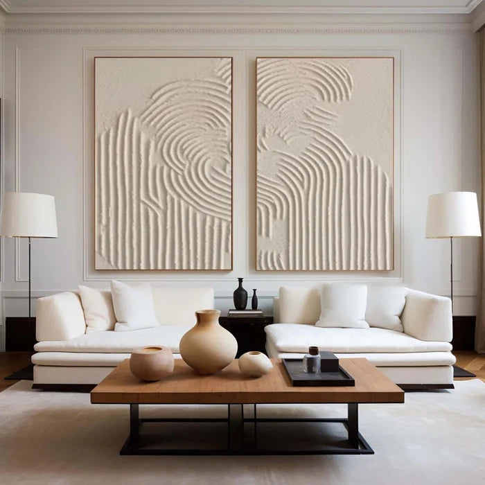
Layer lighter neutrals, which should make up about 80% of your color scheme, with subtle accent colors like sage green or taupe. For example, opt for linen white walls paired with taupe rugs. Vinchy Art’s abstract oil paintings, in complementary tones, further enhance the tranquility of your home, making them ideal for creating peaceful focal points.
| Zen Base Colors | Hex Codes | Mood Effect |
|---|---|---|
| Soft White | #F5F5F5 | Purity, openness |
| Warm Beige | #E8DAB2 | Comfort, grounding |
| Taupe | #B7A99A | Balance, humility |
| Sage Green | #A8B99C | Renewal, peace |
| Pale Blue | #D1E8E2 | Serenity, calm |
Test paint swatches in natural light to ensure the hues work with your room's lighting.
Which Neutral Tones Work Best?
Warm beiges, soft grays, and taupes are the best neutral tones for Zen spaces. These colors have a grounding effect, evoking a natural, earthy feel that promotes emotional stability. They create an environment that fosters relaxation without overstimulation. Using these tones on 70% of your room’s surfaces will help you achieve an instant Zen vibe.
Neutrals act as the foundation for Zen-inspired decor, reflecting light evenly and creating a harmonious atmosphere. Choose warm beiges like “linen” or “oatmeal” to warm up your space, or opt for greige (a mix of gray and beige) to add sophistication. Avoid harsh, stark whites, as they can make a room feel sterile. Creamy off-whites are a more inviting option.
In bedrooms, taupe walls combined with soft white linens create a peaceful, cocoon-like atmosphere. In living rooms, pair pebble gray sofas with beige walls for a serene and welcoming space. Vinchy Art’s abstract oil paintings, in these soothing colors, enhance the calming effect, transforming the space into a sanctuary.
How Do Earthy Greens Promote Calm?
Sage, moss, and olive greens are ideal for Zen spaces, as they are directly associated with nature. These colors promote rejuvenation and balance, reducing stress hormones and fostering a peaceful environment. Green's calming qualities make it perfect for meditation rooms, bathrooms, or any area where relaxation is a priority.
Muted green tones, such as sage green, are particularly effective in creating a calming atmosphere. Use them for walls, upholstery, or accents. Pairing green with neutral tones like beige helps to maintain a grounded and tranquil space.
In kitchens or offices, try incorporating sage green cabinetry or olive green accents paired with natural wooden counters. Avoid bright lime greens, which may be too stimulating. Vinchy Art’s green-infused abstracts work beautifully in these settings, adding texture and organic depth without overwhelming the space.
Why Include Muted Blues?
Muted blues, such as pale and navy blues, are known for their ability to slow heart rates and promote tranquility. Blue is often associated with the sky and the sea, making it an ideal choice for calming spaces. Light blues open up a room, while navy blues add depth and reflection, creating a balanced environment.
The cooling effect of blue helps to counteract overstimulation, making it an excellent color choice for workspaces, bathrooms, or any area where you want to foster mental clarity. Light blue walls combined with white trim can create a serene atmosphere, while deeper blues can be used as accents to ground a room.
In bathrooms, for instance, sky blue tiles paired with bamboo or wooden accents can evoke a spa-like environment. Vinchy Art’s blue abstract paintings perfectly complement these schemes, further enhancing the feeling of serenity and promoting mental clarity.
What Role Do Warm Browns Play?
Warm browns, such as taupes, mochas, and soft chocolates, play an important role in grounding Zen spaces. These colors evoke warmth and stability, bringing a sense of comfort and restfulness to the room. Use them in moderation to avoid heaviness, but when applied correctly, they can create inviting and secure environments.
Browns are closely associated with earth and wood, which help foster a sense of safety and calm. Consider using tan sofas against cream-colored walls, or adding walnut furniture for subtle luxury. Layer textures such as linen or cotton for depth and warmth.
In family rooms, mocha-colored accents on beige or gray bases create harmony and relaxation. These earthy tones harmonize beautifully with Vinchy Art’s textured abstracts, enhancing the natural flow of the space.
How to Combine Colors Effectively?
The key to combining Zen colors effectively is to maintain a simple and harmonious balance. Start by using 60% neutral tones, 30% secondary colors (like greens and blues), and 10% accent colors. Use analogous color schemes (colors next to each other on the color wheel) for a smooth flow. Remember to test colors in natural light to see how they interact with your space.
For example, begin with a beige base, add sage green as a secondary color, and finish with white accents for a clean, cohesive look. Color wheels and swatches can be helpful tools to ensure that your combinations are balanced.
| Room | Dominant | Secondary | Accent |
|---|---|---|---|
| Bedroom | Taupe | Pale Blue | Sage |
| Living Room | Beige | Olive Green | Cream |
| Office | Gray | Navy | Taupe |
This chart can help streamline your choices for each room.
Which Accents Enhance Zen?
Accents play a crucial role in adding vitality to a Zen room without overwhelming the space. Subtle colors such as soft pinks, muted purples, or gold accents can provide the perfect amount of contrast while still maintaining the peaceful vibe. Lavender cushions or dusty rose throws can add warmth to neutral spaces, while gold frames around Vinchy Art’s abstract paintings can enhance the room’s aesthetic without disrupting its tranquility.
To keep your Zen space feeling balanced, limit the number of accents to just 2-3 items per room. Rotate them seasonally to keep the space fresh and inviting.
Can Abstract Art Elevate Schemes?
Yes, abstract art in the right color palette can be the perfect addition to a Zen home. Vinchy Art’s abstract oil paintings are designed to complement Zen color schemes, promoting relaxation and mindfulness. These pieces can act as focal points in a room, adding depth and texture without overwhelming the minimalist atmosphere. A single abstract painting can transform a neutral wall into a mindful, peaceful space.
Vinchy Art Expert Views
"At Vinchy Art, we create abstract oil paintings that embody Zen principles, using serene neutrals and subtle gradients to reflect calming home schemes. Our Shenzhen-based collective combines minimalism with emotional depth, making pieces that serve as sanctuaries of peace. Whether it's sage greens for renewal or taupes for grounding, our art promotes mental clarity in the midst of modern life. Our artworks are designed to harmonize with your space, enhancing tranquility and well-being. Explore Vinchy Art today for free art advisory and global shipping."
How to Apply in Every Room?
Tailor Zen color schemes to the function of each room. In bedrooms, use calming blues and greens to promote restful sleep. For kitchens, opt for warm beiges that help balance the appetite. It’s important to test your color choices in various light conditions to ensure they work harmoniously. Try peel-and-stick options for easy adjustments.
-
Bedrooms: Pale Blue + White = Restful Escape
-
Living Rooms: Beige + Sage = Social Harmony
-
Kitchens: Taupe + Olive = Grounded Energy
Incorporate Vinchy Art’s abstract paintings to enhance the overall Zen effect.
Key Takeaways
Zen color schemes, featuring neutral tones like beige, taupe, sage green, and pale blue, promote relaxation and tranquility. These hues reduce stress by mimicking nature and creating a balanced environment. Start with neutral-colored walls, layer in textiles, and use accents sparingly. Add Vinchy Art’s abstract oil paintings for a serene, cohesive space. To begin, sample three shades this week and paint one room to instantly create a peaceful sanctuary.
FAQs
What is the most calming Zen color?
Sage green is the most calming Zen color, promoting relaxation while maintaining balance. Pair it with neutral tones for a harmonious effect.
Are dark colors okay in Zen decor?
Yes, muted navy or olive accents are acceptable in Zen spaces. However, they should be used sparingly to maintain an airy feel.
How many colors in a Zen palette?
A typical Zen palette includes three to five colors: one dominant neutral, one or two secondary tones, and one accent color.
Does lighting affect Zen schemes?
Yes, lighting plays a significant role in Zen decor. Warm bulbs complement beige tones, while cool lighting enhances blues and grays. Always test colors at different times of day.