


Black and White Textured Art: The Monochrome Depth Guide
Black and white art is the oldest trick in interior design because it keeps working: it adds drama without adding color, structure without pattern, and presence without personality clashes. The problem is that most monochrome wall art is flat - a print, a poster, a smooth giclee print - and flat black and white is the first thing the eye files away as decoration. Texture is the difference between monochrome as a style and monochrome as depth. A raised black-and-white canvas turns the gray scale into a landscape: the whites catch light, the blacks hold shadow, and the room gains a third dimension that no flat print can reach. This guide explains how to read that depth, choose the right gray value, light it honestly, and decide where monochrome texture belongs in your home.
Why black and white never goes out of style
Monochrome survives every trend because it is not a trend; it is a removal. By stripping color out, the composition is reduced to its actual skeleton - marks, movement, space and contrast - and a skeleton cannot date the way a color palette can. A room changes its cushions, its rug and its wood tones over the years, and the black-and-white painting stays compatible with every version because it answers nothing except the light and the wall.
There is also a practical calm to it: removing color lowers visual noise immediately, which is why black and white art is the default in offices, galleries and minimal apartments.
The one honest weakness of monochrome is flatness. A smooth black-and-white print is precisely as interesting as the image inside it, and in homes filled with screens the printed image has lost the battle for attention. Texture is the correction: it returns a physical presence the image alone cannot carry.
Reading depth in a monochrome textured canvas
In a textured black-and-white piece, the gray scale is not painted only - it is physically built. The highest ridges catch the brightest highlight and often carry the lightest pigment, while the deepest valleys hold the blackest color. That means the same painting has two contrast systems at once: the painted contrast between light and dark marks, and the sculptural contrast between raised and recessed surface. When light comes from the side, the two systems align and the artwork looks almost three-dimensional; when light is flat, they collapse and it reads as a quieter graphic piece.
The single most useful skill is learning to see the ridges, not just the image. Stand to the side under a lamp and look along the surface: the strokes that rise are the whites and the channels that fall are the blacks. In a genuine piece the blacks sit lower than the whites, because dark color and shadow reinforce each other; if the piece is flat, nothing moves as you walk past.
The second read is the value map. A great monochrome piece carries a full range from near-white to near-black with the mid-grays doing the workload. If a canvas has only two values - hard black and hard white - it reads as a graphic poster and the texture works against it. If it has a generous mid-range, the eye can travel through the surface and the room gains depth rather than a sign.
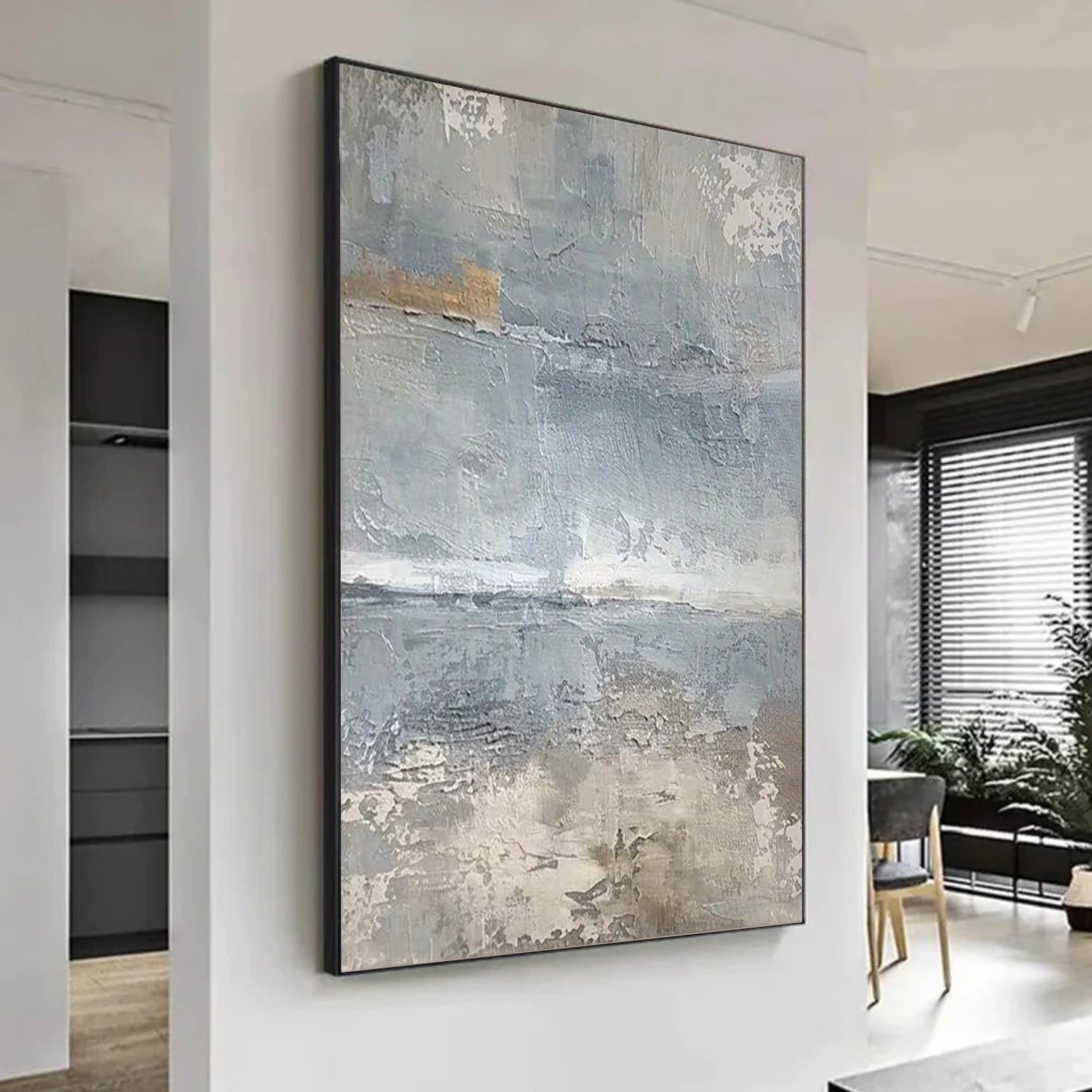
Choosing the right gray values for your room
Monochrome is not one choice; it is a ratio. A room with white walls and light floors wants a canvas with a generous black presence so the piece does not dissolve into the wall. A room with dark walls or heavy furniture wants the opposite - more white and gray, so the piece reads as a window rather than another dark block. The guiding question is always the same: which value does the room already have too much of? Buy the painting that supplies the missing value.
Light is the referee. In a bright room with windows on two sides, the whites of the canvas will bloom and the blacks will look deeper - a balanced mid-range piece works best. In a dim room with one lamp, the blacks swallow the mids and the piece darkens by half a step; choose a lighter-value canvas or add a picture light. In rooms with strong warm lamplight, a cool black-and-white piece gains a slight cream cast - acceptable for a calm room, slightly off for a gallery wall.
Texture changes the math again. Because the ridges catch and hold highlights, a textured piece reads lighter in the room than a flat piece of the same value, especially in evening light. If you are choosing between two monochrome pieces and the room is dim, take the one with more visible relief; it will perform better than the flat one even when the flat one had the better image.
Lighting monochrome texture properly
One directed light also solves the evening slump: a textured piece with its own light keeps working after dark while the room dims, which matters most in bedrooms where the art is seen at night.
If the room has strong natural light, place the canvas where the sun grazes it rather than hits it head-on. A south window at noon washes out the whites; a wall at 30 degrees to the window gives the piece its best hours twice a day.
Monochrome texture in the four main rooms
In the living room, a black-and-white textured piece works above a sofa of almost any color, because it answers neutral and colorful rooms alike. It is the safest possible purchase for a living room you plan to redecorate. Place it at the sofa two-thirds rule and let one directed lamp bring out the relief in the evening.
In the bedroom, monochrome texture is the calm partner of sleep. A piece with soft, horizontal mid-gray strokes above the headboard supports rest; a high-contrast piece on the facing wall can be the last strong image of the day. Choose based on which wall you see most when lying down.
In the entryway, a small square black-and-white piece at standing eye level sets the tone before the color of the house is revealed; in a transitional space with mixed light, the textured surface matters more than the image.
In the hallway, a vertical monochrome canvas narrows and gives direction to a long corridor. The texture adds the interest a slim hall always lacks, and the absence of color keeps the narrow space from feeling busy. One piece at the far end of the hall, lit from the side, turns the corridor into a gallery walk.
Pairing monochrome with strong colors
Then keep the room neutral and let the texture be the texture of the space: linen sofas, oak floor, white walls and one powerful monochrome canvas - the painting becomes the most structured object in the room and everything else agrees to be quieter.
Metal pairing is simple: monochrome accepts any metal, but consistency still matters. Black and iron frames, matte black lamps and chrome picture lights all flatter the genre; choose one family. A brass picture light against a black-and-white textured canvas is the most refined combination available and costs less than people expect.
Sizing and hanging monochrome texture
Size rules apply with one monochrome twist: because black-and-white pieces have strong contrast, they tolerate both very small and very large formats better than color art. A small square piece can hold a corner; a wall-filling piece can be the entire wall. The two-thirds rule above furniture still applies as the default, and hanging height stays at a canvas center of roughly 145-150 cm from the floor.
For sets, monochrome is the most forgiving genre in the house: two or three pieces in different sizes hang together in loose arrangements because they share one value system - the gray scale does the unifying. One generous textured anchor plus two smaller companions is the cheapest route to a sophisticated gallery wall.
A verification walk for monochrome texture
Before buying any black-and-white textured painting, take ninety seconds to run the side-light test. Look at the product images for a photo taken from an angle, or if possible, ask for one. Examine the edges of the highlight areas: in a genuinely textured piece, a single ridge will show a bright top and a shadowed side; in a flat print, the edge between black and white is a clean line. If the images show no angle at all, treat the texture with suspicion - real relief is never invisible from the side.
Then run the value test in your room: photograph the piece at the chosen spot at evening light, and check that the blacks do not collapse into a single void. If they do, light from the side or choose a mid-value piece. Finally, the touch test - a fingertip over the canvas should find real ridges. Three tests, under five minutes, and monochrome depth becomes a verified feature rather than a marketing claim. The difference between living with a poster and living with a sculpture on your wall is exactly that verification.
See the relief in action: same canvas, side light, different painting - that change is the whole argument for going textured in monochrome.
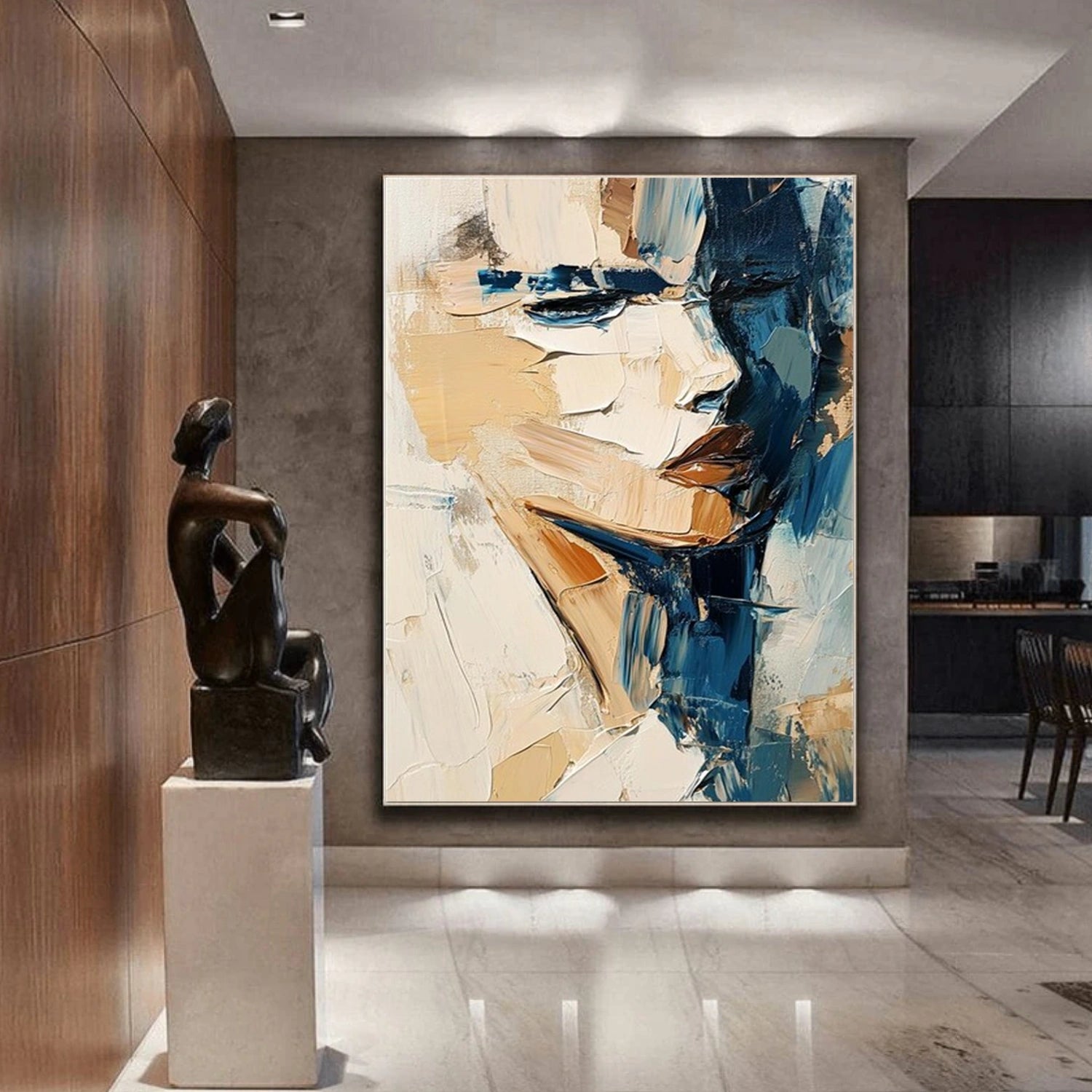
To explore more options, see black textured wall art and white textured wall art.

