


White Textured Art: Quiet Luxury in Light and Shadow
People fear white art will disappear into the wall and add nothing - true of a flat print, false of white texture. A white canvas built in raised paste is not a blank rectangle; it collects light, throws tiny shadows, and changes shape with every hour. Properly done, white textured art is the closest a wall gets to quiet luxury, the expensive look that does not announce its own expense. This guide explains why white texture works, how to read a canvas so you never buy a blank one, how to light it, where it belongs, and how to keep it clean for years.
What white texture actually adds
A flat white painting is a gap waiting to be filled. A textured white painting is the opposite: the relief creates its own image out of shadow. Every raised stroke has a bright side where the light lands and a shaded side where the stroke falls away, so the surface carries a landscape of light and dark that shifts as the sun moves. The artwork is never the same twice, and that subtle change is the entire foundation of its effect - a room with a textured white canvas feels lived in by light, not decorated by products.
That is also why white texture reads as luxury: expensive interiors accumulate quiet, well-made surfaces - linen, plaster, stone, wool - and a raised white canvas belongs in that family, a surface treated as a finish rather than a picture.
The practical benefit is just as strong. White textured art is the most forgiving piece in any room being restyled, because it sits under almost every color scheme. It is the piece you buy when you are not sure what the room will look like in three years, and it stays correct through every change.
How to read a white canvas before you buy
Since the image is made of shadow, the first skill is distinguishing a textured white canvas from a blank one. Look at the product photos for angle shots: a genuine piece will show highlights and shadows on the same strokes, and the ridges will be visible even in a thumbnail. If every image is straight-on and uniformly white, the relief is either shallow or absent. The one question that settles it as you stand in front of a real piece: does the surface change when you move? A true textured canvas does; a blank one does not.
The second skill is reading the depth. White canvases range from gentle brush texture, which reads as calm, to dramatic palette-knife relief, which reads as sculpture. Neither is better; they answer different rooms. Gentle texture belongs in bedrooms and reading corners where calm is the goal. Bold relief belongs in entryways and living rooms where the light can do the drama. Decide what the wall needs before you choose the depth, and let the room's light level direct the decision - dim rooms need deeper relief to stay visible.
The third read is the tone of the white. Pure brilliant whites read cool and contemporary; cream whites with warm pigment read soft and gallery-like; stone whites with grey undertones read modern and architectural. Hold the canvas next to the actual wall before deciding - a warm cream on pure white looks yellow, while a cool white on warm cream looks blue-grey.

Lighting white texture: the rule of angles
White texture is a lighting instrument, and the lighting rule is simple: the angle of light is everything. A single directed light at a 30-45 degree angle from the side turns gentle relief into visible relief and makes bold relief dramatic. Overhead center light is the enemy - it lands on the top of every ridge and casts no shadows, flattening the piece back into a blank. If your room only has overhead light, add one picture light or angle a floor lamp up at the canvas.
Natural light works the same way. A white textured piece on a wall facing a window shows almost nothing at noon, when the light is straight and flat, and comes alive in the morning and late afternoon, when the sun rakes across it. Place the piece on a wall that takes angled light - beside a window rather than across from it - and you get two daily performances instead of none. In rooms with no natural light at all, the piece needs its own lamp more than any other genre of art does; without it, the white will read exactly as people fear: blank.
In the evening, a textured white canvas with a warm lamp becomes a calm glowing surface, while a flat white print only reflects the lamp - which is why white texture succeeds in bedrooms and dim corners, provided it has a directed source.
Where white texture belongs
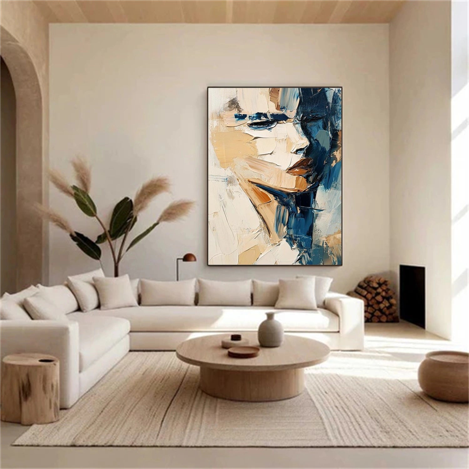
In the bedroom, a white textured piece above a linen bed is the quiet luxury archetype. The texture echoes the linen weave, and the pale surface holds the room calm at night. Choose gentle-to-mid relief, keep the tone warm, and light it softly from the side. In the living room, a larger white textured canvas above a neutral sofa gives the wall a central object without introducing a color you must then decorate around. The piece becomes the room's still point.
A white textured piece also solves the awkward wall - the small landing, the narrow hall end, the wall between two windows - because with no color it cannot clash, and it simply fills the space with a quiet surface.
Pairing white texture with color and material
White texture is not colorless; it is a mirror for the room. Next to a green sofa, the canvas picks up green reflections at its ridges and the room feels coordinated without a single matching item. Next to warm wood, the cream tones of the canvas warm up and the pairing reads as natural. This reflective quality is why white textured art survives restyling - it does not insist on its own scheme, it joins whatever scheme arrives.
The strongest pairings are with linen, oak, stone and brass: linen echoes the weave, oak matches the warmth, stone shares the surface philosophy, and brass adds the single warm glint that keeps the piece from feeling clinical. Avoid glossy white furniture and reflective surfaces everywhere - the combination turns the room sterile.
For a gallery wall, white texture is the unifying member. One large white textured anchor plus smaller color pieces creates a composition where the color items change over the years and the anchor holds the wall constant. It is the one piece in the group that cannot date, and its physical depth gives the flat prints around it a frame of sculptural reference.
Sizing, hanging and scale for white pieces
White texture behaves differently at scale. Small white pieces genuinely risk disappearing on large walls, so the default is to size up: a white textured canvas used as an anchor should sit at the larger end of its category - roughly two-thirds of the furniture width and no smaller. In a set arrangement, pair one generous white piece with smaller colored or dark companions so the group has a center of gravity.
Hanging height follows the standard rules - canvas center at roughly 145-150 cm - with one white-specific addition: the lower the piece sits, the more it depends on the room's lamps. Above a console, keep 15-25 cm of clearance so the relief stays clean and lit; in an entryway, hang at face level so the relief greets people first.
Keeping white texture clean
The honest question every white-texture buyer asks is whether it stays white. The answer is yes, with two habits. First, place it away from cooking steam and direct drafts; kitchens and open windows are the two places white relief attracts grime. Second, dust it gently with a dry, soft brush or a microfiber duster once a month - never vacuum it, never wet it. The raised paste is professionally sealed, but the valleys still collect dust like any sculpture.
When a light grey haze appears, a dry duster fixes it in most homes; for marks, use a barely damp microfiber cloth without pressure and never near the ridge tops. Skip household cleaners and sprays - the sealant is water-resistant, not cleaner-proof.
The verification test for white texture
Before buying, run this three-part check. One: inspect the photos for angle shots and visible shadow on the strokes - no angle, no proof, no purchase. Two: know your wall's tone and match the canvas tone to it by comparing in real light. Three: confirm the lighting plan before purchase - the piece needs a directed source from the side, so if the wall has no lamp and no angled window, budget for a picture light. Each check takes about a minute, and each prevents the classic disappointment of a white piece that reads blank because the light was never set up for it.
White texture rewards preparation more than any other genre, which is a fitting rule for the style itself: quiet luxury is never an accident. It is a collection of deliberate decisions - surface, tone, light, placement - and a white textured canvas is the one wall purchase where all four decisions are visible in a single object. Get the light right, and the piece stops being a white rectangle and becomes the shadow-play the whole room was missing.
White texture completes the case in one image: the shadow in the valleys is the proof the surface is real, not printed.
To explore more options, see white textured wall art and white 3d textured art.

