


Blue Wall Art: Psychology, Placement and Styling
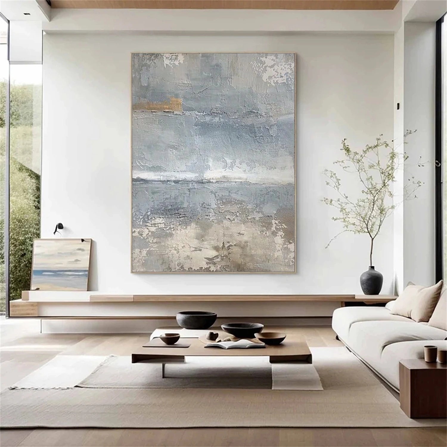
Blue can lower the visual temperature of a bright space, make a small wall feel deeper, and give a room a sense of order most colors have to earn with busy pattern. Texture changes the bargain again: a flat blue poster is a color, while a blue canvas built in raised oil and acrylic paste is a color with weather in it - darkening, lightening and casting its own small shadows as the day turns. This guide explains the psychology that drives the request, shows how to read the undertone of a blue piece, and walks through ten finished styling ideas you can apply tonight.
Why blue keeps winning the wall
The appeal of blue is cultural and physiological at once. Culturally, blue has come to mean competence, calm and depth - it is the color of deep water, clear sky and trust in almost every flag and brand that wants to be taken seriously. Physiologically, blue sits at the cool end of the spectrum and reads visually as distance, which is why a blue wall makes a room feel larger rather than smaller. The eye treats blue as background material: it settles behind the furniture instead of jumping forward the way a warm red does.
None of this means blue is timid. The same hue family contains navy, cobalt, teal and slate, and each brings a different personality. The choice is not whether the room gets blue; it is which blue earns the wall. Getting that right starts with learning to see undertone, which is the most useful single skill in this guide.
Reading the undertone of a blue canvas
Hold a blue painting at arm's length against a plain white paper and ask one question: does the blue lean green or violet? A green-leaning blue (teal, petrol, sea glass) harmonizes with wood, olive, cream and brass, and belongs in a room with plants; a violet-leaning blue (periwinkle, slate) harmonizes with silver, grey and white and reads cooler; a neutral mid-blue does both and is the safest pick over a busy sofa.
One practical test beats every theory: photograph the canvas with your phone against the actual wall, in the actual room, at the hours you actually use the space. A blue that reads perfect at noon under bright light can go flat and grey at 6 p.m. in a shadowed corner. Test before you commit, and choose the piece you can live with at the dimmest hour, not the prettiest one.
How texture changes the blue
Flat blue reflects light uniformly and reads as a smooth block of color. Textured blue breaks the reflection: each raised stroke throws a highlight on one side and a shadow on the other, so the surface carries a moving pattern of lighter and deeper blue through the day. In morning light from a window, the ridges glow; in evening lamp light, they recede into a darker, quieter depth. The same painting becomes two paintings, which is the honest reason sculptural color holds attention longer than a print.
Ten styling ideas you can apply today
The ten ideas below are ordered from easiest to boldest, and each one names the blue tone that works best so you can shop or rehang with a clear intention.
- 1. The neutral anchor. One mid-blue textured piece above a grey or white sofa, sized to about two-thirds of the sofa width. Best tone: slate or cornflower. This is the low-risk default that photographs well and never fights the room.
- 2. The reading corner. A deep navy painting beside a floor lamp in a corner that sees evening light. The texture gives the dim corner something alive to look at. Best tone: navy with clear ridges.
- 3. The tonal trio. Three small blue canvases of different tones (pale, mid, deep) hung in a horizontal row. Best on: a long console or a hallway wall. The trio reads as intentional, not repetitive.
- 4. The warm-and-cool pair. Hang a textured blue piece and a small warm-toned piece (ochre, terracotta) side by side. The blue withdraws, the warm advances, and the depth between them gives the wall dimension.
- 5. The blue entryway. A vertical blue painting in a narrow entrance tells guests the house is calm before they see the sofa. Best tone: petrol or teal for a modern first impression.
- 6. The bedroom calm. Pale blue above a bed with white linen. Choose a piece with soft, horizontal ridges to echo the rest of the bed. Best tone: powder or ice blue.
- 7. The dining formality. Navy or slate above a sideboard, flanked by matched lamps. The symmetry plus the dark blue creates the formality a dining room wants without wallpaper.
- 8. The office focus. A square blue texture at eye level behind your desk. Blue is the classic focus color; the texture stops it reading as a flat decoration. Best tone: slate or steel blue.
- 9. The gallery mix. Use one larger blue textured piece as the spine of a gallery wall, then add smaller neutrals and one framed object. The blue holds the wall together because the eye returns to it.
- 10. The statement-scale piece. A large textured blue painting on a generous wall, hung so the center sits at eye level. Best tone: cobalt or deep petrol when you want the wall itself to be the moment.
Pairing blue with wood, metal and fabric
Blue is unusually generous with materials, which is why it survives redecorating. With wood, the rule is temperature matching: warm mid-brown oak and walnut pair with teal and petrol, while pale ash and grey oak pair with slate and periwinkle. With metal, cool silver, chrome and aged brass all work, but pick one metal family in the room so the mix stays deliberate. With fabric, the safest scheme is one blue artwork plus two neutral textiles - linen, boucle or wool - and one small accent such as a mustard cushion or a terracotta vase.
The common mistake is stacking a blue painting with blue cushions, blue curtains and a blue rug at once; let the painting be the only saturated blue in the room and keep fabrics two tones lighter, so the piece reads as the origin of the room's calm.
Lighting is the final partner. A textured blue painting needs one directed light source - a picture light, a floor lamp angled from the side, or track light - to unlock the relief. Light straight from above flattens the ridges; light from a 30-degree side angle makes each stroke cast its own shadow. If the room only has overhead lighting, add one cheap picture light before you judge whether the painting works.
Sizing blue for the wall you have
The reliable shorthand is the two-thirds rule: for a piece above furniture, aim for roughly two-thirds of the furniture's width; for a standalone wall, aim for two-thirds to three-quarters of the empty wall width, leaving at least 15-30 cm of breathing room on each side. Vinchy Art sizes its textured pieces from 61 x 51 cm up to 91 x 61 cm, so most living walls can be served by a single well-proportioned canvas without a complicated multi-piece layout.
Height is simpler than it looks. Hang so the center of the canvas sits around 145-150 cm from the floor, which matches the average eye level of an adult standing. Above furniture, lower the center to roughly 20-30 cm above the back of the sofa or bed. When you are unsure, cut a piece of kraft paper to the canvas size, tape it to the wall, and live with it for a day. A blue wall you can close your eyes and remember exactly is the wall you should paint.
Where blue fails and what to do instead
Honesty saves money, so here are the three rooms where blue underperforms. First, a north-facing room with little natural light: a dark cool blue can go murky and grey by afternoon; choose a pale blue with visible texture or add a warm lamp near the piece before you commit. Second, a room with strong warm orange or terracotta walls: navy can read as a bruise rather than a cool accent; if you love the combination, make the blue piece the only large cool object and keep neutrals between. Third, a very small, windowless bathroom or closet: blue needs even a little daylight to show its depth; a deep navy in a flashlight-lit room is the quickest way to feel down, not calm.
When blue feels wrong but the wall still needs cool, try green. Teal and petrol sit exactly on the border between the two, and in many rooms a blue-green textured piece delivers the same calm with a touch more warmth. The room's light, not the color chart, decides whether blue or green serves you better - which is why the paper-test on the wall beats any rule in this guide.
A five-minute verification method
Before you finalize any blue purchase, run this test in the actual room. Hang or lean the piece at the proposed spot, then photograph it at three moments: bright morning, cloudy midday and lamp-lit evening. Look at the three photos together and check two things - that the undertone stays true (no grey slump) and that the texture still shows in the evening photo. If both pass, the blue will serve the room for years. If the light looks doubtful, move it near a window or a lamp and re-test; a textured piece earns its place when the light can reach its ridges.
One last look at the family: blue paint pools darker in the deepest relief, so verify the tone you love in the valleys before the hammer goes in.

To explore more options, see blue paintings and blue-green abstract art.

