

Designing calm and clarity with black and white art for bedroom and office spaces
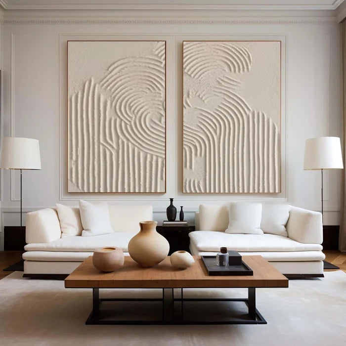
Black and white art for bedroom settings often gets dismissed as too minimal, yet in practice it solves two common problems at once: visual overload at night and lack of focus during the day. In a bedroom, a restrained monochrome piece quiets the wall so your eye can rest. In an office, the same contrast sharpens attention without introducing distracting color. The difference comes down to how contrast, scale, and surface texture are handled. A flat print can feel lifeless, while a hand-painted surface—matte blacks, chalky whites, or subtle sheen—adds depth that changes with light, giving the room presence without noise.
Why monochrome works differently in bedrooms and offices
In bedrooms, the goal is decompression. Strong color contrasts or busy compositions can keep the eye moving when it should settle. Black and white, when used with softer transitions or larger negative space, creates a slower visual rhythm. A wide horizontal piece above the bed, for example, can anchor the room without pulling attention away from rest.
In offices, the same palette becomes a tool for clarity. Sharper lines, higher contrast edges, or geometric compositions can reinforce structure and focus. A vertical or square format placed within your direct line of sight can act almost like a visual metronome—steady, consistent, and free of color cues that compete with your work.
Black is not just black when texture enters the picture
“Black and white” only feels flat when it is printed flat. With handcrafted paintings, black behaves like a material rather than a color. Matte black absorbs light and feels grounded; a slightly glossy layer reflects light and adds movement; charcoal-like strokes introduce softness and irregularity. White can shift from crisp and bright to warm and plaster-like.
A common disappointment happens when buyers expect depth but receive a smooth, poster-like surface. In low evening lighting, that flatness can make the artwork disappear instead of anchoring the wall. Texture prevents that by catching light at different angles throughout the day.
This is where hand-painted surfaces matter. Subtle ridges, layered brushwork, or plaster textures create a tactile field that changes from morning to night, especially in bedrooms with softer lighting and offices with directional task lighting.
Getting the scale right without breaking the calm
Proportion is the difference between “quietly intentional” and “underwhelming.” Black and white art tends to recede visually, which means it often needs to be slightly larger than a colorful piece to hold the wall.
-
Above a bed: aim for about two-thirds to three-quarters of the bed width; keep the composition airy rather than densely detailed.
-
Above a desk: align the width with the desk or go slightly wider; choose a composition with a clear center or directional flow.
-
For tall walls: consider a vertical piece or a paired set to avoid a floating, disconnected look.
-
For narrow spaces: a vertical artwork with elongated brushwork can guide the eye upward without adding clutter.
Spacing matters too. If you are working with a set of two, keep the gap consistent and modest so the pair reads as one visual unit rather than two separate accents.
Choosing the right composition for your room’s mood
Composition determines how the artwork “behaves” in the space. In bedrooms, look for pieces with generous negative space, soft gradients, or organic forms. These allow the wall to breathe and support a slower pace. In offices, structured compositions—bold lines, balanced asymmetry, or controlled splatter—can create a sense of order without becoming rigid.
Furniture also plays a role. A heavy upholstered bed pairs well with softer, cloud-like forms, while a streamlined desk can handle crisper lines. If your room already has strong patterns (rugs, curtains), keep the artwork quieter to avoid visual competition.
When monochrome is the wrong choice
Black and white is not universally right. North-facing rooms with cool light can make stark contrasts feel colder than intended. Small bedrooms with minimal natural light may benefit from a touch of warmth rather than strict monochrome. In offices that require creative ideation, a completely colorless environment can feel too restrained.
If you still prefer monochrome in these cases, lean toward warmer whites, softer blacks, and more visible texture to prevent the space from feeling flat or clinical.
From inspiration to a confident purchase
Once you know the mood, scale, and composition you need, the remaining challenge is translating that into an online purchase without second-guessing. This is where tools like room previews and art advisory become practical, not promotional. Being able to upload a photo of your wall and check proportions helps avoid the most common mistake—buying too small. Getting guidance on how a specific black reads (matte vs slightly reflective) against your wall color can prevent surprises.
If you want to explore options that emphasize surface depth rather than print-like flatness, you can browse a curated range of textured pieces in the Monochrome & Abstract Series. For buyers who are comparing several directions, advisory support can help narrow choices based on your room’s light, furniture scale, and the level of contrast you actually want to live with.
Vinchy Art focuses on handcrafted paintings where brushwork and texture carry as much weight as the palette, which is particularly relevant in monochrome spaces where subtle surface variation does most of the visual work.
Frequently Asked Questions
Is black and white art too cold for a bedroom?
Not necessarily. It depends on contrast and texture. Softer transitions, warmer whites, and visible brushwork can make monochrome feel calm rather than cold, especially under warm evening lighting.
What size black and white art works best above a bed?
A width of roughly two-thirds to three-quarters of the bed is a reliable starting point. Because monochrome recedes visually, slightly larger pieces often look more balanced than small ones.
How do I avoid black looking flat on the wall?
Choose hand-painted work with layered blacks—matte, slightly glossy, or charcoal-like textures. These catch light differently and create depth that a flat print cannot provide.
Should I choose abstract or geometric styles for a home office?
Abstract works with controlled composition or subtle movement can support focus without rigidity. Geometric styles suit structured workflows and modern desks but should not be overly busy.
Can I mix black and white art with colored decor?
Yes. Monochrome art pairs well with colored textiles or furniture because it acts as a stabilizing element. Just ensure the artwork’s contrast level does not fight with bold patterns nearby.
For a deeper look at aligning artwork with mood, scale, and personal routines, you can review guidance on Choosing Art for Your Sanctuary.