

Dynamic Room Energy: The Technical Guide to Selecting and Scaling Colorful Wall Art
Many fully furnished, well-lit rooms still feel oddly flat. This is rarely a structural or furniture issue; it is a color energy and dimensional deficit. While standard design advice recommends treating walls as final, passive layers, a high-contrast visual anchor changes the emotional temperature of a space faster than structural renovations. However, not all colorful art behaves identically. Navigating the choices between hand-painted canvases and flat prints requires a precise understanding of lighting physics, scale ratios, and textural shadows.
This guide outlines the frameworks for selecting and positioning large-scale colorful wall art to transform residential interiors from sterile spaces into highly intentional environments.
The Physics of Hand-Painted Pigments vs Flat Prints
Most online searches for colorful decor default to digital prints. While accessible, commercially printed posters flatten color into uniform surfaces that remain static under changing environmental conditions. Hand-painted artwork, such as original abstract or 3D textured paintings, interacts dynamically with real-world environments due to its physical properties.
-
Pigment Layering: Hand-painted works utilize built-up acrylic or oil layers. Light passes through translucent top coats and reflects off underlying opaque paint, generating depth and subtle color variations that cannot be replicated by flat CMYK or RGB ink matrices.
-
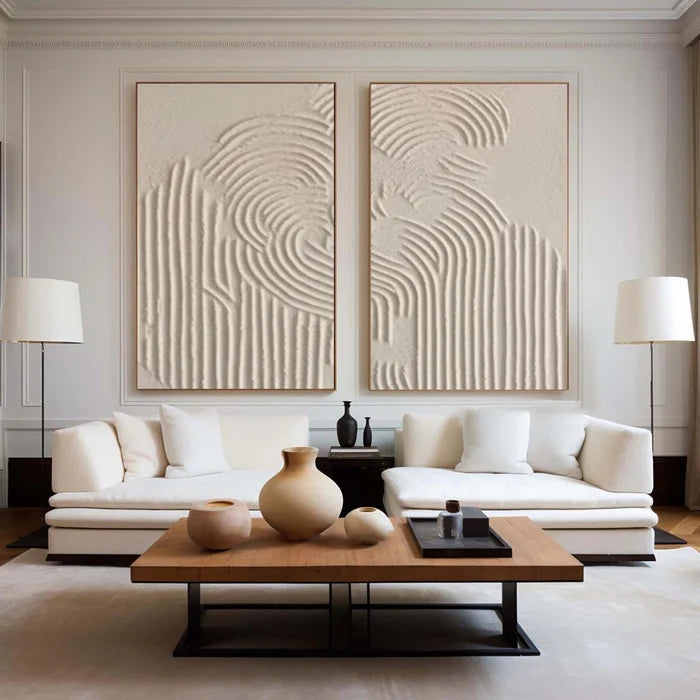
Micro-Shadows: Palette knife strokes, heavy impasto techniques, and plaster-like finishes create physical ridges. These ridges cast micro-shadows across the canvas surface, giving even a highly restricted palette a sense of kinetic movement.
-
Vibration Effect: Because paint is applied by hand, edge boundaries retain slight imperfections and varying thickness. This variation creates a visual phenomenon known as color vibration, where two high-saturation hues placed side-by-side appear to shift slightly as the viewer moves across the room.
Color Temperature and Room Orientation
A common mistake is selecting artwork colors based solely on digital screen previews. The physical success of a bold canvas depends entirely on how the pigments interact with the ambient light temperature of the actual room.
-
Warm Lighting (2700K): Emphasizes reds, oranges, and deep earth tones like terracotta. It softens harsh contrasts but can dull cooler pigments, turning vivid teals and sky blues slightly muted or muddy.
-
Cool/Daylight Balance (4000K–5000K): Sharpens greens, blues, and stark contrasts. This lighting environment is optimal for high-saturation minimalist art and complex abstract geometries, though it can make low-quality prints look clinical.
-
Spatial Orientation: North-facing rooms receive cool, consistent daylight that absorbs warmth; these spaces require deeply layered warm tones to avoid feeling clinical. South-facing rooms experience high-intensity, warm sunlight, which can cause ultra-high-saturation color combinations to become visually exhausting over long periods.
The Dimensional Formula for Wall Anchors
Scale errors are the primary cause of unsuccessful wall art installations. Because the human eye processes vivid colors more intensely than neutrals, decorators often misjudge the physical presence required to anchor a space, resulting in fragmented wall compositions.
To establish a proper visual center of gravity in open-plan or neutral spaces, the artwork size must match the primary furniture anchor rather than the open wall space.
-
The Two-Thirds Ratio: For artwork placed above a sofa, headboard, or dining sideboard, the frame width must span between 66% and 75% of the total furniture width. Anything less reads as an undersized afterthought, failing to ground the wall.
-
Negative Space Margins: A large statement piece requires a minimum buffer of 12 inches of blank wall space on all sides. Forcing an oversized canvas into a cramped alcove creates visual claustrophobia rather than a luxury focal point.
-
Vertical Positioning: The vertical center of the canvas should rest between 58 and 60 inches from the floor, aligning directly with standard human eye level. When hanging above furniture, maintain a strict gap of 6 to 10 inches between the bottom of the frame and the top of the furniture asset.
Practical Frameworks for Real-World Spaces
Integrating bold art requires balanced visual relationships across the existing interior palette. Instead of attempting a direct color match, implement a structured contrast strategy.
-
The 80-20 Composition Rule: Utilize a high-contrast painting within an interior that is 80% neutral (cream, grey, taupe, or natural wood). The artwork forms the vital 20% contrast anchor, creating intentional tension without pushing the room into sensory overload.
-
The Tonal Echo Technique: Select a maximum of two minor undertones from the painting and repeat them in soft furnishings, such as an accent cushion or ceramic vessel. Do not match the dominant color of the canvas, as this diminishes its role as a distinct focal point.
-
Style Contrast Match: Pair ultra-minimalist, clean-lined furniture with heavily textured, expressive abstract art to break up rigid geometries. Conversely, place structured, geometric color-block art in rooms featuring organic, wabi-sabi shapes to provide structural grounding.
Mitigating Risk in Digital Art Procurement
Acquiring original artwork online introduces distinct variables regarding color accuracy and textural expectation. Screens compress dynamic ranges, making it difficult to project how a physical piece will respond to home lighting conditions.
-
Analyze Close-Up Angles: Evaluate macroscopic detail photos showing the edges of the canvas. Authentic hand-painted art displays irregular paint buildup, visible fabric weave saturation, and variable stroke directions rather than smooth, machine-printed consistency.
-
Verify Global Fulfillment Logistics: Handcrafted statement pieces traveling internationally require robust protection. Confirm the supply chain supports custom wooden crate packing, specialized art-courier handling, and transparent customs clearing, especially for large-scale stretched canvases.
-
Utilize Visual Mockups: Before procurement, overlay a scaled digital image of the artwork onto a photo of your actual wall captured during peak daylight hours. This steps removes guesswork regarding scale and undertone alignment.
Strategic Boundaries: When Bold Color Fails
Bold, colorful wall art is not a universal solution for every interior space. Specific design architectures and environments require restraint to preserve their intended function.
-
Strict Structural Minimalism: In spaces built entirely around negative space, raw materials, and architectural shadow lines, high-saturation color disrupts the intended structural purity. These environments are better served by monochrome, low-contrast textured reliefs.
-
High-Stimulation Environments: Avoid placing frantic, high-velocity warm compositions (such as bright yellows and neon reds) directly in spaces designed for rest or deep focus, such as bedrooms or home offices. These areas yield better satisfaction when paired with slower, deeper tonal movements like deep indigos, terracotta, and forest greens.
Frequently Asked Questions
What makes colorful wall art look premium rather than cheap?
The distinction lies in surface depth and light refraction. Premium art utilizes dimensional texture, varied paint opacity, and authentic pigment layering that changes character under different light angles. Mass prints lack this physical variation, presenting a flat, uniform face that reads as mere background decoration.
How do I choose between a single giant canvas and a gallery wall?
A single large-scale artwork functions as a structural anchor, providing clean lines, minimal visual noise, and a luxurious feel appropriate for modern living areas. A gallery wall distributes visual weight across multiple frames, which suits transitional spaces like stairwells but can easily clutter a clean, contemporary room if the palettes are not perfectly unified.
Will vibrant artwork clash with a completely neutral room?
No. Neutral rooms provide the ideal backdrop for expressive art because they eliminate competing elements. The neutral space absorbs the energy of the canvas, allowing the bold color palette to function as a deliberate focal point rather than a chaotic addition.
How can I reliably test if the colors will match my existing furniture?
Focus entirely on the minor undertones rather than the dominant shade. If the artwork contains subtle flecks of a color that shares a cold or warm relationship with your floor finishes or primary upholstery, the piece will sit naturally within the space.
Is it better to buy a framed or a frameless canvas for an abstract painting?
Frameless or gallery-wrapped canvases extend the composition into the room, emphasizing a contemporary, studio-like atmosphere. Adding a floating frame creates a distinct architectural border that separates the artwork from the wall, adding formality and visual weight suitable for traditional or structured living rooms.
How do I maintain and clean heavily textured 3D wall art over time?
Textured art requires careful maintenance due to the dust-catching nature of deep impasto ridges. Use a clean, dry, ultra-soft anti-static artist brush or a delicate feather duster to gently sweep across the crevices once every few months. Never apply liquid cleaners, damp cloths, or household sprays, as moisture can compromise the binder of hand-applied acrylic or plaster layers.