


Gallery Wall With Textured Pieces: Spacing, Balance, Scale
A gallery wall with textured art is a different project from a gallery wall of prints. Flat prints behave like paper on a wall; textured canvases behave like small sculptures leaning against it, each with its own depth, shadow line, and light appetite. The spacing rules that make a print grid feel tidy can make a texture wall feel busy, and the balance tricks change because relief adds a third dimension to the composition. This guide covers how to lay out a mixed gallery wall when some — or all — of the pieces are textured, with the spacing math, the balance moves, and a rehearsal method that avoids a wall full of holes.
First decision: grid or organic layout
The layout choice is the first fork. A regular grid — same spacing, aligned edges — reads as calm and architectural, and it is the right tool when the pieces are roughly similar in size and depth. An organic layout — staggered sizes, shared sight lines, no two edges aligned — reads as curated and lived-in, and it is the right tool when the pieces vary in size or when a textured anchor sits among smaller flat pieces.
The disciplined middle path is the salon-style layout, used by galleries for mixed collections: pieces are arranged around a central horizontal line, with the dominant piece at or near the center, and smaller pieces flow outward and upward. This is the pattern that flatters textured art the most, because a textured anchor at the center gives the eye one main surface, then rewards the journey outward. Whichever layout you choose, decide it on the floor before touching the wall.
Spacing: the numbers that actually matter
Spacing has two jobs: keep each piece readable and keep the group legible as one unit. The conventional guidance is to hold gaps between frames or canvases between 5 and 10 cm (about 2 to 4 inches), and to keep the gap uniform within one cluster. Uniformity does more work than the exact size: an off-gap anywhere in the group reads as an error even when the eye cannot name it.
- Between flat prints: the 5–10 cm range, comfortably, since prints have no depth to protect.
- Between textured pieces: stay closer to the upper end, 7–10 cm. Relief needs a little air to be seen; two heavily textured canvases jammed together fuse into one busy surface.
- Between textured and flat: 5–7 cm is fine — the depth difference itself creates separation.
- Around the group: the whole cluster should sit as one artwork on the wall, roughly centered in the clear span, with the group center around eye level.
The one hard rule across all combinations: distance the group from furniture. A gallery wall that crowds a sofa back or a console top loses its hang; give the cluster the same vertical buffer you would give a single painting, and let the largest piece in the group set that line.
Balance, not symmetry
Symmetry is one kind of balance; most mixed gallery walls use the forgiving kind called visual balance. The idea is simple: treat each piece as having a visual weight, then arrange so no side of the group feels loaded. Textured pieces weigh more visually per square centimeter than flat prints of the same size — the relief gives them presence — so a small textured canvas can balance a larger flat print across the composition.
Three moves build balance reliably:
- Anchor and surround: place the most textured or largest piece near the center, then balance smaller pieces around it by weight, not by size alone.
- Triangle the centers: the eye connects piece centers into triangles; overlapping triangles make a composition feel intentional. Sketch the triangles in pencil before hanging and adjust their corners on paper.
- Use the frame line: align at least one edge — tops, bottoms, or a shared center line — in every cluster. One alignment, repeated, is what makes a mixed group read as designed.
The checkable version of balance is the two-palm test: stand two arms' lengths back, close one eye, and cover the left half of the group with your hand, then the right. If one side feels substantially heavier, swap two pieces and re-test. Roughly even is the target; perfect symmetry is not.
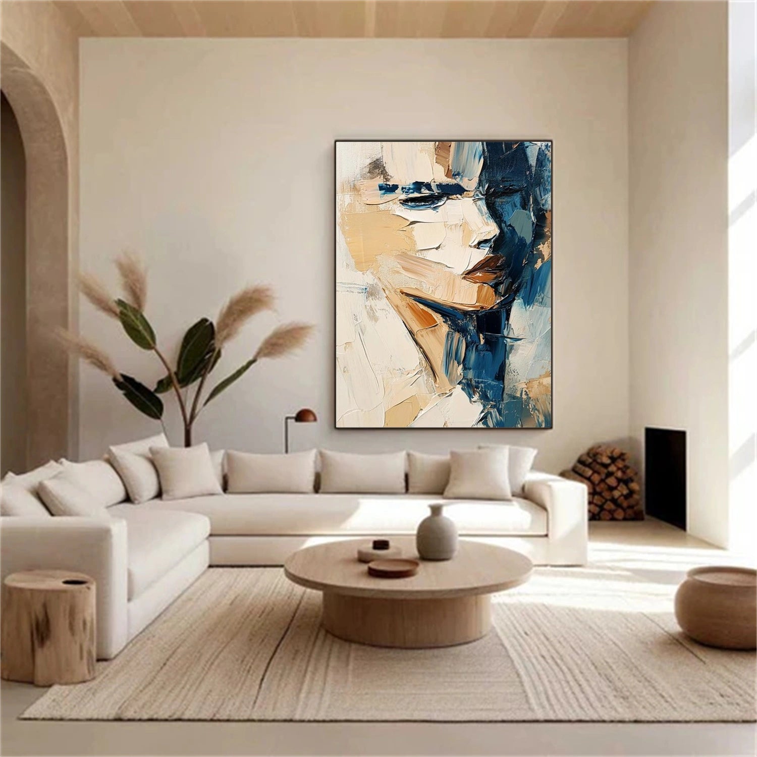
Mixing one textured piece with flat prints
The most common real-world case is a single textured piece added to an existing print wall. The textured canvas becomes the anchor by default, and the layout should let it lead: give it the strongest placement — center, or high-center in the sight line — and let two or three flat pieces orbit around it in balancing roles. Two habits keep this from failing:
- Feed the depth with space: never touch a textured edge to a flat frame. The 7 cm air between them lets the relief cast its shadow.
- Match tonal weight, not subject: a textured beige canvas pairs with prints that share its neutral range; mixing a warm textured anchor into a wall of cold blue prints creates a fight the prints cannot win.
Subject variety needs no apology — interior guidance consistently favors mixing subject across a wall — but tone is the glue. If in doubt, hold one class of print: the wall that mixes landscape prints with a textured abstract reads intentional; the wall that mixes every color and every subject reads open-air market. The textured anchor disciplines the rest of the wall by giving it a center.
Lighting a mixed-depth wall
A gallery wall with textured pieces asks for more careful light than a flat print wall, because relief needs a grazing angle to show. In practical terms:
- Prefer one broader light source slightly to the side of the anchor piece — a picture light or a directional lamp aimed at the textured canvas.
- Avoid a single overhead flood centered on the wall; it flattens the relief and leaves the flat prints fine while the textured pieces lose their dimension.
- If the wall is near a window, use the window as the side light: the texture will animate through the day as the light moves, which is a feature of textured walls and a reason many owners place them on naturally lit walls.
There is a cheap evening check: light the wall the way you live at night — lamps on, no ceiling light — and step back. If the textured anchor disappears in the lamp light, the layout needs either a picture light or a wall-side lamp; if it reads clearly, the composition will hold from morning to midnight.
The rehearsal that prevents the hole-pattern wall
The classic failure of gallery walls is the wall that ends up with more holes than art, so rehearse before the first drill. Cut paper rectangles at each piece's true size, label them by position, and tape the full layout to the wall — this is the same rehearsal professionals do in miniature. Live with the paper wall for a day or two, photograph it, and move pieces until the spacing, the alignment, and the balance all hold. Then, for each piece, mark the top two corners, remove the paper, and transfer the hardware position using the drop math for that specific canvas.
For textured pieces there is one more source of error: the canvas face is not flat, so measure the hanging points on the back of the stretcher, not the front edge. When the D-rings are set, the front of a thick textured canvas can sit a few centimeters off your paper plan — account for it when you mark, and the composition will land exactly as designed.
Making texture work at every eye level
Gallery walls are viewed from several distances, and textured pieces need the layout to survive all of them. From the doorway the group should read as one silhouette; from the sofa the anchor should dominate; close up, each piece should be discoverable. Set the anchor's silhouette check first — stand back until the whole group fits one glance and confirm no piece juts past the composition's edge. Then test the seating distance: from where people actually sit, the anchor should hold the eye, with the satellites supporting rather than competing. Close up is where texture wins the wall: a gallery wall with one textured anchor rewards the two-meter visit in a way that an all-flat grid cannot. If the group is large, treat it like a single painting for the eye-level rule — the arrangement's center at around 57 inches — and let the satellites obey the group line rather than their own heights.
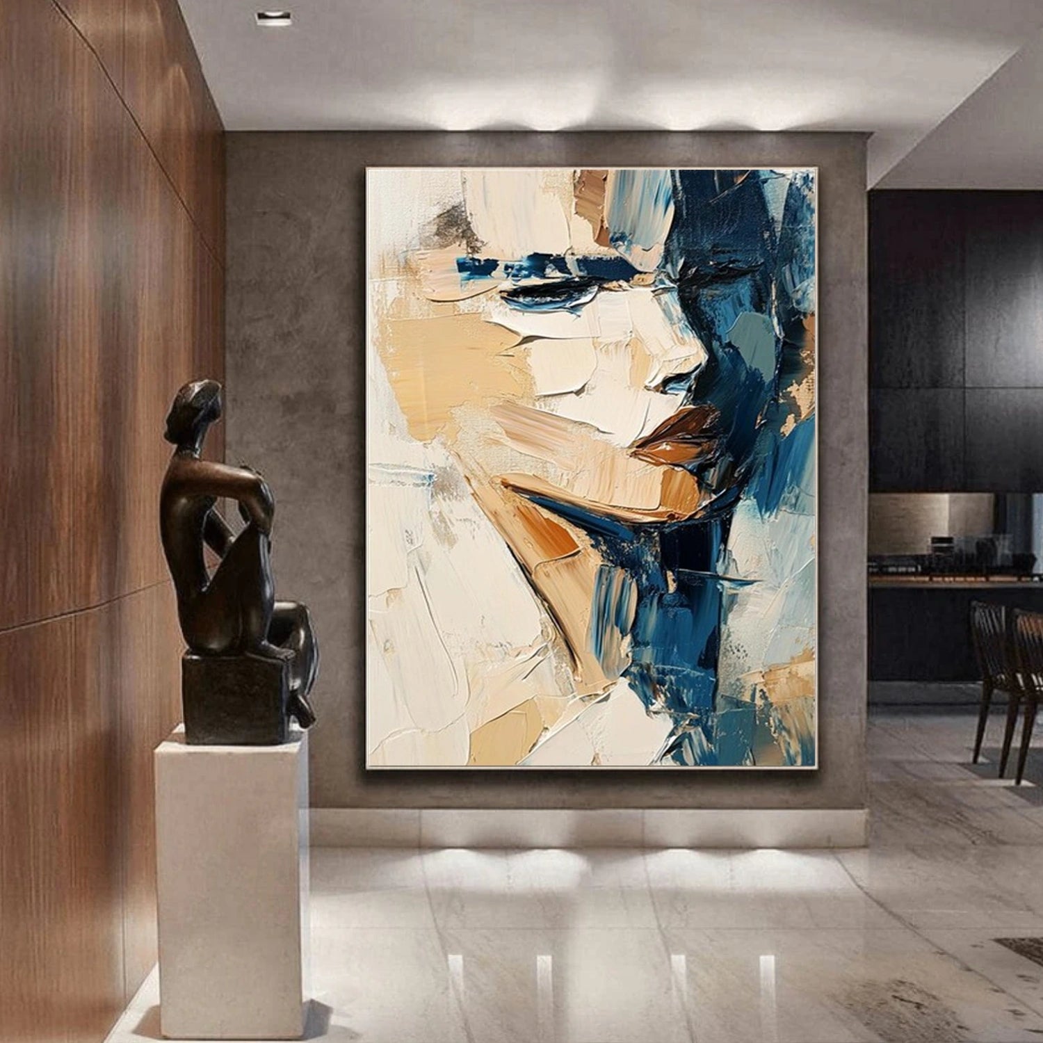
Maintenance of a mixed wall over time
Galleries evolve, and a textured gallery wall should change without drama. Pieces will be swapped for different seasons; the layout should make that easy by keeping the anchor position stable and recycling the satellites. When a new piece arrives, re-run the two-palm balance test and the paper rehearsal rather than trusting the memory of the old plan. Dust the textured canvases gently — a soft dry brush, no pressure — and check every three months that no canvas has sagged a few millimeters on its wire. A gallery wall is a living composition; the maintenance is light, and the reward is a wall that always looks decided.
To explore more options, see sets of two paintings and sets of three paintings.

