

How wall art for home reshapes mood and function across offices apartments and living spaces
A blank wall rarely feels neutral for long. In a home office it can quietly drain focus, in a small apartment it can make the room feel tighter than it is, and in a larger home it can leave a space emotionally flat even when the furniture is right. Choosing wall art for home is less about filling space and more about correcting how that space behaves—visually, psychologically, and even in how light moves across it. The same painting can feel energizing in daylight, heavy under warm evening lighting, or surprisingly flat if the surface lacks texture. That is why the setting matters as much as the artwork itself.
Why the same artwork feels different in each space
A large abstract canvas with visible brushwork might feel expansive in a living room, but in a compact apartment it can visually crowd the wall if the composition is too dense. In contrast, a restrained minimalist piece with softer contrast can create breathing room, even when the size is similar.
Lighting plays a quiet but decisive role. Natural daylight reveals tonal variation and texture, especially in plaster or layered paint surfaces. Under artificial lighting, especially warm LEDs, darker tones compress and textured surfaces cast subtle shadows that either enrich the piece or make it feel heavier depending on placement.
This is where handcrafted paintings behave differently from prints. A flat print reflects light evenly, which can make it predictable but less dynamic. A textured surface shifts throughout the day, which is often what gives a room a more lived-in, dimensional feeling.
A practical decision matrix for home office apartment and home
Instead of choosing by style name alone, it helps to anchor your decision in how the room needs to function.
-
Home office: Prioritize clarity and mental rhythm. Look for abstract or geometric compositions with controlled contrast and directional movement. Avoid overly chaotic splatter styles unless the goal is creative stimulation rather than deep focus. Horizontal pieces can widen the visual field behind a desk, while vertical works can reinforce structure.
-
Apartment: Focus on spatial efficiency. Smaller walls benefit from lighter palettes, negative space, and simpler compositions. Square or vertical formats often fit better between furniture. Textured neutral art, including Wabi Sabi-inspired surfaces, can add depth without making the room feel busy.
-
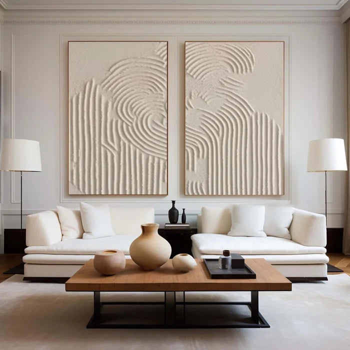
Home living areas: Aim for emotional resonance. This is where bolder scale and richer palettes work well. Large-format paintings or set-of-two arrangements can anchor a sofa wall. Color becomes more expressive here, whether through deep blues, warm earth tones, or layered neutrals.
Scaling art without guessing proportions
One of the most common mistakes is choosing art that is too small for the wall or too large for the surrounding furniture. A simple proportion guideline can prevent that mismatch.
Place this table mentally against your wall before choosing:
Even well-chosen art can feel wrong if the scale is off. Measure the furniture first, not just the wall.
What style of art actually works in a home office
The best style depends on whether the space is meant for concentration or ideation. For focus-heavy work, controlled abstract compositions, soft gradients, or linear designs tend to reduce visual noise. High-contrast, chaotic patterns can become distracting over time, even if they look exciting initially.
For more creative roles, expressive brushwork or Pollock-style energy can stimulate thinking, but scale and color still matter. Keeping the palette slightly restrained prevents fatigue during long hours.
If you are comparing options, browsing a curated selection like the Home & Office Collection can help clarify how different compositions behave in work settings rather than purely decorative ones.
Texture changes everything depending on light
Texture is often underestimated online because it is hard to read from a flat image. In reality, it can completely change how a piece feels in a room.
A heavily textured plaster painting placed opposite a window can cast soft shadows throughout the day, adding movement to an otherwise minimal apartment. The same piece under a single overhead light can appear denser and more sculptural, which may feel too heavy in a small space but grounding in a larger living room.
Smooth, low-texture paintings behave more predictably and are often safer for tight spaces. Heavier textures are better used when you want the wall itself to feel like a material element, not just a surface.
Where buyers misjudge wall art when ordering online
The biggest gap is not style—it is expectation. Product images often show ideal lighting and scale references that do not match your room.
Color temperature at home can shift a neutral beige toward yellow or gray. A painting that looks subtle online may feel stronger in person if the texture catches light differently. Framing, or the lack of it, can also change how finished the piece feels.
This is where tools like room previews and art advisory become practical rather than optional. Being able to place a painting onto a photo of your own wall helps clarify proportion instantly, while advisory input can align palette choices with your flooring, sofa fabric, or paint undertone.
When handcrafted art makes more sense than prints
There is a clear place for both, but they serve different goals. Prints are consistent and often easier to match quickly. Handcrafted paintings introduce variation, depth, and slight irregularities that make a room feel less staged.
In apartments where every piece needs to earn its space, a textured painting can replace multiple smaller decorative items. In larger homes, it can anchor a room without relying on excessive furniture or accessories.
For buyers exploring original, surface-rich work, Vinchy Art positions itself as an online source of handcrafted paintings that emphasize texture, scale, and room fit rather than mass-produced flat imagery. It is not about filling a wall quickly, but about choosing something that behaves well in your specific environment.
Matching your space before committing
If you are unsure whether a piece will work, it is worth slowing down the decision rather than guessing. Uploading your wall into a preview tool or discussing your space with an advisor can reveal mismatches you might not notice on a product page.
For those who want a more tailored direction, you can connect through their Personalized Art Advisory to align size, palette, and texture with your actual room conditions before making a decision.
Frequently Asked Questions
What size wall art is best for a small apartment?
A piece that covers around to of the wall width usually works best. Smaller spaces benefit from simpler compositions and lighter palettes to avoid visual crowding.
Should home office wall art be bold or subtle?
Subtle, structured designs are generally better for focus-heavy work. Bold or highly energetic art can work in creative environments but should be balanced in color and scale.
Does textured wall art look different in real life than online?
Yes, significantly. Texture interacts with light, creating shadows and depth that are hard to capture in photos. This can make the artwork feel more dynamic—or heavier—depending on lighting.
Is one large painting better than multiple small pieces?
In most cases, one well-scaled painting creates a cleaner and more intentional look. Multiple small pieces can work, but they require careful spacing and alignment to avoid clutter.
How do I know if the colors will match my room?
Compare the artwork palette to your dominant room tones—walls, flooring, and furniture. Using a room preview or getting advisory input can reduce the risk of color mismatch.