

Textured wall art that brings sculptural depth into modern interiors
Flat wall decor often looks convincing online but disappoints in person. The surface sits still, the light does nothing, and the wall feels unchanged. Real textured wall art behaves differently. It interacts with daylight and shadows, creates subtle depth shifts across the canvas, and reads more like a built element of the room than a decorative layer. For buyers specifically searching for plaster wall art or textured paintings, the expectation is not just visual style but physical presence. The difference lies in how the artwork is made, how it catches light, and how it holds scale on a real wall.
Why true texture changes how a room feels
A textured painting does not rely only on color or composition. Its surface physically alters how light moves across the wall. Raised plaster ridges, palette-knife strokes, and layered impasto create micro-shadows that shift throughout the day. Morning light produces crisp highlights, while evening light softens the relief into a more diffused surface.
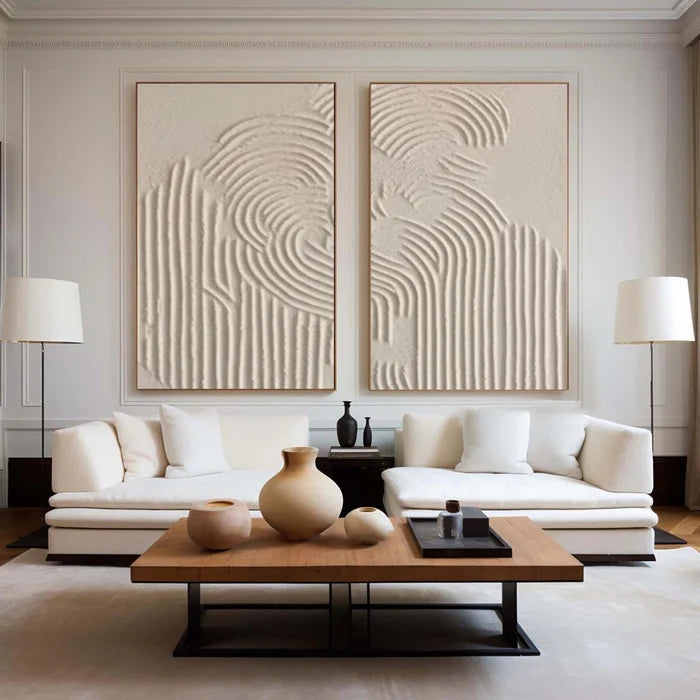
This is why textured wall art often works where flat prints fail—large, minimally decorated walls. In open-plan living rooms or entryways, a smooth canvas can feel visually insufficient. A sculptural surface introduces depth without adding clutter. It acts almost like architectural detailing rather than decoration.
The effect becomes especially noticeable in neutral interiors. Beige, off-white, or grey spaces can feel flat when everything shares the same finish. Introducing a plaster-textured artwork adds variation through surface, not just color, which keeps the palette calm while making the wall visually active.
What actually makes plaster wall art “textured”
Not all “textured wall art” is genuinely dimensional. Many mass-produced canvases simulate texture through printed images of brushstrokes. The distinction becomes obvious when viewed from an angle or under directional light.
Below is a practical comparison that helps clarify what you are actually buying:
If you have ever seen macro photography of real plaster art, the difference becomes unmistakable. Close-up views reveal cracks, ridges, and layered build-up that cannot be replicated through printing.
The techniques behind sculptural canvas work
Understanding how textured wall art is made helps explain why it feels more substantial and why no two pieces are identical.
Plaster mixing and base formation
Artists begin by preparing a plaster or heavy-body medium, adjusting thickness depending on the desired relief. A thicker mix creates bold, sculptural ridges, while thinner layers produce softer transitions. This base layer determines how dramatically the piece will interact with light.
Palette-knife shaping
Instead of brushes, palette knives are often used to push, scrape, and lift the material across the canvas. This creates irregular edges and directional movement. Unlike brushwork, which tends to smooth paint, knife work leaves intentional ridges and peaks.
Layered impasto buildup
Impasto refers to applying paint or material thickly enough that it stands off the surface. In textured wall art, multiple layers are built gradually. Each layer partially dries before the next is added, allowing depth to accumulate rather than collapse into a single flat mass.
The result is not just texture, but structure. The artwork behaves almost like a low-relief sculpture mounted on canvas.
Where textured wall art works best in a home
Placement matters because texture depends heavily on light and viewing distance. A poorly placed piece can lose much of its impact.
Large walls with natural side lighting tend to produce the strongest effect. For example, a living room wall adjacent to a window allows angled light to cast shadows across the surface. Hallways with directional ceiling lights can also highlight vertical textures effectively.
Bedrooms benefit from softer, more restrained plaster textures. Overly aggressive relief can feel too active in a space meant for rest. In contrast, dining areas or entryways can handle bolder sculptural work because they are transitional or social spaces.
A common mistake is placing textured wall art directly under flat, overhead lighting. Without angled light, the surface loses its shadow play and can appear flatter than intended.
Scale also matters. Small textured pieces may look intricate up close but fail to carry across a larger wall. In most modern interiors, medium-to-large formats allow the texture to read clearly from a normal viewing distance.
When textured art might not be the right choice
Despite its appeal, textured wall art is not universally suitable.
Highly detailed gallery walls, for example, often benefit from flatter pieces that sit cohesively together. Introducing heavy plaster textures into a tightly arranged grid can disrupt visual balance. Similarly, rooms already rich in material contrast—such as spaces with exposed brick, heavy wood grain, or patterned stone—may not need additional surface complexity.
There is also a practical expectation gap. Because each piece is handcrafted, slight variations in texture, edge finish, or surface pattern are normal. Buyers expecting perfectly uniform surfaces may find this surprising if they are used to printed canvases.
Navigating online buying without guesswork
Buying textured wall art online comes with a specific concern: will the texture look as real in person as it does in photos?
The most reliable way to evaluate this is through close-up imagery and angled photography. Look for shadows within the artwork itself, not just around it. If every image looks evenly lit with no surface variation, it is likely printed.
Some platforms also offer tools to reduce uncertainty. For example, Vinchy Art provides a Hand-Textured Plaster Collection where the focus is explicitly on sculptural surfaces rather than flat prints. Buyers can also use a room preview feature to upload a photo of their wall and check how scale and composition will look in context.
For those unsure about matching texture with existing interiors, an art advisory service can help translate material, color, and scale into a more confident decision before ordering.
How craftsmanship standards influence what you receive
Texture is not just about appearance—it is about durability and structural integrity. Poorly constructed textured paintings can crack excessively, shed material, or warp over time if the base layers are not properly built.
This is why craftsmanship matters more in plaster wall art than in flat prints. Layer adhesion, drying time, and canvas support all influence the longevity of the piece.
If you are evaluating a source, it is worth understanding how their work is made and finished. You can review broader production approaches and expectations through their Quality Craftsmanship Standards, which outline how materials and processes are handled at a structural level.
Frequently Asked Questions
Is textured wall art difficult to maintain?
No, most textured paintings require minimal maintenance. Light dusting with a dry cloth or soft brush is usually sufficient. However, they should not be cleaned with water or chemicals, as this can affect the surface.
Does plaster wall art crack over time?
Minor surface variations or hairline texture shifts can occur naturally, especially in heavily layered pieces. Well-constructed artworks are designed to minimize structural cracking through proper material preparation and layering techniques.
How do I know if the texture is real when buying online?
Look for angled photos and close-up images showing shadows and surface depth. Real textured art will display uneven light interaction, while printed canvases appear uniformly flat from all angles.
What size textured wall art should I choose for a living room?
In most cases, the artwork should span around two-thirds to three-quarters of the width of the furniture beneath it. Larger formats tend to showcase texture more effectively than small pieces.
Can textured wall art work in minimalist interiors?
Yes, it often works particularly well. Texture adds visual interest without introducing additional color, making it ideal for neutral, minimalist spaces that rely on subtle variation.