

Ocean wall art that brings movement and depth into modern interiors
Flat beach photos often look calm online but feel surprisingly lifeless once they’re on the wall. Ocean wall art works best when it carries a sense of motion, depth, and changing light—qualities that prints struggle to deliver. Hand-painted ocean pieces use layered pigment, raised texture, and visible brushwork to suggest tide lines, foam, and shifting horizons. That physical surface is what gives a room “breathing space,” whether you’re styling a compact apartment or a double-height lobby. If your goal is not just to decorate but to introduce atmosphere, the difference between flat imagery and a textured ocean canvas becomes immediately noticeable.
Why textured ocean paintings feel more spacious than prints
A textured seascape doesn’t just depict water; it builds it. Subtle ridges of plaster or thick paint catch light at different angles throughout the day, which creates the illusion of depth beyond the wall plane. In smaller rooms, that illusion can counteract visual crowding, especially when the palette leans toward layered blues, soft whites, and diluted greys.
In open-plan living areas, the same effect works differently. Instead of making the space feel larger, it anchors it—giving the eye a horizon line to rest on. This is one reason textured ocean art is frequently chosen in modern coastal interiors: it balances minimal architecture with a sense of natural movement, without introducing clutter or overly literal imagery.
Reading the surface like a seascape
When evaluating ocean wall art online, look past the image and focus on how the surface is built. The most convincing pieces tend to combine multiple techniques rather than relying on a single flat gradient.
-
Layering creates depth between foreground foam and distant water.
-
Palette variation prevents the “solid blue block” effect common in prints.
-
Raised texture suggests wave breaks and shoreline energy.
-
Soft transitions keep the composition calm rather than chaotic.
A helpful way to think about it: if you can imagine how the paint was physically applied—scraped, built up, softened—the piece will likely feel more alive in person.
Choosing ocean wall art for a modern living room
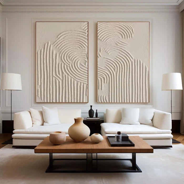
Modern living rooms often sit between minimalism and comfort, which makes ocean art a natural fit—if scale and restraint are handled correctly. A large horizontal canvas above a sofa can echo the width of the seating and establish a calm focal line. If the room already includes strong architectural features, a quieter, mist-like ocean composition tends to work better than a high-contrast crashing wave.
Color temperature matters more than people expect. Cooler blue-dominant works suit spaces with natural daylight or light timber finishes. Warmer coastal tones—think sand, muted teal, or grey-green—blend more easily with beige upholstery, stone surfaces, or darker woods.
For those exploring textured options, browsing a curated range like the Hand-Textured Ocean Collection can help clarify how different finishes—smooth blends versus heavier relief—change the mood of a room.
Scale, orientation, and placement logic
Ocean compositions are particularly sensitive to proportion because of their horizon structure. A mismatched size can make the piece feel either cramped or disconnected.
A wide canvas works best when it spans roughly two-thirds to three-quarters of the furniture beneath it. Vertical ocean pieces, while less common, can be effective in narrow wall sections or entryways where you want a sense of height rather than width.
Spacing is equally important. Ocean art benefits from breathing room; placing it too close to shelves or architectural edges can interrupt the illusion of openness it’s meant to create.
When ocean art does not work as expected
Not every room benefits from an ocean theme, and forcing it can flatten the overall design. In highly colorful interiors, a soft blue seascape may disappear rather than complement. In very small rooms with low ceilings, a dark, storm-heavy ocean painting can make the space feel compressed instead of expansive.
A common misstep is choosing ocean wall art purely for its theme rather than its structure. A beautifully painted wave can still feel wrong if its horizon line clashes with furniture height or if its contrast level competes with lighting fixtures and decor.
There is also the online buying gap to consider. Texture, in particular, is difficult to judge from a single product image. Checking multiple angles or close-up shots becomes essential to avoid surprises.
How handcrafted ocean art connects to real buying decisions
For buyers who want more than decorative imagery, handcrafted ocean paintings offer a tactile alternative that aligns with how real rooms behave under changing light. Vinchy Art positions its ocean pieces within this context—focusing on original, hand-painted works rather than mass-produced prints, and supporting the decision process with tools like room previews and art advisory guidance.
If you’re unsure about scale or palette, using a preview tool to place the artwork on a photo of your wall can prevent common sizing mistakes. For more tailored direction—especially in larger spaces or coordinated interiors—requesting input through the Art Advisory portal can help align the painting with your materials, layout, and lighting conditions.
Why ocean-themed textured art leads modern coastal design
Modern coastal interiors have moved away from literal beach imagery toward abstraction and materiality. Instead of shells and obvious nautical references, the focus is now on atmosphere—air, light, and movement.
Textured ocean wall art fits this shift because it communicates the feeling of the sea rather than illustrating it directly. The result is more adaptable across styles, from minimalist apartments to refined commercial spaces, without locking the room into a themed aesthetic.
Frequently Asked Questions
How do I choose ocean wall art for a modern living room?
Start with scale and palette. Choose a piece that aligns with your furniture width and existing color temperature, then refine by texture level depending on how much visual movement you want.
Does textured ocean wall art look very different in person?
Yes, often significantly. Texture interacts with real light, so raised areas and brushwork create shadows and highlights that are not fully visible in flat images.
Is large ocean wall art suitable for small spaces?
It can be, if the composition is calm and not overly dark. A large, soft-toned ocean piece can actually make a small room feel more open.
What colors work best for ocean-themed interiors?
Layered blues, soft whites, and muted greens are the most versatile. Warmer coastal tones can help integrate the artwork into neutral or earthy interiors.
Can I request a specific ocean style or color palette?
Yes, custom direction is often possible. Sharing your room’s colors, materials, and dimensions helps guide a more accurate match.