


Seascape Textured Art: Waves You Can Almost Feel
Of all the subjects in textured painting, the sea may benefit the most from raised paint. A wave is a moving volume, and a flat print can only suggest that volume with color and line. A textured seascape gives the water actual height: the crest of a wave lifts off the canvas, the foam ridge casts a shadow, and the stroke of a breaking swell reads as a physical event rather than a painted one. Stand close and the surface behaves like weather; step back and the whole canvas becomes a seascape again. This article covers what textured seascape art does best, how to judge wave, foam and sky honestly, how the genre fits real rooms, and what to verify before a coastal canvas ships to you.
What the sea gives texture to work with
The sea is the best-behaved subject in art, structurally. It has three permanent layers — sky, horizon, water — and each layer has its own texture logic. The sky should stay calm: a smooth field with maybe a faint raised sun or cloud edge, because a sky built in thick paint competes with the water for the eye. The horizon is the quiet hinge: mostly flush, defining the meeting line without stealing attention. The water is where almost all the relief belongs: crests, foam, the white edge of a wave, the run of a current. When the three layers respect that division, the eye moves through the painting the way it moves through a real seascape — sky, then sea, then the water's surface.
That layering is the whole craft. The most common failure in textured seascapes is texture everywhere: foam on top of waves, waves on top of sky, nothing for the eye to rest on. The confident painter spends relief the way a budget is spent — heavily on the water, lightly on the sky, almost nothing at the horizon. Judge a seascape on whether it spends that way.
Waves: reading the rise of the swell
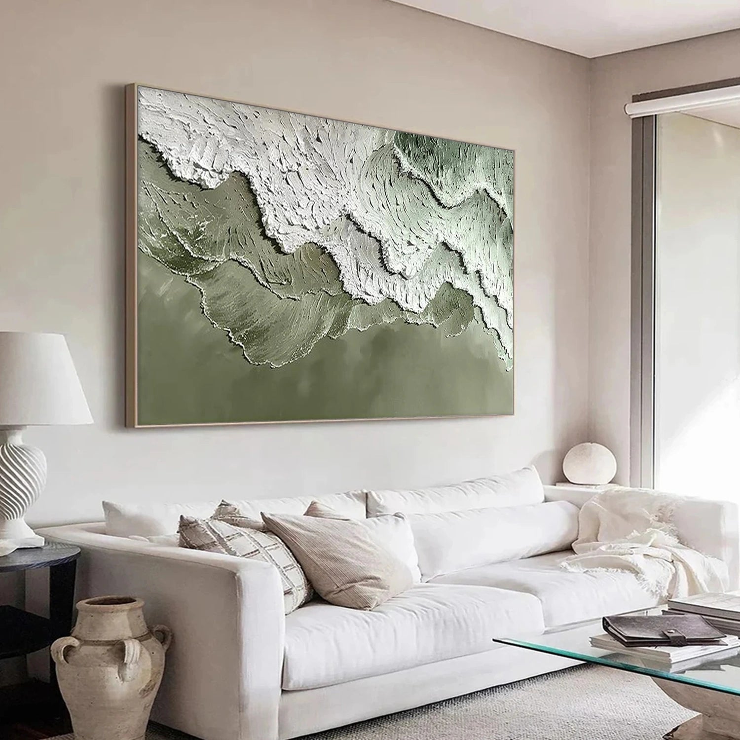
Wave texture follows ocean physics, and the physics is readable. A breaking wave throws its thickest paint at the lip — the white edge where the water turns over — and thins behind it, because the foam is the most three-dimensional thing in the scene. A rolling swell, by contrast, keeps its relief low and long, a smooth raised line that reads as a moving body of water rather than a crest. When you look at a seascape at an angle, the two should be distinguishable: sharp raised lips for breakers, long low ridges for swell. A canvas that textures every wave identically is a canvas that has painted water from a picture, not from motion.
The direction of wave strokes matters second only to their height. Water runs in directions that make sense for the scene: strokes that follow the incoming swell into the shore, a white lip that curls consistently one way. When the stroke directions fight each other, the sea reads as choppy in a way viewers feel but cannot name. Look at the foam particularly — foam should look tossed, landing in separate bright beads, not combed into one smooth stripe.
Foam and spray: the painter's signature
Foam is where seascape painters either earn their claim or lose it. The honest foam of a breaking wave is not a solid white slab but a mass of small bubbles and shreds, and the most convincing textured foam is built the same way: many small raised dabs of white paint, some catching full light, some in the shadow of the wave behind them. When foam is painted as one thick white bar, the wave reads as a meringue; when it is built bubble by bubble, the foam reads like weather.
Spray — the fine mist thrown from a crest — is the subtlest detail and the one that rewards close viewing. A few tiny pale flecks of raised paint, scattered downwind of the break, can sell the motion of the whole wave. If a canvas has no spray at all, it may be a calm sea; if it has no spray but shows a hard breaker, the painting has skipped the detail that makes the water breathe. Spray is also the detail that photographs worst, so when you see it clearly in a seller's close-up, the painting is usually genuinely textured.
Sky and horizon: restraint as a skill
The sky in a seascape should be the canvas's quietest layer, and judging it is easy: it should stay behind the water. The strongest seascapes often give the sky little or no relief — a smooth wash with sediment where the sun is, at most a faint raised cloud edge. If the sky is the most textured part of the canvas, the painter has confused the subject. The horizon deserves even less: a clean line, nearly flush, because any raised horizon casts a shadow across the whole sea below it.
Color temperature does the sky's emotional work. Dawn and dusk seascapes go warm — coral, gold, soft pink on the clouds — and pair naturally with sandy or wooden interiors. Midday marine scenes stay cool and blue, reading crisp and maritime, and suit white, gray or blue rooms. The choice of sky key is effectively the choice of the room's mood, so it belongs early in the decision: pick the sky you want the room to feel, then let the water follow.
Matching a seascape to a room
Seascapes are the most widely compatible textured subject, which is both their strength and their trap. They work in almost any room — living rooms, bedrooms, bathrooms, coastal-style entries — but they need the right reading to avoid becoming a seaside cliche. The rule that keeps them sophisticated: let the canvas be the only literal ocean reference in the space. One textured wave over a neutral sofa reads as art; the same canvas surrounded by rope, driftwood and shell accents reads as a themed corner. If the room already has nautical decor, choose a calmer, more abstract seascape; if the room is neutral, a bold breaker can be the single statement.
Scale follows the familiar rules — about two-thirds of the furniture width below, center near eye level — with one coastal refinement: horizontal formats suit seascapes, because the horizon line wants to run long. Vinchy Art's seascape and snowy-peak range spans sizes from about 24 x 20 inches (61 x 51 cm) to 36 x 24 inches (91 x 61 cm), letting a narrow hallway take a small wave and a wide living wall take the full break. Single works generally run about $219 to $489, with sets from about $369 to $819.
The calm and the storm: two seascape temperaments
Seascapes divide into two temperaments, and buyers usually know which they want faster than they can name it. The calm sea — long low swells, soft colors, flat light — reads as rest, and suits bedrooms, reading corners and post-work spaces. The breaking wave — a crisp lip, foam, motion — reads as energy, and suits living rooms, entries and rooms where people gather. The difference matters more than the color choice, because it decides what the canvas does to the room hour after hour.
The honest buying advice is to decide temperament before palette. A calm canvas with a warm sky fits a room that needs settling; a dramatic breaker in the same warm palette fits a room that needs presence. Asking which temperament the wall needs answers most seascape questions in one step — and it makes the later color decisions easier, because each temperament has a natural palette family.
How to verify a seascape before it ships
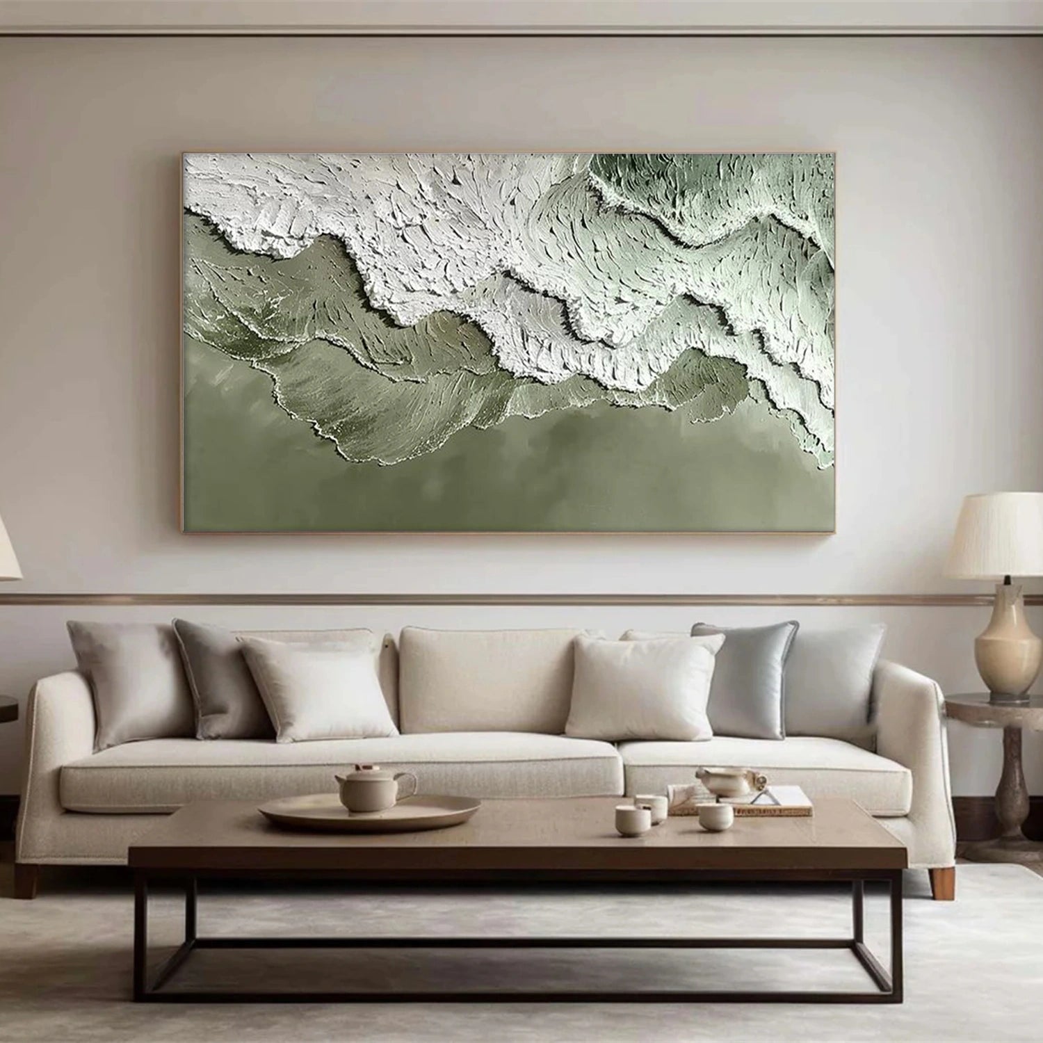
Three checks cover the genre. First, raked-light confirmation of the wave: a side-lit close-up should show the lip lifting off the canvas, not uniform raised paste across the whole surface. Second, the layering test: the sky and horizon should be visibly calmer than the water; if every layer carries equal relief, the painter spent the budget badly. Third, the foam inspection: the foam should read as many small bright dabs, not one smooth white stripe. Any seller of a textured seascape should be able to show all three in their detail shots.
For online purchases, the preview workflow is the practical answer to the biggest risk — a canvas whose relief looks different in person than in photos. Vinchy Art paints seascapes to order, typically within about a week, and sends a photo of the finished canvas before shipping so you can confirm the colors, tones and overall look; adjustments are made before dispatch. The canvas then travels either rolled in a protective tube or framed in a wooden crate, most often arriving within 3 to 7 days of shipping via FedEx, DHL or UPS, with eligible returns covered for 30 days after delivery.
Trouble spots: what most seascape canvases get wrong
Knowing the genre's usual failures protects a purchase. The meringue wave — foam painted as one thick white bar — is the most common. The all-texture canvas, where sky, beach and sea compete, is the second. The frozen wave, where the relief is actually lovely but the motion is absent, is the third: check that the strokes imply flow, a lip curling, foam scattering. A canvas can have all three faults and still photograph beautifully from the front, which is why a raked-light view and a close inspection of the foam matter more than the pretty hero shot.
None of these checks are demands for perfection; hand-painted water will always wander a little, and that wandering is part of why the piece holds light. The goal is the opposite of perfection: a seascape whose relief follows the physics of water, whose layers know their place, and whose foam looks tossed rather than combed. A canvas that passes those three tests will do the one thing flat reproduction cannot — it will carry the motion of the sea into a room that stays perfectly still.
To explore more options, see ocean and sky paintings and blue paintings.

