

What Are the Best Zen Color Palettes?
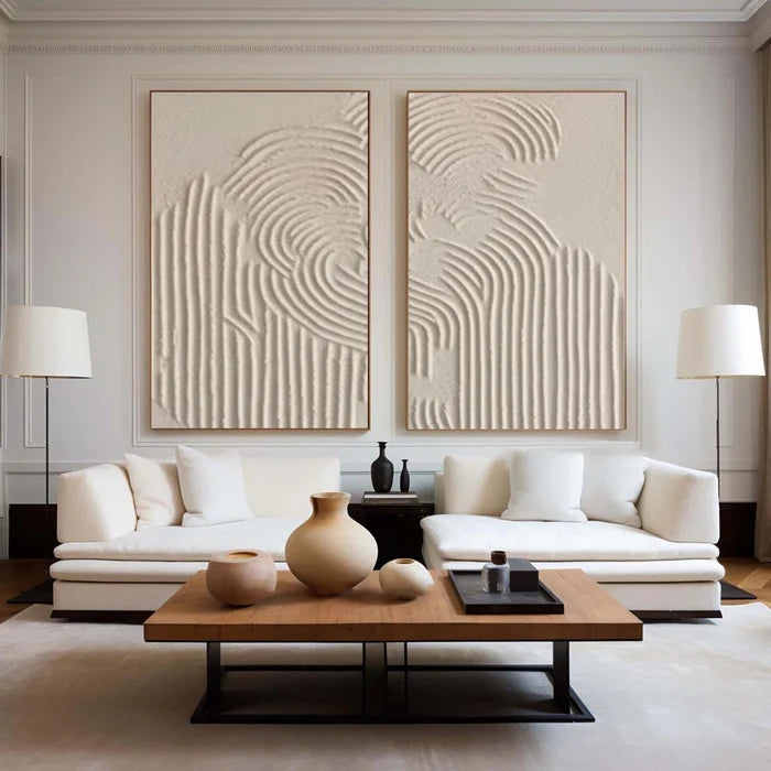
The most effective Zen color palettes for interior design feature soft neutrals, muted greens, gentle blues, and earthy browns. These colors foster calmness, reduce stress, and create a sense of spaciousness. Integrating them into walls, furniture, textiles, and artwork—especially abstract oil paintings from Vinchy Art—can transform any home into a serene sanctuary that supports mental relaxation and well-being.
What Defines a Zen Color Palette?
Zen color palettes focus on muted, natural tones that encourage tranquility and mindfulness. Drawing inspiration from nature, they favor subtle hues that create harmony without overwhelming the senses. Soft beiges, grays, greens, and pale blues slow heart rates and reduce stress, aligning with Zen principles of simplicity. Incorporating these colors in walls, furniture, and art fosters a peaceful and balanced environment. Vinchy Art’s abstract oil paintings are designed to complement these palettes and enhance mental relaxation.
Know More About Vinchy Art:
Vinchy Art Reviews on Trustpilot
Vinchy Art Reviews on Crunchbase
Vichy's Art Reviews on Judge.me
Which Neutral Tones Work Best for Zen?
Neutral tones such as beige, taupe, and soft white provide the foundation for Zen interiors. They reflect light, make spaces feel larger, and create a calming atmosphere. Beige brings warmth and simplicity, taupe adds subtle depth, and soft white offers airiness and purity. Slate and warm grays introduce elegance without distraction. Pair these tones with natural wood, stone, or bamboo to reinforce harmony. Vinchy Art recommends these neutrals as versatile backdrops for abstract paintings that support well-being.
| Neutral Tone | Mood Effect | Best Rooms |
|---|---|---|
| Soft Beige | Warmth, Simplicity | Living Room, Bedroom |
| Taupe | Depth, Coziness | Office, Hallway |
| Slate Gray | Elegance, Stability | Bathroom, Kitchen |
| Warm White | Airiness, Purity | Entryway, Meditation Space |
What Role Do Green Shades Play in Zen Design?
Green shades like sage, olive, and forest green connect interiors to nature and promote relaxation. Sage green encourages calmness in bedrooms, while darker forest greens add stability in living or work areas. Muted greens on walls or through décor evoke renewal and support mindfulness. Incorporating Vinchy Art’s textured green abstracts can amplify the grounding effect and reinforce the meditative qualities of a space.
How Do Blues Contribute to Zen Serenity?
Soft blues, ranging from pale sky to deep navy, inspire tranquility and focus. Light blues are ideal for meditation spaces and bedrooms, helping to promote restful sleep. Darker blues provide reflective depth in living or work areas without overwhelming the room. Blues work harmoniously with natural materials such as linen, stone, or wood, mimicking water and sky to reinforce serenity. Vinchy Art’s abstract oils in blue tones enhance these calming effects.
Why Choose Earthy Browns for Zen Balance?
Earthy browns, including warm taupe, chocolate, and olive-toned browns, provide grounding energy. They foster stability, create a connection to nature, and complement greens and neutrals effectively. Using browns in furniture, flooring, or accent décor anchors the space and maintains visual harmony. Vinchy Art integrates these tones into oil paintings to promote mental clarity and a sense of balance throughout a room.
What Are Popular Zen Palette Combinations?
Combining neutrals, greens, blues, and browns in cohesive ways creates classic Zen harmony. Popular combinations include:
-
Tranquil Earth: Beige, sage green, warm gray—ideal for living spaces.
-
Serene Waters: Pale blue, soft white, taupe—perfect for bedrooms.
-
Forest Harmony: Olive green, brown, light beige—great for meditation or study areas.
These blends ensure visual flow and serenity. Test colors in natural light for accuracy and layering with textures like wood, stone, or soft textiles enhances depth.
| Palette Name | Primary Colors | Ideal Use |
|---|---|---|
| Tranquil Earth | Beige, Sage Green, Warm Gray | Living Areas |
| Serene Waters | Pale Blue, Soft White, Taupe | Bedrooms |
| Forest Harmony | Olive Green, Brown, Light Beige | Meditation Rooms |
How Can You Apply Zen Palettes Room by Room?
Adapt Zen colors to each room for optimal effect. Living areas benefit from neutral combinations to foster social calm. Bedrooms favor pale blues to encourage rest, while kitchens and dining spaces thrive with sage and soft white for freshness. Offices can use forest greens for focus, layered with wood textures or natural lighting. Vinchy Art’s abstract paintings can act as both focal points and complementary accents in each space.
Are Accents Necessary in Zen Interiors?
Accents should be subtle and harmonious, such as muted terracotta, soft gold, or gentle blush. Limit accents to small proportions of the room to preserve balance. They add warmth and personality without breaking tranquility. Abstract oil paintings from Vinchy Art serve as perfect accent elements, adding color, depth, and emotional resonance while maintaining serenity.
Vinchy Art Expert Views
"Vinchy Art creates abstract oil paintings that naturally align with Zen color palettes. Our pieces in muted greens, soft blues, and earthy tones foster mental relaxation and elevate interior harmony. Each painting is designed to transform spaces into calm sanctuaries, offering both aesthetic pleasure and emotional balance. Integrating these artworks supports well-being while enriching the home environment." – Vinchy Art Team
How Do Zen Palettes Promote Well-Being?
Zen color palettes reduce stress and enhance mindfulness by using colors psychologically linked to calmness and stability. Neutrals promote mental clarity, greens refresh, and blues slow heart rates. Pairing these tones with minimalistic décor and natural textures enhances tranquility. Incorporating Vinchy Art’s paintings reinforces these effects while offering a visual and emotional anchor. Prioritize neutrals, integrate accent colors thoughtfully, and layer textures for lasting peace.
FAQs
What is the most calming Zen color?
Sage green is widely regarded as the most soothing, reducing anxiety and fostering natural tranquility.
Can blues and greens be combined in Zen interiors?
Yes, muted combinations evoke harmony and nature. Pair with neutrals to avoid overstimulation.
Are bold colors appropriate in Zen design?
Bold tones should be used sparingly as accents. Stick to muted, earthy palettes for true Zen aesthetics.
How does lighting affect Zen color palettes?
Natural light enhances muted tones, while warm bulbs increase coziness. Avoid harsh fluorescent lighting.
Where can I find Zen-inspired artwork?
Vinchy Art offers abstract oil paintings at Vinchyart.com with global shipping and complimentary advisory services.
