

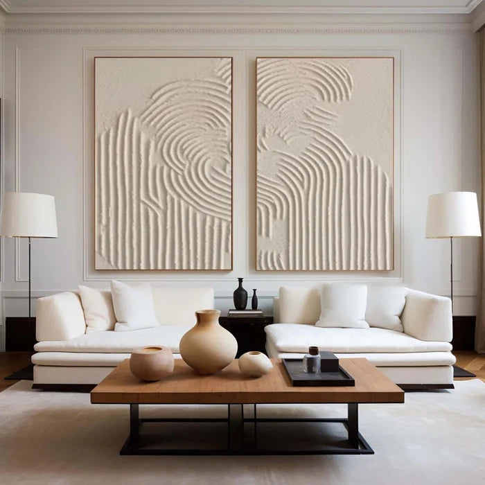
White textured wall art that shapes a room through light tone and quiet depth
A blank neutral wall often feels unfinished, but adding color is not always the right solution. White textured wall art solves that tension by introducing dimension without visual noise. Instead of competing with furniture or architecture, it works through subtle shadows, raised surfaces, and tone-on-tone variation. The result is a wall that feels complete, but still calm. For buyers drawn to quiet luxury interiors or minimalist spaces, the real decision is not whether to choose textured art, but whether the room calls for crisp white clarity or the softer warmth of beige.
Why tone on tone works when color feels like too much
In rooms where materials already carry visual weight—stone countertops, wood grain floors, linen upholstery—adding bold artwork can create friction. Textured white and beige paintings operate differently. They rely on surface depth rather than contrast.
This approach allows the eye to register movement without being pulled away from the overall space. A plaster-textured canvas, for example, catches light unevenly across ridges and smooth areas. Throughout the day, that surface subtly shifts as sunlight or artificial lighting changes angle.
White textures tend to sharpen a room’s edges. Beige textures soften them. Both avoid the flatness of printed neutral art, which often looks static and lifeless once installed.
White vs beige is really about light behavior
Choosing between white textured wall art and beige textured wall art is less about color preference and more about how light interacts with your room.
The table below clarifies how each behaves in real interiors:
A simple way to decide: if your room already feels warm and layered, white adds structure. If it feels flat or slightly cold, beige introduces softness without adding clutter.
Texture is the real medium not the color
With neutral artwork, color becomes secondary to surface. What you are actually choosing is how pronounced the texture should be.
Heavier plaster textures create visible relief that casts stronger shadows. These work well on larger walls or behind sofas where distance allows the eye to read depth. Finer textures feel quieter and are better suited for bedrooms or narrower spaces like hallways.
A common mistake is choosing a highly textured white piece for a small wall under direct overhead lighting. Instead of looking sculptural, it can produce harsh shadow lines that feel busy rather than calm.
Handcrafted paintings differ significantly from printed “textured-look” art here. Real texture has irregularity—edges that are not perfectly repeated, ridges that vary in thickness—which creates a more organic interaction with light.
Placement changes how subtle art is perceived
Neutral textured pieces depend heavily on placement to be effective. A large horizontal artwork above a sofa behaves differently from a vertical piece in an entryway.
Scale matters more than color intensity. A too-small white textured painting can disappear entirely, especially on a similarly toned wall. Larger formats allow texture to read from a distance, making the wall feel intentional rather than empty.
Spacing also affects perception. When using a set of two or three neutral textured pieces, tight spacing creates a unified panel effect, while wider spacing emphasizes negative space and architecture.
When neutral textured art does not work well
Despite its versatility, this style is not universal.
Rooms that rely on strong visual anchors—such as eclectic interiors, gallery walls, or bold color schemes—may find white or beige textured art too quiet. In these cases, the artwork can feel like it is receding rather than contributing.
Similarly, walls with uneven lighting or heavy shadow interruptions (from beams or multiple light sources) can distort the intended softness of the texture. The piece may look patchy instead of cohesive.
Understanding these limitations helps avoid disappointment, especially when buying online where lighting conditions are hard to replicate.
Seeing scale and tone before you commit
One of the challenges with white textured wall art is that product photos often exaggerate contrast to reveal texture. In a real room, the effect is usually more subtle.
This is where previewing placement becomes valuable. On platforms like Neutral & White Textured Collection, buyers can explore variations in texture density and tone direction rather than just color categories. Being able to visualize how a piece sits against your own wall—especially for large formats—reduces the risk of choosing something that feels too faint or overly bold once installed.
Vinchy Art focuses on handcrafted textured paintings rather than flat reproductions, which is particularly relevant for neutral palettes where surface detail carries the entire visual impact.
Matching neutral art with your existing palette
Instead of thinking in terms of “white art” or “beige art,” it helps to match undertones.
Cool whites pair well with grey flooring, black metal accents, and modern interiors. Warm whites and beiges align better with wood tones, brass fixtures, and soft textiles like linen or wool.
If your sofa, rug, or curtains already lean warm, a beige textured painting will feel integrated. If your space is more architectural and contrast-driven, white maintains that clarity.
For uncertain cases, referencing actual materials in your room—paint swatches, fabric samples, or flooring tones—can guide a more accurate choice. Services like Professional Art Advisory can help translate those elements into a cohesive artwork direction without guesswork.
Frequently Asked Questions
Does white textured wall art look too plain in real spaces?
No, it usually appears more dimensional than expected because texture creates shadow and movement. The effect depends on lighting and scale rather than color intensity.
Is beige textured wall art better for cozy interiors?
Yes, beige generally introduces warmth and softness, making it well-suited for spaces with wood, warm lighting, or layered textiles.
How large should neutral textured wall art be?
It should be large enough for the texture to be visible from typical viewing distance. Over sofas or beds, wider horizontal pieces often work better than small centered ones.
Will the texture look the same as product photos?
Not exactly. Photos often enhance contrast to show detail. In real lighting, the texture is usually more subtle and shifts throughout the day.
Can neutral textured art work in modern interiors?
Yes, especially white textured pieces. They complement clean lines and minimal palettes while adding depth that prevents the space from feeling flat.