

Choosing neutral abstract wall art that brings calm structure without making your space feel empty
A room can feel visually “loud” long before you notice why. Competing colors, busy patterns, and overly detailed wall decor often create low-level tension, especially in bedrooms and home offices. Neutral abstract wall art works differently. By limiting palette and simplifying form, it introduces what designers often call visual silence—a sense of calm that still holds presence. The challenge is choosing pieces that feel intentional rather than blank, and pairing them with existing colors so the room feels grounded instead of unfinished.
Why neutral abstraction feels quieter but not weaker
Minimalist abstract painting is not about removing interest—it’s about controlling it. When color is reduced to black, white, beige, or muted greys, the eye begins to notice subtler elements: brush movement, layering, negative space, and surface texture.
In a bedroom, this restraint helps the wall recede slightly, allowing furniture, textiles, and natural light to define the mood. In a home office, it reduces cognitive distraction, which is why many designers lean toward monochrome compositions behind desks or in video-call backgrounds.
The key distinction is this: neutral art does not compete for attention, but it still anchors the wall. A well-composed black and white abstract piece can feel more structured than a colorful artwork simply because contrast is sharper and more deliberate.
Does minimalist abstract art make a room feel empty
It can—but only when scale, placement, or texture are misjudged.
A common mistake is choosing a small, flat-looking piece for a large wall, expecting minimalism to “fill the gap.” Instead, the wall feels unfinished, not serene. The issue isn’t minimalism—it’s proportion and surface presence.
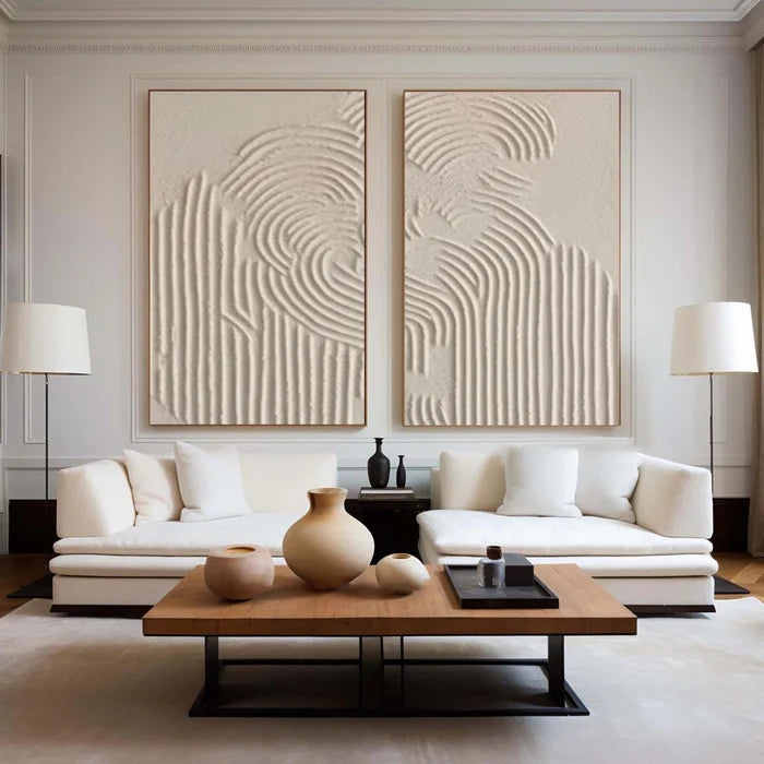
Neutral abstract wall art needs either scale or material depth to hold space. Larger canvases, multi-panel sets, or paintings with visible brushwork or plaster texture create subtle shadows and variation, especially under directional lighting.
If your room already leans minimal—light walls, simple furniture, limited decor—then the artwork must carry quiet authority. That usually comes from:
-
Larger formats that match wall width
-
Noticeable texture or layered paint
-
Strong composition even with limited color
Without these, minimal art risks fading into the background instead of shaping it.
Pairing black and white abstract art with existing colors
Black and white abstract art is often chosen for its flexibility, but it still interacts with surrounding tones. The goal is not to match exactly, but to create controlled contrast.
Consider how it behaves in different palettes:
If your space already has strong color—such as green upholstery or terracotta accents—black and white art acts as a stabilizer. It gives the eye a place to rest between richer elements.
Neutral abstract wall art in bedrooms versus home offices
Although the palette may be similar, the intention shifts depending on the room.
In bedrooms, neutral abstract painting should soften the environment. Compositions with flowing lines, blurred edges, or layered tones tend to feel more restful. Placement above the bed benefits from horizontal orientation or a balanced set of two pieces.
In home offices, the role becomes more structured. Linear elements, geometric abstraction, or higher contrast black and white compositions help define the workspace. These are especially effective behind a desk where visual clarity matters.
There is also a growing trend toward neutral abstract painting in home offices that doubles as video-call framing. Subtle but intentional artwork avoids distraction while still signaling taste and attention to detail.
The role of texture in minimalist art
One reason handcrafted paintings stand apart from prints is surface depth. In neutral palettes, texture often replaces color as the main source of visual interest.
Light interacts with textured surfaces—such as layered acrylic or plaster finishes—creating shadows that shift throughout the day. This adds movement without adding visual noise.
A flat print of a neutral design may look clean online, but in person it can feel static. A hand-painted piece, even in the same palette, tends to feel more dimensional and grounded, especially in natural light.
When neutral abstract wall art is not the right choice
Restraint works best when the rest of the room carries enough warmth or variation. There are situations where neutral abstraction may fall short:
-
Rooms lacking natural light, where subtle tones become dull rather than calming
-
Interiors that already feel overly minimal or unfinished
-
Spaces needing a strong focal point or emotional energy
In these cases, introducing a slightly wider palette—such as muted earth tones or soft color accents—may create better balance than strict monochrome.
Finding the right piece without second-guessing scale or tone
Choosing art online often comes with uncertainty: Will the size feel right? Will the colors match the room? Will the texture translate from photos?
This is where tools and guidance matter more than the artwork category itself. For example, browsing a curated selection like the Minimalist Monochrome Collection helps narrow down style direction, while room preview tools allow you to visualize scale directly on your wall.
For buyers unsure about pairing tones or choosing between a single large piece and a set, consulting an advisory service can clarify decisions before ordering. Vinchy Art offers this kind of support in a practical way, focusing on palette matching, wall proportions, and how different textures behave under real lighting conditions.
If you are balancing multiple neutral tones—such as warm flooring, cool walls, and mixed textiles—getting a second opinion can prevent subtle mismatches that are hard to fix later. You can request tailored suggestions through their Expert Art Advisory team based on your room photos and preferences.
Frequently Asked Questions
Which color abstract art is best for a minimalist bedroom?
Soft neutrals such as warm whites, beige, and light greys tend to work best because they reduce contrast and support a restful atmosphere. Black accents can be included, but should not dominate the composition.
Can black and white abstract art work in a warm-toned room?
Yes, but it should be balanced carefully. Choosing artwork with softer whites or visible texture helps bridge the gap between crisp black elements and warmer surroundings like wood or cream fabrics.
How large should neutral abstract wall art be for a living room or bedroom wall?
A common guideline is to cover about two-thirds to three-quarters of the furniture width beneath it. For example, above a bed or sofa, the artwork should feel proportionate rather than centered as a small standalone piece.
Is textured abstract art better than flat prints for neutral interiors?
In many cases, yes. Texture adds depth and prevents the artwork from disappearing into similarly toned walls, especially when the color palette is limited.
Does neutral wall art go out of style quickly?
Neutral abstract art tends to be more durable stylistically because it relies on composition and material rather than trend-driven color. Its longevity depends more on scale, quality, and how well it fits the room.