

City wall art that captures urban texture and transforms how a room feels
City wall art often disappoints when it leans too literally on skylines. The familiar silhouettes may look impressive online, but in a real room they can feel flat, predictable, and disconnected from the space itself. A more compelling approach treats the city as texture rather than a postcard—layers of steel, reflections, window grids, and shifting light translated into paint. This is where textured cityscape paintings begin to work harder: they don’t just depict a place, they echo the rhythm and structure of urban life. Whether you are styling a focused office or a quieter living room, the way urban energy is interpreted on canvas matters more than the landmark being shown.
When a city becomes texture instead of a skyline
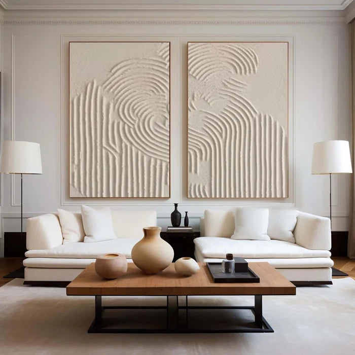
The most interesting city wall art rarely shows a recognizable building. Instead, it borrows from the visual language of cities—repetition, density, vertical tension, and light variation—and turns those into abstract compositions.
Thick palette knife strokes can mimic concrete edges or glass reflections. Layered paint can suggest depth between buildings without outlining a single structure. Even muted tones can carry the sense of a city at dusk through contrast rather than detail.
This approach solves a common interior problem: overly literal artwork can lock a room into a theme. Abstract urban textures, by contrast, stay flexible. They complement modern interiors, industrial spaces, and even softer contemporary homes because they communicate structure without dictating narrative.
If you want to explore how this style appears across different palettes and formats, the Architectural & Cityscape Collection presents a range of interpretations that lean more toward rhythm and material than postcard realism.
Office environments need forward motion, not decoration
In a workspace, city art should do more than fill a wall. It should reinforce direction, focus, and momentum.
Bright, high-contrast urban paintings—especially those with strong vertical or diagonal movement—tend to perform best in offices. They visually “push” the eye upward or forward, which subtly supports productivity and energy. Colors like deep blue, steel grey, black, and sharp white highlights can create a disciplined, architectural feel, while flashes of gold or red introduce urgency without chaos.
Texture plays a functional role here. Heavier impasto surfaces catch light differently throughout the day, preventing the artwork from feeling static during long working hours. This shifting surface keeps the space visually active without becoming distracting.
A common mistake in office design is choosing city art that looks impressive but feels passive. Smooth, printed skylines often fade into the background after a few days, offering no visual engagement. Textured urban compositions, on the other hand, continue to reveal detail over time, which keeps the space mentally stimulating.
Living rooms benefit from a quieter urban interpretation
The same city theme can feel completely different in a living room. Here, the goal shifts from energy to atmosphere.
Instead of sharp contrasts and bold structure, softer urban palettes—misty greys, muted blues, warm neutrals—create a more contemplative mood. The “city” becomes less about movement and more about memory: distant lights, blurred edges, softened geometry.
Brushwork tends to be more blended, with transitions that feel atmospheric rather than architectural. This helps the artwork sit comfortably alongside sofas, textiles, and warm lighting without competing for attention.
The key is restraint. A living room does not need the intensity of a financial district at noon. It responds better to the feeling of a city at twilight—still structured, but softened by light and distance.
Choosing scale and orientation based on wall behavior
City wall art is highly sensitive to scale because urban compositions rely on repetition and structure. When the size is wrong, the entire visual rhythm breaks.
A narrow vertical canvas can emphasize height, echoing skyscrapers and making ceilings feel taller. A wide horizontal piece spreads like a skyline but works best when treated abstractly, avoiding literal building outlines.
To simplify decision-making, use this quick reference:
Spacing also matters. Especially with sets, uneven gaps can disrupt the architectural rhythm the artwork is trying to create.
Handcrafted texture versus flat city prints
The difference becomes obvious once installed. Prints tend to represent the city; handcrafted paintings behave like it.
Flat prints rely on image clarity, which often fades at a distance. Textured paintings, particularly those built with palette knife techniques, create shadow and dimension that change depending on lighting and viewing angle.
This matters in real interiors where lighting is rarely uniform. A textured surface can appear sharper in daylight and softer in evening light, adapting to the room rather than staying fixed.
That adaptability is one reason buyers lean toward handcrafted work when they want the artwork to feel integrated rather than applied.
Where buyers hesitate when choosing city wall art online
Urban art can be difficult to judge digitally because texture, scale, and tonal subtlety do not always translate cleanly on screens.
Buyers often misjudge:
-
How heavy the texture actually is
-
Whether colors lean warm or cool under home lighting
-
The true visual weight of the piece on a large wall
A practical way to reduce that uncertainty is to preview the artwork in your own space before committing. Vinchy Art, for example, offers a room preview tool that lets you upload a photo of your wall to check proportion and placement. Their art advisory service also helps match city-inspired palettes with existing furniture or office finishes, which is especially useful when dealing with complex interiors.
These tools do not replace judgment, but they significantly narrow the gap between expectation and reality.
When city wall art is the wrong choice
Despite its versatility, urban art does not suit every space.
Highly organic interiors—those dominated by natural wood, soft curves, and earthy tones—can feel disrupted by strong architectural compositions. Similarly, very small rooms may struggle with dense, high-contrast city textures, which can make the space feel compressed.
In these cases, a lighter abstract or nature-based piece often integrates more naturally.
Recognizing when not to use city wall art is part of making it work when you do.
Bringing urban narrative into your own space
City wall art works best when it reflects how you want a space to function, not just how you want it to look. Offices benefit from clarity and structure. Living rooms benefit from atmosphere and restraint. The same theme can serve both, but only when interpreted correctly.
If you are trying to align a specific office layout, brand tone, or interior palette with a custom urban composition, it may be worth exploring tailored guidance through Bespoke Customization Services that help translate your space into a more precise visual direction.
Frequently Asked Questions
What makes city wall art feel modern instead of outdated?
Modern city wall art focuses on abstraction, texture, and composition rather than literal skylines. It prioritizes rhythm, layering, and material over recognizable landmarks, which keeps it aligned with contemporary interiors.
Is city art suitable for small rooms?
It can be, but the composition needs to be controlled. Low-contrast, less dense pieces work better in smaller spaces, while heavy, high-energy textures are more suitable for larger walls.
How do I match city wall art with my office design?
Start with your existing materials—desk finishes, flooring, and lighting. Choose artwork that echoes those tones and adds structure without introducing conflicting colors or excessive detail.
Do textured city paintings require special lighting?
They benefit from directional lighting but do not require it. Even standard room lighting will create subtle shadows across the surface, enhancing depth compared to flat prints.
Should I choose a single large piece or a set?
A single large piece creates a strong focal point, while a set can distribute visual rhythm across a wider area. The decision depends on wall size and how structured you want the composition to feel.