

Ocean and sky painting that brings a quiet horizon into your room
An ocean and sky painting does more than fill a wall; it controls how a room breathes. The horizon line, the weight of water against the openness of sky, and the way blue shifts from dense to airy can either calm a space or leave it feeling flat. Many buyers expect any coastal artwork to feel relaxing, but the difference lies in how the transition is painted. In handcrafted work, that transition carries depth and movement, not just color. When the gradient between sea and sky is built with real pigment layering rather than printed fade, the result feels slower, softer, and more immersive—especially in bedrooms and spaces designed for rest.
Why the horizon line changes how a room feels
The horizon in an ocean and sky painting acts like a visual anchor. When placed correctly, it stabilizes the room and subtly guides how your eye moves across the space.
A lower horizon gives more visual weight to the sky. This works well in bedrooms where you want an open, breathable feeling above the bed. The wall feels taller, and the atmosphere becomes lighter.
A higher horizon does the opposite. It emphasizes the ocean, adding depth and grounding energy. This can work in living rooms where the wall needs presence, especially behind a sofa or in a larger seating area.
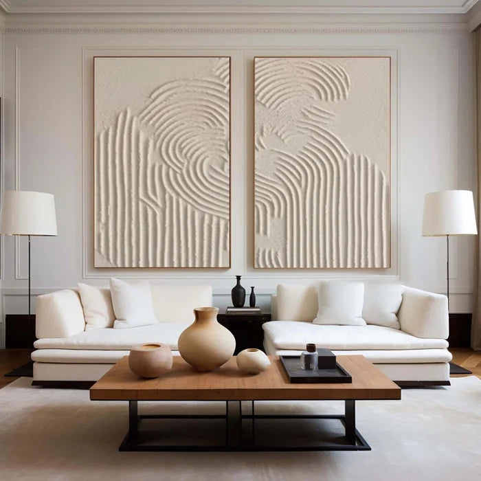
What often goes wrong is scale mismatch. A small canvas with a horizon line can look like a distant window rather than an immersive scene. For this subject, larger formats tend to feel more natural because they echo the real-world expansiveness of sea and sky.
The difference between painted gradients and printed blues
At first glance, many ocean-themed artworks look similar online. Blue sky, soft clouds, gentle waves. But the surface tells a different story once it arrives.
A printed piece usually shows a smooth, uniform gradient. It is visually clean but lacks variation. The sky and water often blend too evenly, which can make the artwork feel flat on a real wall.
A handcrafted ocean and sky painting builds that transition through layers:
-
The sky is created with diluted pigment, softer brush pressure, and visible blending that mimics shifting clouds.
-
The ocean uses denser paint, deeper tones, and heavier strokes to give the water a sense of weight.
-
The meeting point between them—the horizon—is rarely a perfect line. It has subtle irregularities that make it feel natural rather than digital.
This difference is what turns a simple blue artwork into something more atmospheric. It is less about color and more about how that color is physically applied.
Where these paintings work best in the home
Ocean and sky compositions are naturally suited to spaces where visual calm matters, but placement still needs intention.
In bedrooms, they are often positioned above the bed with a horizontal orientation. The wide format mirrors the horizon itself and helps the room feel settled. Softer palettes—muted blues, pale greys, and warm sky tones—tend to support rest rather than overstimulation.
In living rooms, they can act as a central anchor behind seating. Here, slightly deeper blues or more contrast in the water can prevent the artwork from fading into the background.
Hallways and transitional spaces benefit from narrower horizontal pieces or even vertical interpretations where the sky dominates. This keeps the artwork from overwhelming tighter walls while still carrying that open-air feeling.
If you are browsing a curated range, you can explore how different compositions handle this balance in coastal and sky inspired original paintings, where the focus shifts from literal scenery to more expressive, abstracted horizons.
When calm tones stop working
Not every room benefits from a soft blue palette, and this is where many buyers hesitate after installation.
A common issue appears in rooms with warm lighting or beige-heavy interiors. The cool blue of the painting can suddenly feel disconnected, almost like it belongs to a different environment. Instead of calming the space, it creates subtle tension.
This does not mean ocean and sky paintings are unsuitable—it means the palette needs adjustment. Warmer sky tones, hints of sand, or slightly desaturated blues can bridge that gap.
Another limitation is contrast. In rooms that already lack visual structure, a very soft, low-contrast painting may disappear entirely. In those cases, choosing a piece with more defined wave texture or a stronger horizon line helps maintain presence without losing the calming effect.
Understanding texture in ocean and sky compositions
Texture is where handcrafted work quietly outperforms flat alternatives. It is not always dramatic or heavy, but it changes how light interacts with the surface.
In the sky area, texture is usually minimal and smooth, allowing light to glide across it. This keeps the atmosphere open and unobstructed.
In the ocean, texture becomes more noticeable. Slight ridges, layered strokes, or thicker pigment create movement. Even subtle variations catch shadows during the day, which adds dimension without making the piece feel busy.
This contrast between smooth sky and tactile water is what gives the painting its “transitional” quality. It feels like two different physical states meeting, rather than a single flat image.
Choosing the right size and orientation without guesswork
Buyers often rely on wall measurements alone, but with horizon-based art, proportion matters just as much as size.
A painting that is too short in height can compress the sky and remove that sense of openness. One that is too tall may lose the horizontal calm that defines this subject.
A practical approach is to relate the artwork to the furniture beneath it. For example, above a bed or sofa, the painting should span a meaningful portion of the width, allowing the horizon to feel continuous rather than isolated.
If uncertainty remains, using a room preview tool can make a significant difference. Uploading a photo of your wall and placing the artwork digitally helps you see how the horizon aligns with furniture and eye level before committing.
A more tailored approach to ocean and sky artwork
Some buyers know exactly what they want: a specific shade of blue, a softer cloud formation, or a more defined ocean texture. Others only know the feeling they are trying to achieve.
This is where a more guided approach becomes useful. Instead of choosing from fixed options, you can request adjustments based on your room’s lighting, wall color, and existing materials. A slightly warmer sky, a deeper ocean tone, or a repositioned horizon can change how the entire piece interacts with the space.
Vinchy Art approaches ocean and sky painting as a study in mood rather than just imagery, using pigment density and layering to separate the lightness of air from the weight of water. For buyers who want that level of control, it is possible to request a custom seascape through art advisory, aligning the painting more precisely with your interior.
Frequently Asked Questions
What size ocean and sky painting works best above a bed?
A wider horizontal piece generally works best because it mirrors the natural horizon. Aim for a width that spans a substantial portion of the bed without extending too far beyond it, so the composition feels balanced rather than disconnected.
Are ocean and sky paintings always blue?
No. While blue is dominant, many variations include greys, soft pinks, sandy neutrals, or even muted gold tones in the sky. These alternatives can better match warmer interiors while still keeping the coastal atmosphere.
Do textured paintings look very different in person compared to photos?
Yes, slightly. Texture interacts with real light, which images cannot fully capture. Subtle ridges and layered brushwork become more visible in person, especially throughout the day as lighting changes.
Is a calm ocean painting suitable for a busy living room?
It can be, but it depends on contrast. In a visually active space, choose a piece with enough tonal depth or wave definition so it does not fade into the background while still maintaining a calming effect.
How do I know if the horizon height is right for my wall?
The horizon should align comfortably with your natural line of sight when seated or standing in the room. If it feels too high or too low during preview, the painting may not integrate naturally with the space.