

Ski wall art that brings mountain energy into a refined modern interior
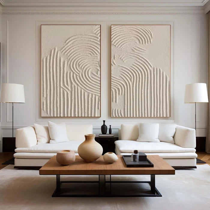
Ski wall art often falls into a predictable trap—retro posters, literal skiers, or souvenir-style graphics that feel more like memorabilia than design. But if your space is a modern cabin, a quiet alpine retreat, or even a city home shaped by a love of winter sport, that approach can feel visually out of step. The more compelling direction is abstract ski wall art: pieces that translate speed, slope, and silence into texture, contrast, and movement. Instead of showing skiing, they feel like skiing. That shift—from depiction to sensation—is what allows mountain-inspired art to sit comfortably in refined interiors without losing its emotional charge.
Why abstract ski wall art works where literal imagery fails
Literal skiing scenes tend to anchor a room in a specific time, place, or style. A vintage lift poster or a figurative downhill scene can quickly dominate the space, especially in minimalist or contemporary interiors where every object carries weight.
Abstract ski wall art takes a different route. It captures the essence of the sport—sharp descents, shifting الضوء and shadow on snow, the rhythm of turns—through compositional elements rather than recognizable figures. Long diagonal strokes can echo a downhill run. Layered whites and cool greys mimic packed snow under changing light. Deep blues or charcoal tones suggest elevation and distance.
This makes the artwork more adaptable. It does not compete with architecture or furniture; it integrates with them. In a modern ski lodge with clean lines and natural materials, abstract mountain wall art feels intentional rather than thematic.
For those exploring this direction, a focused collection like energy of the mountains in our skiing collection shows how skiing can be expressed through movement, palette, and surface rather than illustration.
Translating slope, speed, and silence into visual form
What distinguishes strong skiing sport art from generic mountain decor is how it handles motion and stillness at the same time. Skiing is not just adrenaline—it is also isolation, altitude, and quiet.
In abstract form, that duality shows up through:
-
High-contrast lines that suggest acceleration and direction.
-
Soft, diffused layers that evoke fog, snowfall, or distant peaks.
-
Textural buildup that mirrors uneven terrain or compressed snow.
-
Negative space that recreates the openness of alpine landscapes.
A canvas with heavy palette knife work can feel almost sculptural, catching light differently throughout the day. In a room with a fireplace, that changing surface becomes part of the atmosphere, especially in the evening when shadows deepen and textures become more pronounced.
Choosing the right scale for fireplaces, entryways, and offices
Scale is where many ski-themed interiors fall short. A small piece above a large stone fireplace or a wide wall can make even strong artwork feel insignificant.
Here is a practical way to think about sizing in ski-focused spaces:
A panoramic piece above a fireplace works particularly well for mountain wall art because it echoes the natural width of alpine views. The eye reads it as a landscape, even when the composition is fully abstract.
Color direction that feels alpine without feeling cold
It is easy to default to icy blues and stark whites for ski wall art, but that can make interiors feel overly cold, especially in spaces meant for warmth and retreat.
A more refined palette approach blends:
-
Warm neutrals like beige, taupe, or soft brown to connect with wood and stone.
-
Muted blues and greys for elevation and atmosphere.
-
Occasional deep accents (navy, forest green, or black) to ground the composition.
This balance allows the artwork to reference snow and sky without disconnecting from the warmth of a lived-in interior. In practice, the best pieces often feel slightly desaturated—closer to what you see on an overcast mountain day than a bright postcard scene.
Handcrafted texture versus flat prints in mountain interiors
In ski environments, texture matters more than usual. Natural materials—timber beams, stone fireplaces, wool textiles—already define the space. Flat prints can feel visually thin against that backdrop.
A comparison helps clarify the difference:
In a mountain setting, a textured canvas does more than decorate—it participates in the room. It absorbs and reflects light similarly to the surrounding materials, which helps the artwork feel embedded rather than applied.
A common mistake that makes ski art look dated
A frequent misstep in ski homes is leaning too heavily into nostalgia—mixing multiple vintage posters, signage, and literal ski imagery in one space. Instead of creating atmosphere, it fragments the room into competing focal points and can make even high-quality interiors feel themed rather than designed.
A single, well-scaled abstract piece often achieves more. It allows the architecture, view (if present), and materials to breathe while still expressing a clear identity tied to skiing.
Where this style fits—and where it may not
Abstract ski wall art works best in interiors that already value restraint and material quality. Modern chalets, renovated cabins, and even urban apartments with a mountain-inspired palette benefit from its subtlety.
However, if a space leans heavily into traditional alpine decor—ornate wood carvings, patterned textiles, and rustic accessories—a highly minimal abstract piece may feel disconnected. In those cases, a slightly more expressive or layered composition can bridge the gap.
Using art advisory and previews to avoid scale and color mismatch
Buying ski wall art online introduces a familiar concern: will the scale, tone, and texture actually work in your space?
This is where tools like room previews and art advisory become practical rather than optional. Being able to place a digital version of the artwork onto a photo of your own wall helps answer questions that product images alone cannot—especially for oversized pieces or unusual layouts.
For buyers considering large-format or textured paintings, Vinchy Art offers a way to preview our art in your room, which can clarify proportion and placement before committing. Combined with guidance on palette matching, this reduces the risk of choosing something that feels either too small or visually disconnected once installed.
Frequently Asked Questions
What is modern luxury art for ski lodges?
Modern luxury ski lodge art focuses on abstraction, material quality, and scale rather than literal imagery. It uses texture, restrained color palettes, and large formats to reflect mountain environments in a way that aligns with contemporary interiors.
How do I use abstract ski wall art in a minimalist home?
Keep the composition simple and the palette controlled. Choose one larger piece instead of multiple small ones, and align its tones with existing materials like wood, stone, or neutral fabrics to maintain visual cohesion.
Why choose canvas painting for mountain themed decor?
Canvas paintings, especially handcrafted ones, provide texture and depth that echo the natural materials in mountain interiors. They interact with light and create a more immersive presence compared to flat prints.
What size ski wall art works best above a fireplace?
A wide horizontal piece that spans roughly two-thirds to three-quarters of the fireplace width typically works best. This maintains proportion and creates a strong visual anchor without overwhelming the structure.
Can sport wall art still feel sophisticated?
Yes, when the sport is interpreted through abstraction rather than literal imagery. By focusing on movement, contrast, and texture, sport wall art can feel refined and aligned with high-end interior design.