

Wabi sabi wall art invites quiet texture and imperfect beauty into modern interiors
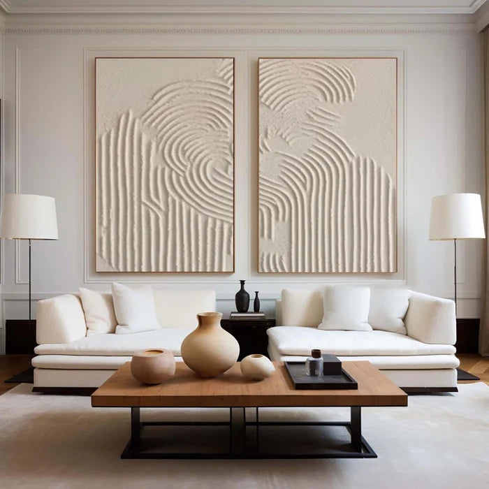
A blank wall often feels less like a design opportunity and more like a pressure to “get it right.” That pressure is exactly what Wabi Sabi wall art resists. Instead of perfect symmetry, sharp lines, or polished finishes, it introduces irregular texture, softened edges, and tonal calm. In practice, that means hand-applied plaster ridges, uneven pigment absorption, and brushwork that doesn’t try to hide the human hand. The result is not unfinished—it is intentional in a different way. For buyers comparing handcrafted paintings to mass-produced decor, Wabi Sabi offers a grounded alternative that feels quieter, more tactile, and more forgiving inside real living spaces.
What Wabi Sabi actually means on a wall
Wabi Sabi is often summarized as “beauty in imperfection,” but on a canvas it becomes something more physical. It shows up through surface, not slogans.
A Wabi Sabi painting typically relies on muted palettes—beige, clay, ash, charcoal, off-white—and lets variation do the visual work. Instead of bold contrast, you get layered tones that shift subtly depending on light direction. Under natural daylight, the piece may feel airy and soft. Under warm evening lighting, the same surface can deepen and reveal shadows within its texture.
More importantly, the imperfections are not decorative tricks. Slight asymmetry, irregular edges, and visible tool marks are the composition. This is where handcrafted work separates itself from printed reproductions, which tend to flatten these details into uniform patterns.
Handcrafted texture versus print-like perfection
One of the most practical ways to understand Wabi Sabi wall art is to compare how it behaves next to mass-produced prints.
This difference matters most on larger walls. A big print can fill space, but a textured painting changes how the wall feels throughout the day.
Where Wabi Sabi wall art works best
Wabi Sabi is not about filling every wall—it is about placing calm where the room needs it.
It works especially well in spaces that already have some visual activity. Think of a living room with textured upholstery, wood grain furniture, or linen curtains. In these environments, a highly graphic or colorful artwork can compete. A Wabi Sabi painting, by contrast, stabilizes the room.
In bedrooms, the effect is even clearer. A large horizontal canvas above the bed with soft tonal variation creates a grounded focal point without overstimulation. In entryways, a vertical textured piece can set a tone of restraint and quiet before the rest of the home unfolds.
A common misstep is pairing Wabi Sabi art with overly sleek, high-gloss interiors. In a space dominated by glass, chrome, and sharp edges, the painting can feel disconnected rather than calming. The philosophy works best when at least one other material—wood, stone, linen—echoes its softness.
Scale, spacing, and why subtle art still needs presence
Because Wabi Sabi wall art is understated, scale becomes critical. A piece that is too small will disappear entirely.
For a sofa wall, the painting should generally span around two-thirds to three-quarters of the sofa width. For beds, a wide horizontal piece or a balanced set can anchor the headboard visually. The texture needs enough surface area to be noticed; otherwise, the detail that defines Wabi Sabi is lost.
Spacing also matters more than people expect. If you choose a set of two or three panels, the gap between them should feel intentional—usually a few inches—not scattered. The negative space is part of the composition.
The role of light in textured paintings
Unlike flat prints, Wabi Sabi paintings are sensitive to lighting angle. This is often overlooked when buying art online.
Directional light—such as a window from the side or a wall washer—will emphasize plaster ridges and brushwork. Overhead lighting tends to flatten those details. Even the color temperature affects perception: warm light (around ) enhances earthy tones, while cooler light (around ) can make the same piece feel more neutral or slightly grey.
This means the artwork you see in a product image is only one version of how it will look. In real spaces, it evolves throughout the day.
Choosing the right piece without seeing it in person
Online art buying introduces a specific kind of hesitation: scale uncertainty, texture ambiguity, and color mismatch. Wabi Sabi wall art adds another layer because its value lies in subtle surface variation.
This is where visual tools and advisory support become useful. For example, you can Explore our Wabi Sabi & Textured Originals to see how different compositions use texture density and tone variation. More importantly, using a room preview approach—uploading a photo of your own wall—helps you judge proportion in a way product images cannot.
Advisory guidance can also help translate your existing materials into an art direction. A beige painting is not just “beige”—it may lean warm, cool, sandy, or grey depending on pigment mix. Matching that nuance to flooring, fabric, or wall paint is where many buyers hesitate.
When Wabi Sabi wall art is not the right choice
Despite its versatility, Wabi Sabi is not universally suitable.
If your space relies on contrast, color energy, or graphic clarity—such as eclectic interiors, pop-art inspired rooms, or highly saturated palettes—this style may feel too quiet. Similarly, in very small spaces with limited light, subtle tonal differences can become harder to perceive.
There is also a psychological expectation to consider. Some buyers interpret irregular texture as unfinished or too minimal. If you prefer clearly defined imagery or strong focal points, abstract Wabi Sabi compositions may not meet that expectation.
A quieter path to buying original wall art online
For buyers who value material presence over visual noise, Wabi Sabi wall art offers a different kind of confidence. It does not rely on trend-driven imagery or bold statements. Instead, it builds atmosphere through restraint.
Vinchy Art approaches this category through original handcrafted paintings where variation is not treated as a flaw but as the defining characteristic. Subtle shifts in plaster, pigment, and brushwork ensure that each piece carries a slightly different surface story. For those who want to understand how these works are made and what to expect from the process, you can Learn about our Hand-Crafting Standards.
The result is not about perfection. It is about choosing a piece that continues to reveal itself as you live with it.
Frequently Asked Questions
What colors are typical in Wabi Sabi wall art?
Most Wabi Sabi paintings use muted, earthy tones such as beige, taupe, clay, off-white, and soft grey. These colors are often layered rather than flat, creating subtle variation that changes under different lighting conditions.
Is Wabi Sabi wall art suitable for large living room walls?
Yes, but it needs proper scale. Larger walls benefit from oversized canvases or multi-panel sets so the texture and tonal variation remain visible from a distance.
How is Wabi Sabi different from minimalist wall art?
Minimalist art focuses on simplicity and reduction, often with clean lines and flat surfaces. Wabi Sabi also values simplicity but introduces irregular texture, organic forms, and visible imperfection.
Will textured paintings look different in my home than online?
Yes. Lighting direction, brightness, and color temperature can all change how texture and color appear. This is especially noticeable with plaster or layered surfaces.
Do all Wabi Sabi paintings look similar?
No. While they share a muted palette and organic feel, differences in texture density, composition, and brushwork create distinct pieces. Even within the same style, no two handcrafted works are identical.