


What Makes a Painting Calm: The Science, Honestly Stated
The wellness art category is full of claims that outrun the evidence - paintings that promise sleep, focus and lower blood pressure as if they were devices. The honest science is more interesting and more useful than the marketing. There are real, repeatable mechanisms by which artwork changes a room's feel: the color response, the visual-load effect, the attention-restoration effect of nature imagery, and the physical novelty of a textured surface. This guide states each mechanism at the level the evidence supports, explains what a room can and cannot expect, and gives a practical test for choosing a calmer painting without buying a placebo.
What the science actually supports
Three effects have real support and one marketing habit should be retired. First, color response: cool hues - blue, green, violet - reliably read as calmer and more distant than warm hues; the effect is consistent enough to be usable as a design rule and modest enough to never be a treatment. Second, visual load: spaces with less competing visual information are reliably experienced as calmer, and reducing the number of high-contrast objects is a robust way to lower perceived busyness. Third, attention restoration: imagery of natural scenes - greenery, water, open skies - has a well-documented tendency to give directed attention a rest, which is the strongest evidence-backed reason nature-adjacent art exists in calm rooms.
The claim to retire is any version of a painting changing your physiology by itself. No artwork reliably lowers resting heart rate or blood pressure as a standalone intervention; those outcomes depend on breath, rest and environment, not pigment. What art reliably does is change the environment - the color, the load, the reference to nature - and environments shape how people rest within them. Buying a painting as one component of a calmer room is reasonable; buying it as a substitute for sleep or stress management is not.
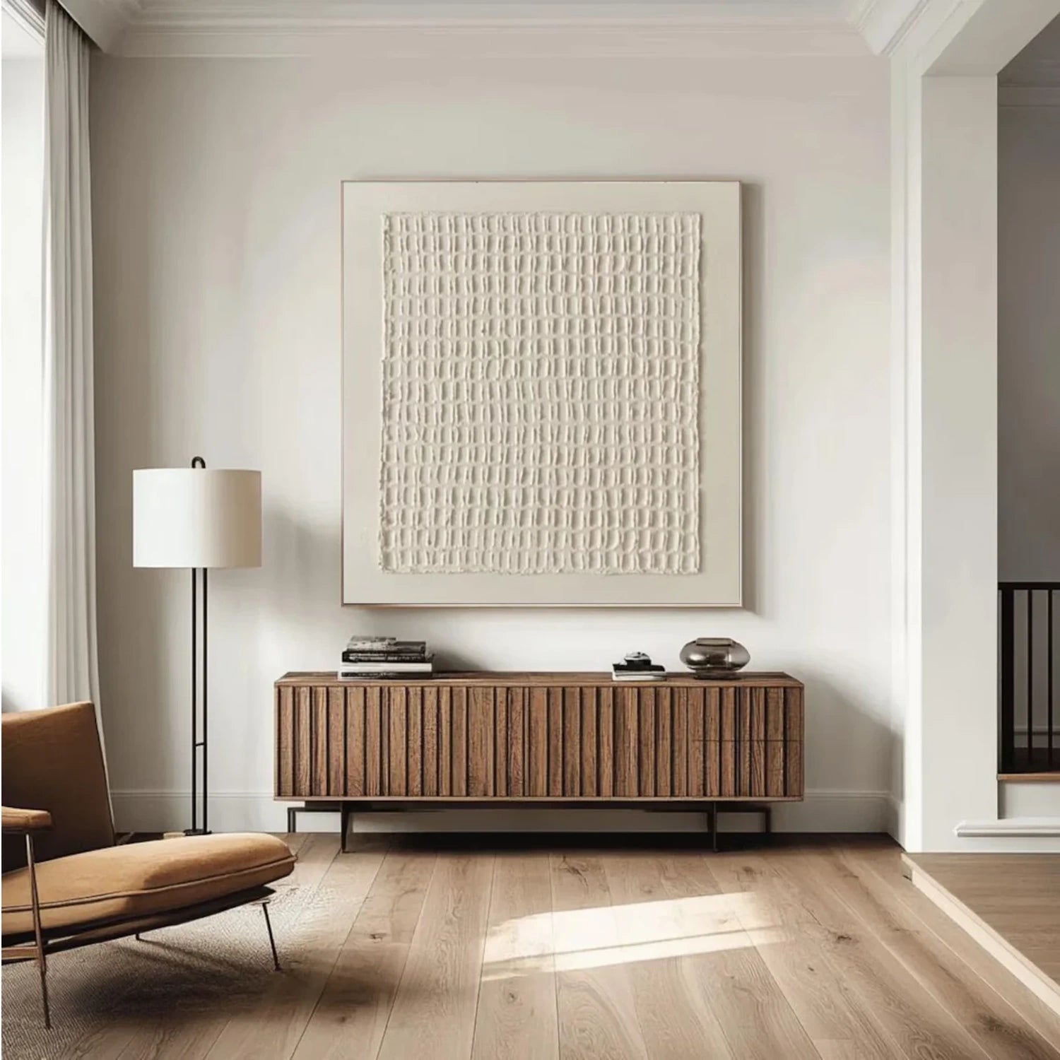
Color response: what to actually choose
If calm is the goal, the color logic is simple: cool and muted over warm and saturated. Blue, green, slate, grey-green and soft neutrals read as quieter than red, orange and bright yellow in almost every testing context. The strength of the effect is at the level of mood and perceived temperature, not measured physiology - which is still worth having: a room that feels calmer is a room people actually rest in. The same logic sets the caution: a large saturated warm painting in a room meant for rest will work against the goal, whatever its other merits.
The deeper design rule is value, not just hue. Pale and mid-tone values lower visual load; high-contrast pieces - black against white, deep against bright - raise it. A calm-room painting should therefore be judged on three scales: hue (cool), saturation (muted), and value contrast (low to moderate). A piece that passes all three is evidence-aligned for calm; a piece that fails even one can still be loved, but not for the calm claim.
Visual load: the busyness mechanic
The most underestimated variable in calm rooms is load. The eye subconsciously counts objects, contrasts and patterns, and busy rooms tax attention whether or not they are consciously noticed. The practical translation: calm does not come only from the painting; it comes from the painting not adding load to a room. That means choosing pieces with generous negative space, moderate contrast and a single dominant note, and hanging them with air - the wall around the art behaves as part of the calm. A busy canvas in a busy room doubles the load; the same canvas in a calm room becomes the room's one statement.
The load logic also explains why texture belongs in calm rooms more than flat prints do. A flat high-contrast print is pure signal with no rest; a textured piece breaks the surface into shadow detail that the eye can settle into - the load is present but graduated. Texture converts a single loud statement into a soft hierarchy of marks, which is exactly what a calm environment needs from its one visual anchor.
Nature imagery: the strongest evidence
Of all the mechanisms, the nature reference has the most support. Looking at imagery of natural scenes - water, greenery, open sky, gentle terrain - is associated with recovery of directed attention in a well-replicated line of research. The practical reading is not that a painting silently heals you; it is that a reference to nature gives the mind a familiar, low-demand rest stop, reliably rated as calming by study participants. A calm-room painting should therefore either depict nature or abstract it in forms the eye reads as natural - soft curves, layered depth, horizon-like bands.
Texture raises the nature effect a step. A smooth photo of a coastline is an image of nature; a textured canvas with wave-like relief is an image that also behaves physically - the ridges are the water, the valleys are the troughs, and the surface performs its subject. Viewers rate textured natural forms as engaging in a way flat reproductions are not, which is the honest boundary of the evidence: the texture earns attention, and the nature earns rest. The combination, used in a low-load room, is what a calm wall actually is.
What texture does and does not do
Texture contributes to calm through three observable channels. It softens saturation by breaking large color fields into shadow detail. It gives the eye a graduated resting surface instead of a flat field to scan. And it adds a novelty cue - the physical 3-D surprise causes a moment of attention that then releases, which in a low-load context reads as interest without stress. None of this requires grand claims; it is the behavior of surface and light that anyone can verify with a lamp and a walk past.
Texture does not make a painting calm by itself - a loud high-contrast texture in a busy room is still loud. The texture is a moderator: it softens and holds what the color and composition set up. The complete calm equation is muted cool color, low visual load, a nature reference, and texture as the surface that ties them together. Remove any one and the others can still work; add them together and the wall performs at its calmest.
The honest room design for calm
Translate the mechanisms into a room plan: choose a cool muted piece with visible negative space and a nature-hint; hang it on the wall the eye rests on most - opposite the bed, or opposite the seat you read in; give it air and a soft side light; then remove one competing object from the same sightline. The removal step is the part most people skip, and it matters as much as the painting: one calm anchor with air behaves calmer than five soothing pieces crowded together. The room's rest comes from the system, not the single object.
Lighting finishes the calm: warm and soft rather than bright and cool. A warm picture light at a gentle angle brings out the relief without glare, and the piece reads as part of the restful hour rather than a display. If the room lacks a lamp that can be angled, add one before the painting - the light is half of the surface's calm behavior.
A verification test that separates calm from claims
Before believing a calm claim about a painting, run this five-minute check in the room. One: the coverage test - stand at the seat you will actually use and check the painting is in the field of view at the relaxed angle, not only on the wall you face while walking. Two: the load test - cover the painting with a sheet, look at the room, then reveal it; the room should feel calmer or at least unchanged, never busier. Three: the color test - confirm the palette is cool or muted; if the reveal makes the room feel warmer or louder, the calm claim fails for that wall. Four: the texture test - walk past under lamplight and confirm the surface changes without demanding attention; movement from a side angle that holds quietly is the texture behaving. Five: the week test - live with it for a week and notice the moment you relax into it; a genuinely calm piece becomes background support within days, while a busy one keeps re-announcing itself.
Wellness art, stated honestly, is not medicine and not decoration - it is environment design with three evidence-backed dials and one honest limit. Color, load and nature reference are real, usable and measurable in your own room; physiological promises are not. Choose cool, light and space; add one nature-leaning textured surface; light it warm and soft; and remove one thing from the same line of sight. That is the entire practical science of a calmer wall, and unlike the claim of a miracle painting, it is a program you can verify in a single evening and trust for years.
Calm as a weekly habit, not a single object
The evidence-backed conclusion is that calm compounds through repetition: the same wall, the same light and the same seat create a settled association far stronger than any single first impression. That is why a calm wall is a routine rather than a product. The painting stays, the lamp stays at the same angle, and the seat stays where the view works - and within weeks the corner becomes the room where attention relaxes on its own.
The practical version is a once-a-month reset: the same five-minute test, run again in the actual room, catching the drift that new furniture or a changed lamp introduced. Calm is not a purchase; it is the maintenance of a system, and the canvas is the system's most reliable component.

To explore more options, see wabi-sabi art and zen wall art.

